Download
1 / 2
30 likes | 325 Views
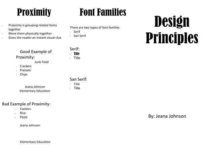
Proximity. Font Families. Design Principles. Proximity is grouping related items together Move them physically together Gives the reader an instant visual clue. There are two types of font families Serif San Serif Serif: Title Title San Serif: Title Title.

E N D
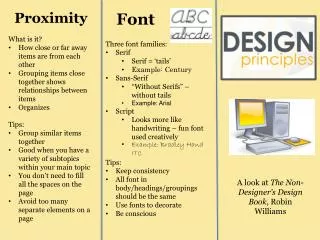
Proximity Font Families Design Principles • Proximity is grouping related items together • Move them physically together • Gives the reader an instant visual clue There are two types of font families • Serif • San Serif Serif: • Title • Title San Serif: • Title • Title Good Example of Proximity: Junk Food • Crackers • Pretzels • Chips Jeana Johnson Elementary Education Bad Example of Proximity: • Cookies • Rice • Pasta Jeana Johnson Elementary Education By: Jeana Johnson
Contrast Repetition Alignment • Most useful way to make your visual interesting • Created when two elements are different • If they are not exactly the same then make them really different • Repeat some aspect of the design throughout the whole project • Thought of as consistency • Can be anything the reader can recognize visually • Nothing on the page should be placed arbitrarily • Every item should have visual connection to something else on the page Good Examples of Repetition: • Lining up bullet points • Same size fonts for headings and body • Same format for each fold Dogs • Golden Retrievers • Labradors • Poodles Cats • Siamese • Tabby • Persian Bad Examples of Repetition: • Changing all fonts on each fold • Not using the same fonts Cats • Siamese • Tabby • Persian Dogs Golden retrievers Labradors Poodles Good Examples of Contrast: Good Examples of Alignment: Jeana Johnson 1000 Sterling Hts Dr Menasha, WI 54952 Jeana Johnson Insrutuctional Tech 2/20/14 Bad Examples of Alignment: Jeana Johnson 1000 Sterling Hts Dr Menasha, WI 54952 Jeana Johnson Insructional Tech 2/20/14 My Life This is my story about my life. Biography My earliest memory is a happy one. Bad Examples of Contrast: My Life This is the story of my life. Biography My earliest memory is a happy one.