Download
1 / 4
40 likes | 197 Views
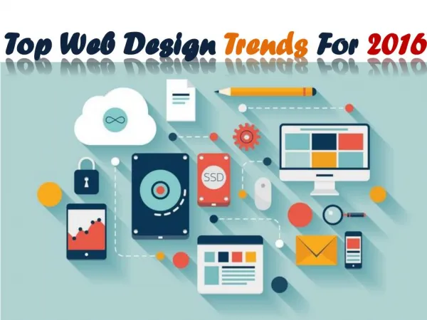
To push your organization forward it is must to follow the latest and innovative trends in the field of website design. Get a professional website designed by a company that offers top class solutions for web graphics design in Chandigarh. Read the blog to find out more about the latest trends in the field of web designing to look out for in 2017. For more information visit our website: http://www.indiamarkethub.com/resources/blog/web-design-trends-in-2017-future-of-website-digital-product-design/

E N D
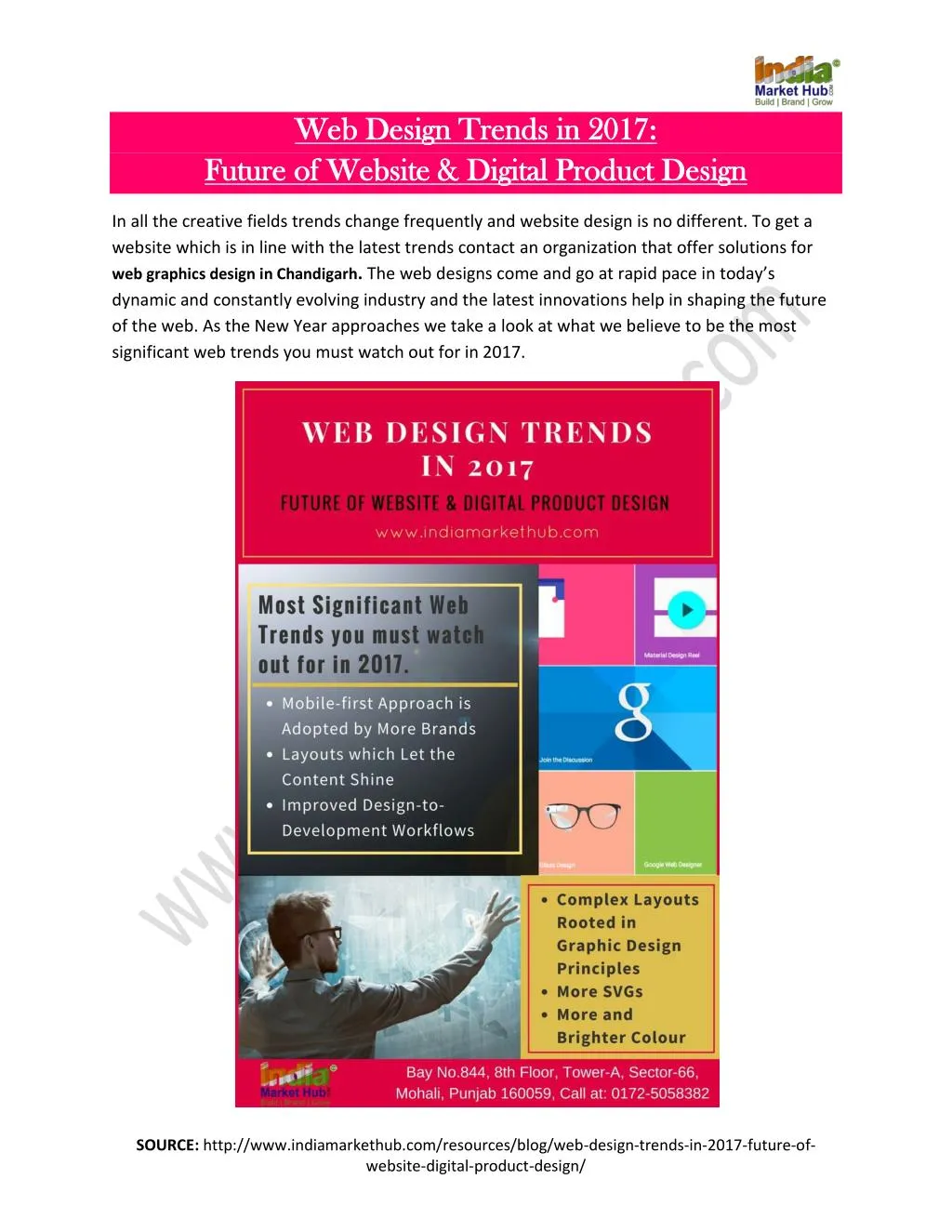
Web Design Trends in 2017: Web Design Trends in 2017: Future of Website & Digital Product Design Future of Website & Digital Product Design In all the creative fields trends change frequently and website design is no different. To get a website which is in line with the latest trends contact an organization that offer solutions for web graphics design in Chandigarh.The web designs come and go at rapid pace in today’s dynamic and constantly evolving industry and the latest innovations help in shaping the future of the web. As the New Year approaches we take a look at what we believe to be the most significant web trends you must watch out for in 2017. SOURCE: http://www.indiamarkethub.com/resources/blog/web-design-trends-in-2017-future-of- website-digital-product-design/
1. Mobile-first Approach is adopted by More Brands The mobile-first approach is the process of designing for mobiles first and then working it up to the bigger screens. As smart phones are the primary devices used for browsing the web these days more organizations are realizing the significance of having a website which delivers the content effectively on smaller screen. The content is also designed to fit on the mobile and smaller screened devices first. The restrictions of the mobile-first model makes the brands consider what is their core content and message they want to communicate. Smartphones have a limit to the amount of content a user can view at once. This forces the brands to do-away with any information which is not absolutely necessary. This allows you to add content in it along with visual bells and whistles when the users switch to the devices with larger screens. 2. Layouts which Let the Content Shine The design elements should be arranged in the given structure to enable the reader to focus easily on the message without slowing down his reading speed. There has been a sea change in the design’s role in your business over the last few years. The design has shifted from the optimization stage to the focus on content which is the meat and bones of the web. Designers across the world have realised that people visit the websites for their content which may include thoughtful long-reads, tweetstorms or latest user-generated meme. It is the role of the designer to present the content in an efficient, intuitive and delightful manner. Most of the designers are shifting away from skeumorphic design towards a flatter and more minimalistic design approach. However, many designers feel that flat design trend has taken out the soul from the design. We expect to see this debate continuing in 2017. 3. Improved Design-to-Development Workflows As the designing and prototyping tools have become more mature and sophisticated the traditional handoff deliverable has also undergone major transformation from the static files to more dynamic visualizations. These range from animated keynote files to fully functional web pages. The dynamic deliverables shorten the feedback loop and simultaneously improve the design as well as development team agility thus lowering frustration. These also facilitate better communication with the customers. SOURCE: http://www.indiamarkethub.com/resources/blog/web-design-trends-in-2017-future-of- website-digital-product-design/
Indeed for many users of webflow client meetings have become the live working sessions where the designers are able to rapidly bring the ideas to life and everyone can experience them immediately. 4. Complex Layouts Rooted in Graphic Design Principles If we want to correctly predict the evolution of website design in visual terms we must refer to the evolution of graphic design. The web design layout has been constrained by the CSS’s limitations for the past few years. However, new upcoming tools like flexbox and CSS grid will enable you to create more expressive layouts on the web. If you haven’t dived into flexbox yet you are in for a treat. This new CSS layout module offers incredible responsive-friendliness. Plus it can be used by visual designers to manipulate objects on the canvas with it’s align and distribute tools. CSS grid is first CSS module which has been specifically designed to solve the layout problems while making websites. It has been built for full-page layouts. You need to use the browsers which support CSS grid such as Firefox Nightly, Chrome Canary or Safari Technical Preview for best results. 5. More SVGs Scalable Vector Graphics present the web designers and developers loads of advantages when compared to traditional image formats such as PNG, JPG and GIF. SVGs are not raster or pixel- based rather are composed of vectors which are mathematical descriptions of the object’s shape. Thus, SVGs are resolution-independent and look great on any screen and all device types. You do not have to worry about getting everything retina ready. The SVGs also rock as they do not require any HTTP requests. If you have ever run a page speed test on one of your sites you may have noticed that HTTP requests can really slow down your website. The SVGs can also be animated. 6.More and Brighter Colour As minimalism and brutalism came in forefront this year, designers sought ways so that more personality can be infused into their design work and worked well in these stripped-down aesthetics. A natural answer to this came in the form of usage of bold and bright colours. SOURCE: http://www.indiamarkethub.com/resources/blog/web-design-trends-in-2017-future-of- website-digital-product-design/
Apart from the bright and enthusiastic colour gradients also came back in a big way. These blend the exuberant hues into the spectra reminiscent of the noon sky or splashy sunset. This re-emergence on bold gradients and bright hues can be seen more in 2017. There are hundreds of trends going on in the web designing industry at any one time, and it may be hard to pin-point every single one. We believe that the aforementioned are the core trends that you can focus on in 2017 and beyond. India Market Hub is a leading web designing and web development organization which also offers free local business listing sites in Indiaand can help take your business to new heights. Have a well designed 2017! SOURCE: http://www.indiamarkethub.com/resources/blog/web-design-trends-in-2017-future-of- website-digital-product-design/