Download
1 / 22
220 likes | 228 Views
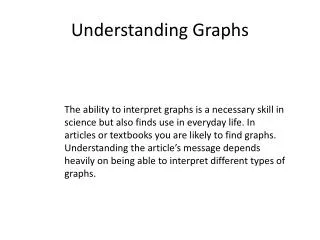
Learn about different types of graphs, including bar graphs, box-and-whisker plots, circle graphs, histograms, line plots, scatter plots, and stem-and-leaf plots. Understand how each graph represents data and how they can be used to analyze and compare different sets of information.

E N D
Bar Graph • Easy to make • Information is easily understood • Each bar represents counts for a category • The length of the bar represents the percent of the total that falls into that category
Bar Graphs title y-axis x-axis origin labels
Box-and-Whisker Plots • Good for large data sets — at least 15 Give five important pieces of data: median, maximum, minimum, lower and upper quartiles • Can be used to compare sets with different number of data points
Box-and-Whisker Plots title number line Math Test Scores maximum minimum median lower quartile upper quartile
Circle Graphs • Easy to read • Each piece represents a percent of the whole • Can also calculate the degree of the circle • Shows the whole as 100 percent
Circle Graphs title percent of total legend
Histogram • Kind of a bar graph • Easy to make • Bars represent an interval of data—not just one number (e.g., 0 to 5) • The length of the bar represents the number that falls into that category
Histogram title label for x-axis label for y-axis interval of data for each category
Line Plots • Easy to read • Easy to make • Best when you have 25 data points or less • Shows clusters (groups of points), gaps (large spaces between points), outliers (points much larger or smaller in value) and variability (how the data is spread)
Line Plots Represents 1 cookie Number line title
Scatter Plots • Organizes bivariate data (two variables) • Shows the association between two variables • Involves causation and association • Shows clusters and outliers • Have the independent variable on the x-axis • Can only connect points in a time-series
Scatter Plots title label for y-axis label for x-axis Dependent variable y-axis Independent variablex-axis
Stem-and-Leaf Plots • Easy to make • Best with more than 25 values • Allows the identification of largest and smallest values, clusters, gaps and outliers • Other varieties include back-to-back plots
Stem-and-Leaf Plot 2|3 means 23 Legend
Measure of Center Mean — A number that represents the middle point, or average. It is the quotient obtained by dividing the sum total of a set of figures by the number of figures.
Mean • The sum of the salaries is $339,190 • There are six values. • $339,160/6 = $56,531 • The mean is $56,531
Measures of Center Median — The value in an ordered set of values that represents the point of which there are as many instances higher as there are lower.
Median • Put the numbers in order by value: • 184,150 41,410 38,860 30,850 22,960 20,960 • Find the middle. In this case, the middle is between 38,860 and 30,850. So find the mean of those 38,860 + 30,850 • 2 • $69,720/2 = 34,855 • The median is $34,855
Measures of Center…continued Mode — The most frequent value of a set of data. • There is no number that appears most often, therefore: • There is no mode.
Look at the measures of center • The mean is $56,531. • The median is $34,855. • There is no mode. Why are the mean and the median so different if they are both measures of center? The mean is greatly affected by very large or very small numbers. The surgeon’s salary is much greater than the others and that gives us a larger mean.
Understanding Graphs For more information about data, go to Quiz Bus: Dealing With Data http://westernreservepublicmedia.org/quizbus/index.htm Dealing With Data Hotlist http://westernreservepublicmedia.org/quizbus/index.htm