Download
1 / 5
50 likes | 59 Views
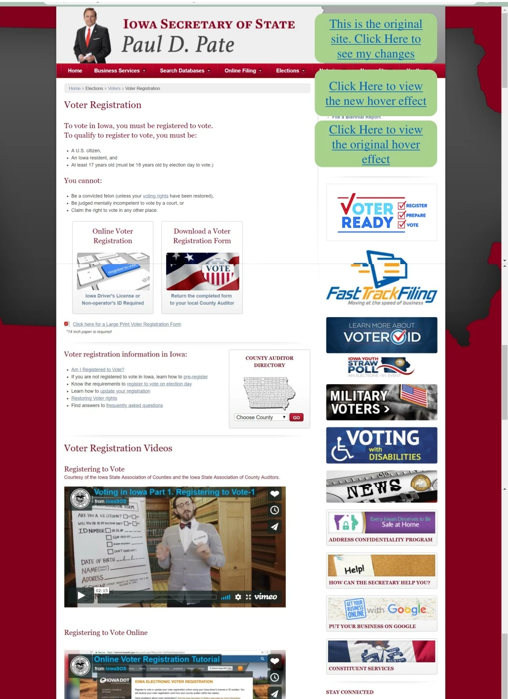
This is the original site. Click Here to see my changes. Click Here to view the new hover effect. Click Here to view the original hover effect. Click Here to view the original. Click Here to view the new hover effect. Headings make information more organized and the page more easily navigated.

E N D
This is the original site. Click Here to see my changes Click Here to view the new hover effect Click Here to view the original hover effect
Click Here to view the original Click Here to view the new hover effect Headings make information more organized and the page more easily navigated Removing this R in “voter” makes is sound like a person will be ready to vote, not like the information is recently-prepped and ready to be seen by the voter Captions make graphics more consistent and gives more information on where it leads
Click Here to view the original Click Here to view the original hover effect Blue shows up better against the white background. Underline makes it more obvious that it is a link
Click Here to view the original Click Here to view the new hover effect The very subtle change in shade makes it hard to tell this is being hovered over or that this is clickable.
Module 3 report Megan Elias 02-13-2019 For my redesign of the Iowa voter registration site, my original plan was to use PowerPoint. I took screenshots of the website, then realized the slides were too small to fit as much of the site as I wanted to, so I moved to Canva. Unfortunately, these same screenshots were taking a very long time to load, and in fact never did finish uploading, so I moved to the ever-reliable Microsoft Word, then my world changed when I realized the slide size in PowerPoint can be changed. This was great news because it meant I could use hyperlinks to switch between slides. For the actual changes I wanted to make, I knew I wanted to reorganize the graphics along the right-hand side of the screen, so the first thing I did after organizing the screenshots to recreate the webpage was to jot down each of the buttons and a quick description of what each of them led to. Then I grouped them into headings based on purpose. To make it interactive, I showed what it would look like to hover over a button by placing a mouse icon on top of one, and a transparent blue rectangle to simulate a color filter. Once I had them properly shuffled on my prototype, I asked my roommate, Max, to take a look and poke around. I showed them the original site, what each of the buttons led to, and then how I organized them on my recreation, making sure they noticed the color filter. My first prototype had captions on the buttons, but they only showed up when the mouse was hovering over the icon, and they appeared to be beneath the blue color filter. I showed that to Max, and they said that it was definitely better organized than the original, but that it didn’t make sense to have the captions only appear after you were hovering, and that it was odd to have the text included in the filter. I thought about it myself and realized that it did look weird. I then went back to work to give all of the icons relevant and informative captions in the same off-white frames the website already used and changed the size of the blue box to have it stop before the text. I showed this new version to Max, and we both liked how it looked better. Then, as they were comparing my site to the original, they noticed that the captions changed color on the original when they were being hovered over, so I made mine do the same. I made most of my decisions based on what I felt would be more user-friendly and on what Max, the actual user, preferred. My goal was to get the audience to find things more easily and be able to understand the information that the website was presenting them with without thinking too hard. I also wanted things to be consistent. Making all of the captions the same color, size, and format made the site not only look better, but also easier to navigate. Additionally, making the hover function additional noticeability made it easier to tell it was a button, which was another way to help the user understand the site without thinking about it.