Download
1 / 2
20 likes | 35 Views
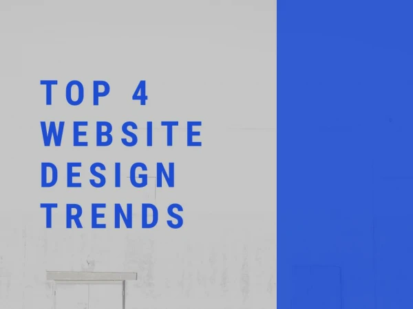
For 2017, the main catalyst for the traffic would be mobile browsing. To turn your website user-free, there is some latest Responsive web design which trends for your website.

E N D
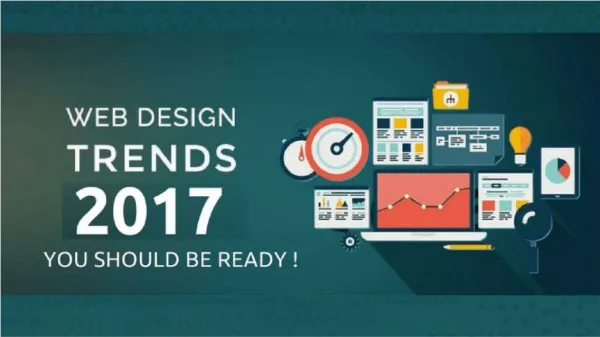
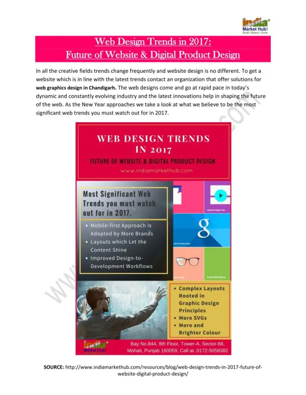
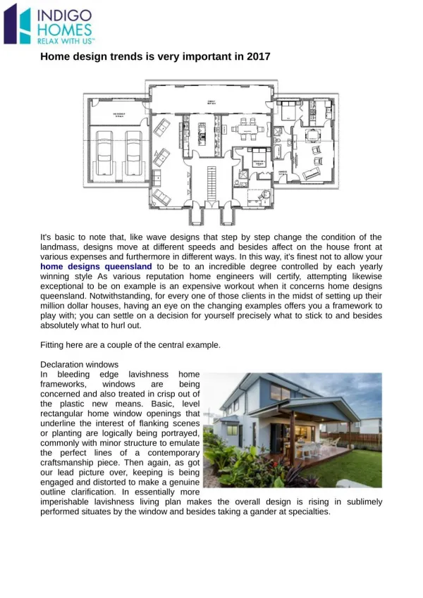
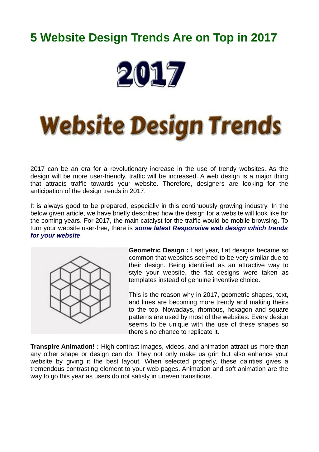
5 Website Design Trends Are on Top in 2017 2017 can be an era for a revolutionary increase in the use of trendy websites. As the design will be more user-friendly, traffic will be increased. A web design is a major thing that attracts traffic towards your website. Therefore, designers are looking for the anticipation of the design trends in 2017. It is always good to be prepared, especially in this continuously growing industry. In the below given article, we have briefly described how the design for a website will look like for the coming years. For 2017, the main catalyst for the traffic would be mobile browsing. To turn your website user-free, there is some latest Responsive web design which trends for your website. Geometric Design : Last year, flat designs became so common that websites seemed to be very similar due to their design. Being identified as an attractive way to style your website, the flat designs were taken as templates instead of genuine inventive choice. This is the reason why in 2017, geometric shapes, text, and lines are becoming more trendy and making theirs to the top. Nowadays, rhombus, hexagon and square patterns are used by most of the websites. Every design seems to be unique with the use of these shapes so there's no chance to replicate it. Transpire Animation! : High contrast images, videos, and animation attract us more than any other shape or design can do. They not only make us grin but also enhance your website by giving it the best layout. When selected properly, these dainties gives a tremendous contrasting element to your web pages. Animation and soft animation are the way to go this year as users do not satisfy in uneven transitions.
Easy Navigation : A User likes to explore websites which have simple navigations and a less load time. In a survey of SmartInsights, about 70% of people spend their time on their mobile phone. This means they want information as soon as possible. Shortening navigation can help a user to stay on your website in finding whatever they are looking for. Apart from information, less navigation of site means fast load time and fast load time means satisfying users. Blend of Old and New School : If your whole website goes on a too advanced, it doesn’t look good and also, if a site seems too shabby, it doesn’t seem to attract the user. But, if an old graphic design works on an advance and digital website, it will give user’s the best experience of the internet. Hand drew pictures, symbols and graphs on a digitized navigated website take your design to another level. Typography : The changing of colors while scrolling web pages, change in animation in moving from one web page to another and different types of page effects comes under Typography. They are very reflective for websites on which they are implemented. These are the Responsive web designswhich can make your site trendy this year. Elsner Inc 46 Chester street,Schofields NSW 2762, Australia +61 261004040 sales.aus@elsner.com www.elsner.com.au