Download
1 / 4
40 likes | 134 Views
Magazine analysis . Conor Longley-Brown. Layout & Text. .

E N D
Magazineanalysis. ConorLongley-Brown
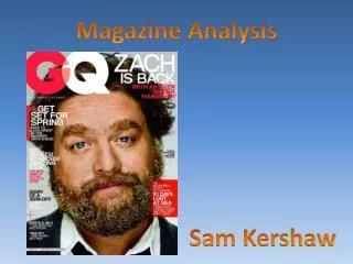
Layout & Text. This cover is from a very well-known American magazine named "Vibe". The masthead of the magazine is significant in many ways. They have used a sans-serif type font (almost graffiti like), which suggests to us, the readers, that this magazine is aimed at a younger audience. The colour of the masthead is also fairly important. The way that the masthead fades from black to red is not a usual characteristic of a magazine, so it is very unusual. However, it links the black of his top, and his tattoos, with the other colour scheme of the magazine, red. With all of the colours on the magazine being contrasting colours, this makes the magazine easy to read, and is also a common characteristic of any magazine. Highlighting the quote marks in red is reassuring you that it is a quote from Eminem: ‘literally almost died’ Red is the colour of danger and they have used a lot of red text. Big Boldred writing for the masthead of the magazine is making it stand out from the rest. Use of red writing again to make certain comments on the cover stand out against the black writing. ‘who is THE BEST RAPPER EVER? You decide’. This makes you think about this and the first rapper that comes to mind is Eminem because he is cleverly placed largely in the centre of the cover. Limited amount of text makes the centre piece stand out. Using faded grey text makes other text stand out more, making it less significant.
The main image, in the centre of the magazine is very significant. The way that he is looking directly at the camera makes him draw the reader into the magazine, as it makes him look at the reader; however it is the reader who is looking at the magazine. The colour scheme for the magazine is derived from the image. The black of his top make the cover lines black, and they have also taken the grey from his tattoos and put that onto the cover lines. This magazine does not include a barcode, which you normally see on every magazine, but it does include an issue number, a website and a date. This could mean that the barcode is on the back cover, which is an unusual place to have one on a magazine. Use of Images & target Audience. The number of images is very low for this particular magazine cover. As you can see there is only one image which is the centre piece. The use of the single image catches your eye, especially the eye of a fan. This cover is clearly aimed at music fans, particularly fans of rapping and Eminem. You can see that this is a music (rapping) magazine as it mentions a lot about rapping on the main cover alone; ‘Swaggajack Lil Wayne Kanye West Jay-Z & T.I.’ all of which are famous for there rapping talents.