Download
1 / 4

E N D
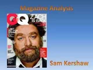
The story lines on the side are all in a smaller font than the masthead, even some in a different colour. This piece of text is in a bright yellow which heavily contrasts against the background, emphasising it. A small portion of the text is behind Justin Bieber, since it’s still readable that way. The text next to this is in 3 long, white boxes and a smaller black font. This is overlapping Justin Bieber which adds diversity to the cover. The words “Justin Bieber” are printed in a slightly smaller font than the masthead right above it. However, across the word “Justin” is a quote from him, in long red boxes and small white font. The fact that the quote can quite easily hide the word “Justin” shows how recognisable the name “Bieber” is. The background is a bright, vibrant sky blue which is very eye catching to potential readers. It’s a good contrasting colour for the fonts, and therefore helps every piece of text to stand out. The masthead is big, bold, and simple with signature colours in the textual font. Like the majority of other magazines, it is placed at the top to aid readers in finding it easily. Justin Bieber covers part of the masthead, which shows how well known and recognisable Billboardmagazine is if the masthead doesn’t even need to be seen by readers. Down in the left corner of the cover is where the majority of the text has been placed. Some headlines are in a larger font size than others to make them stand out. Alike to this, some headlines are in bold, vibrant colours such as red and yellow, in an attempt to make them more eye catching. Although most of the headlines are in a plain white font, they still stand out as they contrast with the bright blue background. Justin Bieber is the model used for this cover. This picture was taken in a professional photo shoot, as seen by the lighting and quality. His pose makes it seem almost three-dimensional as if he’s leaning out of the magazine. Also, the way that he is looking straight into the camera makes a strong connection with the potential reader – which entices them to purchase it. The portions of text are split up into sections using thin white lines. This makes it more readable to the customer, which also makes it more appealing. Similar to above, some of the text is put into long boxes, this time yellow with small black font. Again, this adds emphasis to that particular headline as well as making the cover appear more exciting and less boring.
The models used for this magazine cover are Paramore. You can tell that this picture was taken during a professional photo shoot due to the pose and lighting. Each member of the band is looking directly at the camera, which creates a connection with the potential reader, enticing them into buying it. Hayley Williams’ head covers part of the masthead, which shows that Kerrang is so well known, not all of the masthead even needs to be seen. The cover has a red banner running over the top of it which contrasts with the white box beneath. It contains yellow and white text inside it, which is also outlined in black to make sure it stands out against the red background. All the text is purposely all in capitals which adds a fun tone to the cover. Towards the bottom of the magazine cover, there are short headlines plus images to aid them. Opposed to Billboard Magazine, Kerrang doesn’t have long headlines. Instead it has short key words, which help to entice the reader without giving too much away. The words are written in yellow and white whilst also being outlined heavily in black. This helps them to stand out amongst all the other text. The images are spread around the bottom half of the magazine cover, with large yellow words layered over the top to help distinguish what music act they are. The masthead is the biggest piece of the text on the cover. Similar to the majority of magazines, it is located at the top to allow potential readers to find it easily. It is encased in a white box which contrasts with the infamous KERRANG! logo, which is in black. The logo appears to be smashed, with white lines streaming through each letter. The word Kerrang connotes sound, which provides reasoning for the smashed effect. The cover also has a red banner running along the bottom of it. Inside this one, all the text is white with black outlining. A symbol separates each section of text, instead of something obvious such as a comma. Like the bulk of the rest of the magazine, all the letters are in capitals. The word ‘Paramore’ is the second largest piece of text on the cover, which reflects its importance. It’s in white with a faint outline, which isn’t necessarily needed seeing as it already stands out above the other pieces of text. Underneath this is a tagline, in a similar font but in yellow and smaller. This provides an insight into the article that they will be sure to feature in inside.
The masthead is the biggest, brightest font on the whole cover. It is the signature logo of Top of the Pops, which is an established, and therefore recognisable, magazine. Each issue, the masthead colour changes so this one is a vibrant yellow to conform to the colour scheme. The wording of the masthead also shows the genre of the magazine and how it is about pop music. The cover has a long, white banner running across the top of it. The first section of text inside it is in a black font, as well as being in capitals. This helps to draw attention to the story. The rest of the text is in a bright, aqua blue to coincide with the overall colour scheme. Next to the text is a BBC logo which stands out above everything else on the cover. This is mainly because it is of a completely different colour, as well as being placed in an eye catching position – right above the masthead. The colour of the background is a bright., aqua blue which contrasts well with the overlaying colours (being white, and bright yellow). This intense colour also helps to catch the eye of potential buyers, whilst also making it stand out from competitors. The models used for this issue are One Direction. By looking at the lighting and pose, you can tell that this picture was taken in a professional setting, using artificial lighting. Like the other magazines, they are all looking straight at the camera, which creates a connection to the reader. The fact that One Direction are very popular will attract attention to the cover, primarily targeting an audience of young females. People will recognise who’s on the cover and will be more inclined to buy it. Various shapes are used throughout the cover to make it appear more interesting and diverse. This one is half yellow and half blue to fit the colour scheme. The text within it tells us who the central image is of just in case the audience are unaware of them. The way some words are capitalized and emboldened makes them stand out to the reader, enticing them to purchase it Overall, the cover is very crowded and busy. Unlike the Billboard magazine which had one main image only, this one has several images surrounding the main background image. Some may argue that this is unappealing, however along with the bright colour scheme, it does well to catch attention. Each image is relevant to todays pop culture which is suitable to both the magazine genre and the target audience.