Download
1 / 38
770 likes | 1.8k Views
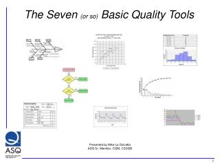
SEVEN QUALITY CONTROL TOOLS. (or) OLD SEVEN TOOLS. Dr.Kaoru Ishikawa, Professor at Tokyo University & Father of Q C in Japan. CAUSE ANALYSIS TOOLS are Cause and Effect diagram, Pareto analysis & Scatter diagram . EVALUATION AND DECISION MAKING TOOLS are decision matrix and multivoting.

E N D
SEVEN QUALITY CONTROL TOOLS (or) OLD SEVEN TOOLS
Dr.Kaoru Ishikawa, Professor at Tokyo University & Father of Q C in Japan. • CAUSE ANALYSIS TOOLS are Cause and Effect diagram, Pareto analysis & Scatter diagram. • EVALUATION AND DECISION MAKING TOOLS are decision matrix and multivoting
DATA COLLECTION AND ANALYSIS TOOLS are check sheet, control charts, DOE, scatter diagram, stratification, histogram, survey. • IDEA CREATION TOOLS are Brainstorming, Benchmarking, Affinity diagram, Normal group technique. • PROJECT PLANNING AND IMPLEMENTATIONTOOLS are Gantt chart and PDCA Cycle.
Cause-and-effect diagram (also called Ishikawa or fishbone chart ) DESCRIPTION • The fishbone diagram identifies many possible causes for an effect or problem. It can be used to structure a brainstorming session. It immediately sorts ideas into useful categories. WHEN TO USE • When identifying possible causes for a problem. • Especially when a team’s thinking tends to fall into ruts
PROCEDURE • MATERISLS REQUIRED:Flipchart (or) White Board, Marking Pens. • Agree on a problem statement (effect). Write it at the center right of the flipchart or whiteboard. Draw a box around it and draw a horizontal arrow running to it. • Brainstorm the major categories of causes of the problem. If this is difficult use generic headings: • Methods • Machines (equipment) • People (manpower) • Materials • Measurement • Environment
Write the categories of causes as branches from the main arrow. • Brainstorm all the possible causes of the problem. Ask: “Why does this happen?” As each idea is given, the facilitator writes it as a branch from the appropriate category. Causes can be written in several places if they relate to several categories. • Again ask “why does this happen?” about each cause. Write sub-causes branching off the causes. Continue to ask “Why?” and generate deeper levels of causes. Layers of branches indicate causal relationships. • When the group runs out of ideas, focus attention to places on the chart where ideas are few.
Example • This fishbone diagram was drawn by a manufacturing team to try to understand the source of periodic iron contamination. The team used the six generic headings to prompt ideas. Layers of branches show thorough thinking about the causes of the problem.
For example, under the heading “Machines,” the idea “materials of construction” shows four kinds of equipment and then several specific machine numbers. • Note that some ideas appear in two different places. “Calibration” shows up under “Methods” as a factor in the analytical procedure, and also under “Measurement” as a cause of lab error. “Iron tools” can be considered a “Methods” problem when taking samples or a “Manpower” problem with maintenance personnel
CHECK SHEET (or) DEFECT CONCENTRATION DIAGRAM DESCRIPTION • A check sheet is a structured, prepared form for collecting and analyzing data. This is a generic tool that can be adapted for a wide variety of purposes
WHEN TO USE • When data can be observed and collected repeatedly by the same person or at the same location. • When collecting data on the frequency or patterns of events, problems, defects, defect location, defect causes, etc. • When collecting data from a production process.
PROCEDURE • Decide what event or problem will be observed. Develop operational definitions. • Decide when data will be collected and for how long. • Design the form. Set it up so that data can be recorded simply by making check marks or Xs or similar symbols and so that data do not have to be recopied for analysis. • Label all spaces on the form. • Test the check sheet for a short trial period to be sure it collects the appropriate data and is easy to use. • Each time the targeted event or problem occurs, record data on the check sheet.
EXAMPLE • The figure below shows a check sheet used to collect data on telephone interruptions. The tick marks were added as data was collected over several weeks.
Histogram • Histogram:The most commonly used graph for showing frequency distributions, or how often each different value in a set of data occurs
WHEN TO USE • The data are numerical values. • To see the shape of the data’s distribution, especially when determining whether the output of a process is distributed approximately normally. • Analyzing whether a process can meet the customer’s requirements. • Analyzing what the output from a supplier’s process looks like. • Whether a process change has occurred from one time period to another. • To determine whether the outputs of two or more processes are different. • To communicate the distribution of data quickly and easily to others.
Histogram Shapes and Meaning • Normal. A common pattern is the bell-shaped curve known as the “normal distribution.” In a normal distribution, points are as likely to occur on one side of the average as on the other.
Skewed. The skewed distribution is asymmetrical because a natural limit prevents outcomes on one side. The distribution’s peak is off center toward the limit and a tail stretches away from it. • These distributions are called right- or left-skewed according to the direction of the tail.
Double-peaked or bimodal. The bimodal distribution looks like the back of a two-humped camel. The outcomes of two processes with different distributions are combined in one set of data. A two-shift operation might be bimodal.
Plateau. The plateau might be called a “multimodal distribution.” Several processes with normal distributions are combined.Because there are many peaks close together, the top of the distribution resembles a plateau.
Dog food. The dog food distribution is missing something—results near the average. If a customer receives this kind of distribution, someone else is receiving a heart cut, and the customer is left with the “dog food,” the odds and ends left over after the master’s meal
Pareto Chart (or)Pareto diagram (or) Pareto analysis • A Pareto chart is a bar graph. The lengths of the bars represent frequency or cost (time or money), and are arranged with longest bars on the left and the shortest to the right.
When to Use • When analyzing data about the frequency of problems or causes in a process. • When there are many problems or causes and you want to focus on the most significant. • When analyzing broad causes by looking at their specific components. • When communicating with others about your data.
The Pareto 80 / 20 rule 80 % of the problems are produced by 20 % of the causes. PARETO DIAGRAM To identify the ‘VITAL FEW FROM TRIVIAL MANY’ and to concentrate on the vital few for improvement. A Pareto diagram indicates which problem we should solve first in eliminating defects and improving the operation.
Scatter Diagram (or) Scatter plot (or)X–Y graph • The scatter diagram graphs pairs of numerical data, with one variable on each axis, to look for a relationship between them. If the variables are correlated, the points will fall along a line or curve. The better the correlation, the tighter the points will hug the line.
When to Use • When you have paired numerical data. • When your dependent variable may have multiple values for each value of your independent variable. • When trying to determine whether the two variables are related, such as when trying to identify potential root causes of problems. • After brainstorming causes and effects using a fishbone diagram, to determine objectively whether a particular cause and effect are related.
Stratification (or) Flowchart (or) Run chart • Stratification is a technique used in combination with other data analysis tools. When data from a variety of sources or categories have been lumped together, the meaning of the data can be impossible to see
When to Use • Before collecting data. • When data come from several sources or conditions, such as shifts, days of the week, suppliers or population groups. • When data analysis may require separating different sources or conditions.
The ZZ-400 manufacturing team drew a scatter diagram to test whether product purity and iron contamination were related, but the plot did not demonstrate a relationship. Then a team member realized that the data came from three different reactors. The team member redrew the diagram, using a different symbol for each reactor’s data
Benefit from stratification. • Always consider before collecting data whether stratification might be needed during analysis. Plan to collect stratification information. After the data are collected it might be too late. • On your graph or chart, include a legend that identifies the marks or colors used.
Control Chart (or) Statistical process control VARIATIONS • Different types of control charts can be used, depending upon the type of data. The two broadest groupings are for variable data and attribute data. • Variable data are measured on a continuous scale. For example: time, weight, distance or temperature can be measured in fractions or decimals. The possibility of measuring to greater precision defines variable data.
Attribute dataare counted and cannot have fractions or decimals. Attribute data arise when you are determining only the presence or absence of something: success or failure, accept or reject, correct or not correct. For example, a report can have four errors or five errors, but it cannot have four and a half errors.
Variables charts • X and R chart (also called averages and range chart) • X and s chart • chart of individuals (also called X chart, X-R chart, IX-MR chart, Xm R chart, moving range chart) • moving average–moving range chart (also called MA–MR chart) • target charts (also called difference charts, deviation charts and nominal charts) • CUSUM (also called cumulative sum chart) • EWMA (also called exponentially weighted moving average chart) • multivariate chart (also called Hotelling T2)
Attributes charts • p chart (also called proportion chart) • np chart • c chart (also called count chart) • u chart


![Seven Quality Tools [Statistical Process Control]](https://cdn3.slideserve.com/6416179/seven-quality-tools-statistical-process-control-dt.jpg)