Download
1 / 4
60 likes | 224 Views
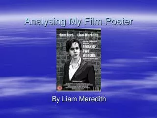
Film Poster Research. - Analysis of 3 ‘Horror’ Film Posters. Film Poster example 1 – The Haunting.

E N D
Film Poster Research - Analysis of 3 ‘Horror’ Film Posters
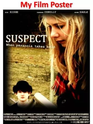
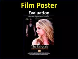
Film Poster example 1 – The Haunting Main image of characters, depicting an abstract horror theme, as if a haunting dream. Black background works well in causing primary and secondary characters to stand out with the visual effects used. Actors’ names displayed at the top of the poster, matching the conventions of film posters. Usually in order of importance and appearance in the film, reading from left to right, like this film poster has done. Title designed to reflect the film’s genre; thin capital letters with serifs communicates the genre of Horror well. Large font positioned in the centre of the poster to attract audience’s attention as attention would be heavily weighted on the characters at first sight. Use of a famous actor to act as a ‘hook’ to fans of the actor to watch the film. Tagline/Slogan to tease the audience into what to expect to see when they watch the film. Tagline here suggests an element of mystery, persuading the audience to find out the meaning behind it by watching the film. Image of primary character crawling with an expression of fear on her face, portraying the horror element of the film well, reinforces the title of the film and justifies the genre. Another film poster convention – direct information about the film; cast & crew, release date, distributors etc. More well-informed audiences may make descisions based on this information, particularly the director of the film.
Film Poster example 2 – Slaughter Title of the film stylised as bold and crooked capital letters to reflect the film genre. Simple one word title “SLAUGHTER” convention of some horror films as one word can have enough impact to entice an audience to see the film, especially if the word has a strong horrific connotation, like ‘slaughter’. Tagline/Slogan positioned underneath the film title – another convention of film posters. The use of the imperative sentence “find a good hiding place” is a good use of direct address that targets the audience and identities the film genre further. Smaller font, in blood red, convention of horror film advertising. Background to main image is completely black. Colour scheme conforms to conventions of horror film advertising, as some connotations to black are death and despair. Compliments the main image of red lips and a knife well by causing it to appear more prominent. Film poster convention of direct information: cast and crew, distributors etc. This technical information about a film can sway an audience’s decision in seeing the film as they may know and appreciate the previous work of a certain director/producer/editor or actor. Main Image of a blood-stained knife resting on bright red lips holds great impact and conveys a sense of danger and seduction, an effective image in representing the film genre. Common convention in film posters, stating that the film has an element of truth and realism. It is an effective ‘hook’ for the audience to see the film, as it plays with human curiosity which provides the film with a great selling point.
Film Poster example 3 – Semum Striking film poster title for the unusual font and colour scheme which works effectively with the black background. Designed to convey the film genre of horror. Stylistic use of ‘@’ as an ‘a’ - most likely a relation to a certain theme or aspect of the film. A recent conventional stylistic aspect of film posters is to position the film title in the lower half of the composition, as this is a common tendency over the past few years in film posters. Stylised to reflect the film’s genre, therefore a great choice of colour scheme of patchy blood red. Enlarged ‘M’ acts as a focal point for the viewer, possibly referencing to a certain key aspect in the film. Main image consists of certain sections of 5 separate images of monstrous faces. This arrangement of images is very horrific and clearly outlines the film’s genre. The intensity of the ‘fear factor’ of this main image entices the audience to discover who the faces belong to and what monsters exist in ‘SEMUM’. Known name in the industry, entices fans of their work to watch this film to witness similar cinematic experiences with previous productions. Conventional technical information regarding cast & crew etc. Certain horror fanatic audiences will look out for their favourite director/producer/editor/actor in this section of the film poster, as they may enjoy the style of filming that exists in their previous work. Another convention of a film poster is to clearly state the release date of the film. Here the date is displayed in a bold, which contrasts with the smaller fonts surrounding it, making it easily accessible for the audience to find out the release date to watch the film.