Download
1 / 21
210 likes | 735 Views
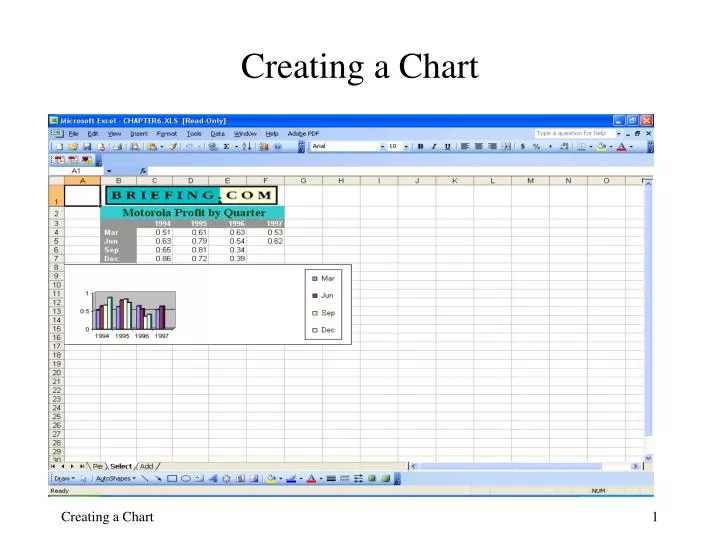
Creating a Chart Creating a Chart This lesson will cover: What is a chart? How to Create a Chart Sheet The Chart Wizard How to Delete, Resize and Move Embedded Charts Selecting Chart Objects Formatting Chart Objects Changing Chart Options Changing the Current Chart Type

E N D
Creating a Chart Creating a Chart
Creating a Chart • This lesson will cover: • What is a chart? • How to Create a Chart Sheet • The Chart Wizard • How to Delete, Resize and Move Embedded Charts • Selecting Chart Objects • Formatting Chart Objects • Changing Chart Options • Changing the Current Chart Type • Adding and Deleting or Changing Source Data • Changing the Chart’s Location Creating a Chart
What is a Chart? Charts are visual aids that help users see comparisons, patterns, and trends in data. For instance, rather than having to analyze several columns of worksheet numbers, you can see at a glance whether sales are falling or rising over quarterly periods, or how the actual sales compare to the projected sales. Charts are created based on data in a worksheet. If the worksheet data is changed, the chart will be automatically updated to reflect the changes. To create a chart you can the Chart Wizard to step through the process of choosing the data from your worksheet, the chart type and the various chart options. Creating a Chart
Chart Elements Z Axis Grid Lines Legend – Chart Series Data Y Axis X Axis - Categories The Z Axis actually replaces the Y axis in 3D charts. It is the horizontal axis that starts at the 0 value of Y and increases to the “back” of the chart. As far as Excel is concerned it is the horizontal markings on the Y axis. Creating a Chart
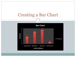
Which Chart type for what? Excel has 14 standard chart types to choose from and many more custom types. Knowing which one to use takes a little time to master. You could try to use the same types in all your work, but data is represented differently with each chart type. So you can present another view of the same data by using another chart. Creating a Chart
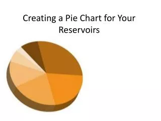
a Pie chart… Profits by quarter in 1995, the legend shows the month that ends each quarter. A “slice” Profits as a percentage of 100% Creating a Chart
a “Stacked” Bar chart… Profits by quarter in 3 years, 1994, 1995 and 1996, the legend shows the month that ends each quarter. Profits as a percentage of 100% Creating a Chart
a “Clustered” HorizontalBar chart… Each bar now represents a specific year Profits are shown as a numerical value (undefined on this sheet) by each quarter Creating a Chart
a Line chart… The Data Series is now 3 years of profits, the legend shows line color that represents each year. Each point, as shown in the circle, is a “data point”, and refers to a value in the table. This chart uses the “Show data table” option available on the Data Table tab of the wizard or the Chart Options dialog box. Creating a Chart
Want to see more charts? Click here to preview your data in the selected chart type To view the other chart types…open the Chart Wizard…scroll through the “Chart Type” pane of the wizard, click on a “Chart sub-type” and press the button directly below the panes…you can also find this information by using the Chart Type command on the Chart menu. Creating a Chart
Want to see more charts? This will display a preview of your data in the selected type…some items, such as in the legend may not be labeled properly…you’ll have to do that later. Creating a Chart
Want to see more charts? To see more types, just “point and click”…but you really need to learn how to properly use the Chart Wizard to appreciate it… Creating a Chart
A Tour of… the Chart Wizard Creating a Chart
Creating a Chart Sheet with the Chart Wizard In this step of Wizard, you will need to confirm the selected data range Data Range Creating a Chart
Creating a Chart Sheet with the Chart Wizard Click the various tabs in Chart Options dialog box to change options for your chart Creating a Chart
Creating a Chart Sheet with the Chart Wizard In this last step, decide whether you want to embed the chart as an object in the current worksheet or create a new worksheet for it. Creating a Chart
Deleting, Sizing and Moving Embedded Charts Deleting resizing or moving an Excel chart is very simple… first you need to make it “Active”. Just like a cell, a chart needs to be activated to be changed. To activate a chart, simply click anywhere on it…when the chart becomes active its border will display little black boxes called “handles”. The handles are used for resizing the chart, but they also let you know the chart is active and can be moved or modified. You can right click on an active chart to display its shortcut menu. Creating a Chart
The active chart’s shortcut menu offers numerous ways to modify it. Of course, there is the usual Cut, Copy and Paste actions…but now there is a Clear command…this is basically the Delete…however you can use the Delete key for this, too. Clicking on the top command, Format Chart Area, brings up… Creating a Chart
The Chart Toolbar The Chart Toolbar can be used to access many of the chart’s features and modify it according to your desires… Chart Objects – shows the active object on the chart and can be used to select another Default Chart – creates the currently selected default chart type by clicking this button. • Format Chart Area dialog • Chart Type • Show Legend • Data Table • Series by Row • Series by Column • Angle Text Creating a Chart
Enhance a Data Series You can change the colors that represent the data series, and also can rearrange the data series order by using Format Data Series dialog box. Creating a Chart
Enhance the Chart Area or Plot Area To format the chart or plot area, right click the area and a dialog box will appear. You can change the patterns, font and other attributes of the area. Creating a Chart