Download
1 / 2
20 likes | 31 Views
It gives Graphic Design Tips for Beginners and Non-Designers<br><br>https://99effect.com/

E N D
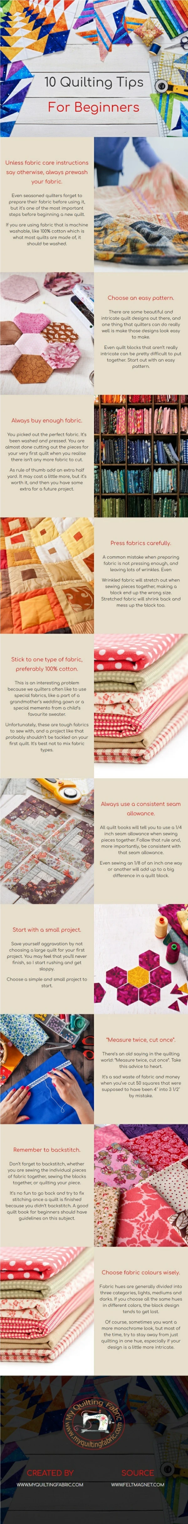
10 Graphic Design Tips for Beginners andNon-Designers A good set of graphic design tips always comes in handy when you are a beginner graphic designer, or even a non-designers on the journey to teach yourself some practical graphic design skills. Here are some practical graphic design tips for beginners and non-designers. Select the RightFonts: Clarity in design and readability is highly important. Make sure not to restrict your designs to one font only. Try to experiment with different styles of fonts and stick to a unique font style for your current project you’re focusing. Explore different opportunities, instead of picking those dull defaultfonts. Use a small colorscheme: Choose a color scheme that has 1-3 primary colors and an additional 1-3 secondary colors that contrast and complement each other. Use different tones of the same color for consistency by adjusting brightness for contrast. Finer typefaces will need stronger distinction against a coloredbackground. Honey Jar MockupCollection Use whitespace: Create a fluid design by surrounding words with white space to let elements breathe. The application of space around text boxes, images and other graphic elements makes a design easier to read. It’s also more likely to attract attention than a clutteredcomposition. Select ConsistentImages: Ensure that the quality of images remains absolutely consistent throughout your design. The quality, framing, style, proportions, and lighting of those elements should stay constant all through your design. The graphics, diagrams, images, and illustrations that you use should add a perfect meaning to your project. Pouch Mockup2020 Contrast is key: Contrast is one of the most imperative parts of the design for mood, legibility and to make it stand out. Use a contrasting color palette background, fonts, and graphics. Use photo filters to enhance the positive/negative space in an image and apply black or white to copy to create optimum contrast against a background image. A good rule of thumb is if you have a light colored background then you should use a dark font (and vice versa). Align yourobjects: This helps to keep design elements in a presentable order, regardless of their differing sizes. Proper alignment is an easy way to give your images a sophisticated and professionallook. Use a line (or two) to create a sense oforder: Lines help to anchor items in an image and create the sense that there is an overall order. Use lines in your image by putting them around blocks of text – there by anchoring thetext.
You can also put lines as “separators” between various elements in the image. In this latter case, the sense of elements being separated furthers the feeling of planning and coordination in thedesign. Add text over images by adjusting brightnesslevels: When your design involves putting text over images, adjust the brightness level of the background image or add a color overlay. This way the background image will offset the color of the text, causing the text to be readable and the design to still look clean and clear. Keep your designssimple: Keep it simple, but don’t forget your basics. Make sure every element has a reason to be in the design and keep the number of fonts, colors, shapes and frames to a minimum. Use contrasting tonal color combinations to text is sharp and easy to read. Applying a solid frame to contain your copy will enhance the compositional structure of adesign. Use hierarchy to order your content: The most visually dominant feature in a design should be the most important part of the message. Apply color or scale to a graphic to see how it changes the hierarchy of elements and what grabs attention first.