Download
1 / 33
360 likes | 579 Views
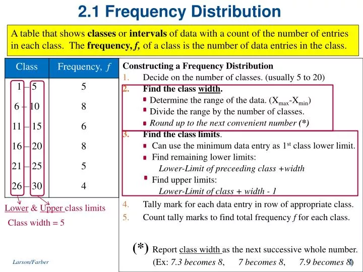
2.1 Frequency Distribution. Constructing a Frequency Distribution Decide on the number of classes. (usually 5 to 20) Find the class width . Determine the range of the data. ( X max -X min ) Divide the range by the number of classes.

E N D
2.1 Frequency Distribution Constructing a Frequency Distribution • Decide on the number of classes. (usually 5 to 20) • Find the class width. Determine the range of the data. (Xmax-Xmin) Divide the range by the number of classes. Round up to the next convenient number (*) • Find the class limits. Can use the minimum data entry as 1st class lower limit. Find remaining lower limits: Lower-Limit of preceeding class +width Find upper limits: Lower-Limit of class + width - 1 • Tally mark for each data entry in row of appropriate class. • Count tally marks to find total frequency f for each class. A table that shows classes or intervals of data with a count of the number of entries in each class. The frequency, f, of a class is the number of data entries in the class. Lower & Upper class limits Class width = 5 (*)Report class width as the next successive whole number. (Ex: 7.3 becomes 8, 7 becomes 8, 7.9 becomes 8) Larson/Farber
Example: Constructing a Frequency Distribution The data set below lists the number of minutes 50 Internet subscribers spent on the Internet during their most recent session. Construct a frequency distribution that has seven classes. 50 40 41 17 11 7 22 44 28 21 19 23 37 51 54 42 86 41 78 56 72 56 17 7 69 30 80 56 29 33 46 31 39 20 18 29 34 59 73 77 36 39 30 62 54 67 39 31 53 44 # of subscribers Minutes online • Number of classes = 7 (given) • Find the class width: • Range / #Classes = (86-7) / 7 ≈ 11.3 ↑ 12 • Find lower & upper limits of each class. • Tally the frequencies • Write the frequency for each class Σf = 50 Larson/Farber 4th ed.
Frequency Distribution(with additional data features) Σf = 50 Cumulative class Frequency: The Sum of the frequency for that class and all previous classes. Midpoint Calculation Relative Frequency of a class Percentage of data in a class. Larson/Farber
Class Boundaries Larson/Farber
Frequency Histogram • A bar graph that represents the frequency distribution. • The horizontal scale is quantitative and measures the data values. • The vertical scale measures the frequencies of the classes. • Consecutive bars must touch. 6.5 18.5 30.5 42.5 54.5 66.5 78.5 90.5 (using class midpoints) (using class boundaries) frequency More than half of the subscribers spent between 19 and 54 minutes on the Internet during their most recent session. data values Larson/Farber
Frequency Polygon • A line graph that emphasizes the continuous change in frequencies. The graph should begin and end on the horizontal axis, so extend the left side to one class width before the first class midpoint and extend the right side to one class width after the last class midpoint. You can see that the frequency of subscribers increases up to 36.5 minutes and then decreases. Larson/Farber
Relative Frequency Histogram • Same shape and same horizontal scale as corresponding frequency histogram. • The vertical scale measures the relative frequencies, not frequencies. 6.5 18.5 30.5 42.5 54.5 66.5 78.5 90.5 From this graph you can see that 20% of Internet subscribers spent between 18.5 minutes and 30.5 minutes online. Larson/Farber
2.2 More Graphs and Displays Graphing for Quantitative Data Stem-and-leaf plot • Each number separated into a stem & a leaf. • Still contains original data values. Data: 21, 25, 25, 26, 27, 28, 30, 36, 36, 45 Dot plot • Each data entry is plotted, using a point, above a horizontal axis 26 Data: 21, 25, 25, 26, 27, 28, 30, 36, 36, 45 26 2 1 5 5 6 7 8 3 0 6 6 4 5 20 21 22 23 24 25 26 27 28 29 30 31 32 33 34 35 36 37 38 39 40 41 42 43 44 45 Larson/Farber
Examples: Graphing Quantitative Data • 159 144 129 105 145 126 116 130 114 122 112 112 142 126 118 • 118 108 122 121 109 140 126 119 113 117 118 109 109 119 148 147 126 • 139 122 78 133 126 123 145 121 134 124 119 132 133 124 129 112 The following are the numbers of text messages sent last month by the cellular phone users on one floor of a college dormitory. Stem-and-Leaf Plots More than 50% of the cellular phone users sent between 110 and 130 text messages. Dot Plot Larson/Farber 4th ed.
Frequency Categories More Graphs for Qualitative Data Sets Pareto Chart • A vertical bar graph in which the height of each bar represents frequency or relative frequency. • The bars are positioned in order of decreasing height, with the tallest bar positioned at the left. Pie Chart • A circle is divided into sectors that represent categories. • The area of each sector is proportional to the frequency of each category. Larson/Farber
360º(0.49)≈176º 360º(0.37)≈133º 360º(0.12)≈43º 360º(0.02)≈7º Example: Pie Chart (Qualititative Data) The numbers of motor vehicle occupants killed in crashes in 2005 are shown in the table. A pie chart is used to organize the data. (Source: U.S. Department of Transportation, National Highway Traffic Safety Administration) Central Angle – Degrees (°) Relative frequency (%) f =37,594 From the pie chart, you can see that most fatalities in motor vehicle crashes were those involving the occupants of cars. Larson/Farber
Example: Pareto Chart (Qualitative Data) In a recent year, the retail industry lost $41.0 million in inventory shrinkage. Inventory shrinkage is the loss of inventory through breakage, pilferage, shoplifting, and so on. The causes of the inventory shrinkage are administrative error ($7.8 million), employee theft ($15.6 million), shoplifting ($14.7 million), and vendor fraud ($2.9 million). Use a Pareto chart to organize this data. (Source: National Retail Federation and Center for Retailing Education, University of Florida) From the graph, it is easy to see that the causes of inventory shrinkage that should be addressed first are employee theft and shoplifting. Larson/Farber
2.2 More Graphs for Paired Data Sets (Each entry in one data set corresponds to one entry in a second data set.) Scatter Plot. • The ordered pairs are graphed aspoints in a coordinate plane. • Used to show the relationship between two quantitative variables. Time Series • Data set is composed of quantitative entries taken at regular intervals over a period of time. • Example: The amount of precipitation measured each day for one month. y Quantitative data x time Larson/Farber 4th ed.
Example:Scatter Plot (Paired Data) The British statistician Ronald Fisher introduced a famous data set called Fisher's Iris data set. This data set describes various physical characteristics, such as petal length and petal width (in millimeters), for three species of iris. The petal lengths form the first data set and the petal widths form the second data set. (Source: Fisher, R. A., 1936) Interpretation As the petal length increases, the petal width also tends to increase. Each point in the scatter plot represents the petal length and petal width of one flower. Larson/Farber
Example:Time Series Chart (Paired Data) The table lists the number of cellular telephone subscribers (in millions) for the years 1995 through 2005. Construct a time series chart for the number of cellular subscribers. (Source: Cellular Telecommunication & Internet Association) The graph shows that the number of subscribers has been increasing since 1995, with greater increases 2003 to 2005 Larson/Farber
2.3 Measures of Central Tendency(Typical or Central Entry of a data Set) Mean Median Mode Mean (average) • The sum of all the data entries divided by the number of entries. • Sigma notation: Σx = add all of the data entries (x) in the data set. • Population meanSample Mean Example: The prices (in dollars) for a sample of roundtrip flights from Chicago, Illinois to Cancun, Mexico are listed. Find the mean flight price. 872 432 397 427 388 782 397 Σx = 872 + 432 + 397 + 427 + 388 + 782 + 397 = 3695 Mean flight price is about $527.90. Larson/Farber
Measures of Central Tendency Mean Median Mode Median • The value that lies in the middle of the data when the data set is ordered. • Measures the center of an ordered data set by dividing it into two equal parts. • If the data set has an • odd number of entries: median is the middle data entry. • even number of entries: median is the mean of the two middle data entries. Example1: The prices (in dollars) for a sample of roundtrip flights from Chicago, Illinois to Cancun, Mexico are listed. Find the median of the flight prices. 872 432 397 427 388 782 397 Order data and find middle: 388 397 397 427 432 782 872 Example2: The flight priced at $432 is no longer available. What is the median price of the remaining flights? 388 397 397 427 782 872 Larson/Farber 4th ed. 17
Measure of Central Tendency Mean Median Mode Mode • The data entry that occurs with the greatest frequency. • If no entry is repeated the data set has no mode. • If two entries occur with the same greatest frequency, each entry is a mode (bimodal). Example1: The prices (in dollars) for a sample of roundtrip flights from Chicago, Illinois to Cancun, Mexico are listed. Find the mode of the flight prices. 872 432 397 427 388 782 397 The mode of the flight prices is $397. • Ordering the data helps to find the mode. • 388 397 397 427 432 782 872 Example2: At a political debate a sample of audience members was asked to name the political party to which they belong. Their responses are shown in the table. What is the mode of the responses? Republican Larson/Farber
Comparing the Mean, Median, and Mode The mean is a reliable measure; it takes into account every entry of a data set, BUT, the mean is greatly affected by outliers (a data entry that is far removed from the other entries in the data set). Example: Find the mean, median, and mode of the sample ages of a class shown. Which measure of central tendency best describes a typical entry of this data set? Are there any outliers? Mean: Median: 20 years (the entry occurring with thegreatest frequency) Mode: • The mean takes every entry into account, but is influenced by the outlier of 65. • The median also takes every entry into account, and it is not affected by the outlier. • In this case the mode exists, but it doesn't appear to represent a typical entry. Larson/Farber
Example: Finding a Weighted Mean You are taking a class in which your grade is determined from five sources: 50% from your test mean, 15% from your midterm, 20% from your final exam, 10% from your computer lab work, and 5% from your homework. Your scores are 86 (test mean), 96 (midterm), 82 (final exam), 98 (computer lab), and 100 (homework). What is the weighted mean of your scores? If the minimum average for an A is 90, did you get an A? The data has varying weights. Larson/Farber
The Shape of Distributions • Symmetric Distribution • A vertical line can be drawn through the middle of a graph of the distribution and the resulting halves are approximately mirror images. • Uniform Distribution (rectangular) • All entries or classes in the distribution have equal or approximately equal frequencies. • Symmetric. • Skewed Left Distribution (negative skew) • “Tail” of the graph elongates more to the left. • The mean is to the left of the median. • Skewed Right Distribution (positive skew) • “Tail” of graph elongates to the right. • Mean is to the right of the median. Larson/Farber 4th ed.
2.4 Measures of Deviation • Variation in data • How individual data values vary within a given data set Range • Quantitative data only • The difference between the maximum and minimum data entries in the set. • Range = (Xmax - Xmin) • Advantage: Easy to compute • Disadvantage: Only uses 2 data entries (not all) Example: Corporation A hired 10 graduates. The starting salaries for each graduate are shown. Find the range of the starting salaries. Starting salaries (1000s of dollars) 41 38 39 45 47 41 44 41 37 42 Xmax = 47 Xmin = 37 Range = 47 – 37 = 10 Corporation B’s starting salaries are below: 40 23 41 50 49 32 41 29 52 58 Note: Both corporation data sets have the same mean, median & mode. The range shows us how ‘varied’ the data is! Xmax = 58 Xmin = 23 Range = 58 – 23 = 35 Larson/Farber 4th ed.
Deviation, Variance, and Standard Deviation Deviation • The difference between the data entry, x, and the mean of the data set. • Population data set: Deviation of x = x – μ • Sample data set: Deviation of x = x – x Deviations for all data entries in Corporation A’ starting salary data set. Mean The sum of deviations = 0. This is true for any data set, so we use the squares of the deviations instead. Σ(x – μ) = 0 Σx = 415 Larson/Farber
Deviation, Variance, and Standard Deviation (Population) Standard Deviation Step1: Find the mean of the data set. Step2: Find deviation of each entry: Step3: Square each deviation: Step4: Add to get the sum of squares. (Sum of squares, SSx) Population Variance Population Standard Deviation x – μ (x – μ)2 Sample Variance Sample Standard Deviation Note: For ‘grouped-data’ organized into a frequency distribution use: SSx = Σ(x – μ)2 Step5: Divide by N to get the variance. Step6: Square root to get standard deviation. **Question** How would the directions change for a SAMPLE Standard Deviation? f Larson/Farber
Standard Deviation The following data represents the midterm grade percentages of all students in an algebra class. Find the standard deviation of the data. 57 55 72 75 84 69 69 90 68 76 85 50 56 13 76 49 93 78 73 60 62 70 38 23 Number of data values: N = _______ Mean = ______________ 1518/23 = 66 7030/23 = 305.65 Variance = ___________ Standard Deviation 7030 Larson/Farber
Using Technology for Calculations The TI-83/84 calculator can do some of this work for you. 1. <STAT> <ENTER> 2. Choose a column such as L3 and enter data. 3. <STAT>, Arrow over to <CALC> <ENTER> 4. See: 1-Var Stats <2nd> <L3> <ENTER> 5. See Readout such as this Note: You can also do these Functions separately using <LIST><MATH> Larson/Farber
Interpreting Standard Deviation • Standard deviation is a measure of the typical amount an entry deviates from the mean. • The more the entries are spread out, the greater the standard deviation. Empirical Rule (68 – 95 – 99.7 Rule) For data with a (symmetric) bell-shaped distribution, the standard deviation has the following characteristics: • About 68%of the data lie within one standard deviation of the mean. • About95%of the data lie within two standard deviations of the mean. • About99.7%of the data lie within three standard deviations of the mean. Larson/Farber.
Interpreting Standard Deviation: Empirical Rule (68 – 95 – 99.7 Rule) 99.7% within 3 standard deviations 95% within 2 standard deviations 68% within 1 standard deviation 34% 34% 2.35% 2.35% 13.5% 13.5% Larson/Farber
Example: Using the Empirical Rule In a survey conducted by the National Center for Health Statistics, the sample mean height of women in the United States (ages 20-29) was 64 inches, with a sample standard deviation of 2.71 inches. Estimate the percent of the women whose heights are between 64 inches and 69.42 inches. • Because the distribution is bell-shaped, you can use the Empirical Rule. 34% 13.5% 55.87 58.58 61.29 64 66.71 69.42 72.13 34% + 13.5% = 47.5% of women are between 64 and 69.42 inches tall. Larson/Farber
Chebychev’s Theorem For data with any shape distribution: • The portion of any data set lying within k standard deviations (k > 1) of the mean is at least: 2 standard deviations : (k=2), At least of the data lie within 2 standard deviations of the mean. 3 standard deviations : (k=3), At least of the data lie within 3 standard deviations of the mean. Example: The age distribution for Florida is shown in the histogram. Apply Chebychev’s Theorem to the data using k = 2. What can you conclude? k = 2: μ – 2σ = 39.2 – 2(24.8) = -10.4 (Use 0 - age is non-negative) μ + 2σ = 39.2 + 2(24.8) = 88.8 Conclusion: At least 75% of the population of Florida is between 0 and 88.8 years old. Larson/Farber 4th ed.
2.5 Measures of Position • Fractiles are numbers that partition (divide) an ordered data set into equal parts. • Quartiles approximately divide an ordered data set into four equal parts. • First quartile, Q1: About ¼ of the data fall on or below Q1. • Second quartile, Q2: About ½ of the data fall on or below Q2 (median). • Third quartile, Q3: About three quarters of the data fall on or below Q3. • Interquartile Range (IQR): Lower half Upper half Q3 – Q1 Example: The test scores of 15 employees enrolled in a CPR training course are listed. Find the first, second, and third quartiles of the test scores. 13 9 18 15 14 21 7 10 11 20 5 18 37 16 17 Q1 Q3 Q2 Step1: Order the data: 5 7 9 10 11 13 14 15 16 17 18 18 20 21 37 ¼ of employees scored 10 or less Step2: Find Median (Q2): Step3: Find Q1 & Q3 (medians of lower & upper halves respectively): • Percentiles: Divide a data set into 100 equal parts. • Often used in education & health fields Ex: A student scored in the 95th percentile on the math test - better than 95% of the other students. • Q1 = 25th percentile, Q2 = 50th percentile, Q3 = 75th percentile Larson/Farber
Box-and-Whisker Plot • Exploratory data analysis tool that highlights important features of a data set. • Requires (five-number summary): Minimum & Maximum entry, Q1Q2 & Q3 Example: Draw a box-and-whisker plot Minimum value = 6 Maximum value = 104 Q1 = 10, Q2 = 18, Q3 = 31, About half the scores are between 10 & 31. There is a possible outlier of 104. Creating a Box-and-whisker plot • Find the 5-number data set summary • Construct a horizontal scale that spans the range of the data. • Plot the five numbers above the horizontal scale. • Draw a box above the horizontal scale from Q1 to Q3 and draw a vertical line in the box at Q2. • Draw whiskers from the box to the minimum and maximum entries. Box Whisker Whisker Minimum entry Maximum entry Q1 Median, Q2 Q3 .
The Standard Score (Z-Score) • The number of standard deviations a given value x falls from the mean μ. • Negative Z : The x-value is below the mean • Positive Z : The x-value is above the mean • Zero Z : The x-value is equal to the mean Example: In 2007, Forest Whitaker won the Best Actor Oscar at age 45 for his role in the movie The Last King of Scotland. Helen Mirren won the Best Actress Oscar at age 61 for her role in The Queen. The mean age of all best actor winners is 43.7, with a standard deviation of 8.8. The mean age of all best actress winners is 36, with a standard deviation of 11.5. Find the z-score that corresponds to the age for each actor or actress. Compare results. • Forest Whitaker 0.15 Std. Dev. above mean (Usual range) • Helen Mirren 2.17 Std. Dev above mean (Unusual range) Unusual Scores occur about 5% of the time Very Unusual Scores occur about .3% of the time