Download
1 / 25
260 likes | 417 Views
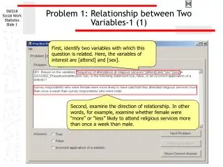
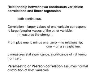
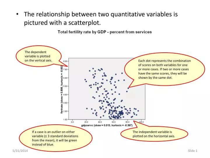
The relationship between two quantitative variables is pictured with a scatterplot . The dependent variable is plotted on the vertical axis.

E N D
The relationship between two quantitative variables is pictured with a scatterplot. The dependent variable is plotted on the vertical axis. Each dot represents the combination of scores on both variables for one or more cases. If two or more cases have the same scores, they will be shown by the same dot. If a case is an outlier on either variable (± 3 standard deviations from the mean), it will be green instead of blue. The independent variable is plotted on the horizontal axis.
To facilitate our understanding of the distribution of variables in the scatterplot, we add a boxplot for each variable in the chart margin. The boxplots support the evaluation of skewness and the presence of outliers. The boxplot at the top of the chart shows the distribution of the independent variable. The boxplot at the right of the chart shows the distribution of the dependent variable.
We add a red trend line or linear fit line that summarizes the overall pattern of the cases in the chart.
We add the cyan colored loess smoother fit line to evaluate the linearity of the fit. A loess smoother averages subsets of points and thus tracks more closely where the points are concentrated. Differences between the linear fit line and the loess line are a visual tool for determining whether the relationship is linear.
The relationship between two quantitative variables can be linear or non-linear, though it is not always easy to distinguish. The loess line in this chart fluctuates above and below the linear fit line, but the overall pattern could be characterized as linear. This chart shows a clear pattern of non-linearity. The curve in the loess line depicts a clear non-linear pattern.
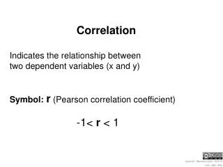
To quantify the relationship between two quantitative variables, we use a correlation coefficient, Pearson’s r or Spearman’s rho. • The correlation coefficient tells us: • If there is a relationship between the variables • The strength of the relationship • The direction of the relationship • Correlation coefficients vary from -1.0 to +1.0. • A correlation coefficient of 0.0 indicates that there is no relationship. • A correlation coefficient of -1.0 or + 1.0 indicates a perfect relationship, i.e. the scores on one variable can be accurately determined by the scores on the other variable.
If a correlation coefficient is negative, it implies an inverse relationship, i.e. the scores on the two variables move in opposite directions, higher scores on one variable are associated with lower scores on the other variable. • If a correlation coefficient is positive, it implies a direct relationship, i.e. the scores on the two variables move in the same direction, higher scores on one variable are associated with higher scores on the other variable. • When we talk about the size of a correlation, we refer to the value irrespective of the sign – a correlation of -.728 is just as large or strong as a correlation of +.728 • The Pearson R correlation coefficient treats the data as interval. • Spearman’s Rho treats the data as ordinal, using the rank order of the scores for each variable rather than the values.
Suppose I had the data to the right showing the relationship between GPA and income. • SPSS would calculate Pearson’s r for this data to be .911 and Spearman’s rho to be .900. • The ranks for the values for each of the variables are shown in the table to the right. • Using the ranks as data, SPSS would calculate both Pearson’s r and Spearman’s rho to be .900.
Suppose the fifth subject had an income of 100,000 instead of 55,000. • SPSS would calculate Pearson’s r for this data to be .733 and Spearman’s rho to be .900. • The ranks for the values did not change. The fifth subject had the highest income, so Spearman’s rho has the same value. • The Pearson’s r decreased from .911 to .733. • Outliers, and the skewing of the distribution by outliers, have a greater effect on Pearson’s r than they do on Spearman’s rho.
In the scatterplot, outliers (the case I changed from 55,000 to 100,000) will draw the loess line toward them away from the linear fit line, making the pattern of points appear less linear. or more non-linear. 100,000 55,000 The lines demonstrate the point, but the cyan line is really a quadratic fit rather than a loess line because I can’t do much smoothing with only 5 data points.
Outliers, and the skewing of the distribution by outliers, have a greater effect on Pearson’s r than they do on Spearman’s rho. • As the outliers become more extreme, and the distribution becomes more skewed, Spearman’s rho becomes larger than Pearson’s r, and the overall trend in the data is non-linear. • To accurately model the relationship, we have three choices: • use a more complex non-linear model to analyze the relationship • re-express the data to reduce skewing and the impact of outliers, and analyze the relationship with a linear model • Exclude outliers to reduce skewing, and analyze the relationship with a linear model • The second alternative is preferred, though it may not always be possible.
If the three following conditions are present, re-expressing the data may reduce the skewness and increase the size of Pearson’s r to justify treating the relationship as linear: • If the model appears non-linear because of the difference between the loess line and the linear fit line, • If Spearman’s rho is larger than Pearson’s r (by ±.05 or more), • If one or both of the variables violates the skewness criteria for a normal distribution. • We will employ the transformations we have used previously: if the distribution is negatively skewed, we re-express the data as squares; if the distribution is positively skewed, we re-express the data as logarithms.
There are two sets of guidelines used to translate the correlation coefficient into a narrative phrase, guidelines attributed to Tukey and guidelines attributed to Cohen. • Tukey’s guidelines interpret a correlation: • between 0.0 up to ±0.20 as very weak; • equal to or greater than ±0.20 up to ±0.40 as weak; • equal to or greater than ±0.40 up to ±0.60 as moderate; • equal to or greater than ±0.60 up to ±0.80 as strong; and • equal to or greater than ±0.80 as very strong. • Cohen’s guidelines interpret a correlation: • less than ±0.10 = trivial; • equal to or greater than ±0.10 up to ±0.30 = weak or small; • equal to or greater than ±0.30 up to ±0.50 = moderate; • equal to or greater than ±0.50 or greater = strong or large
Example of Effective Transformations: Rho Greater Than R - Both Variables Positively Skewed Effective Logarithmic Re-expression
Example of Effective Transformations: Rho Greater Than R – One Variable Positively Skewed Moderately Effective Logarithmic Re-expression
Example of Effective Transformations: Rho Greater Than R – One Positive/One Negative Skew Moderately Effective Logarithmic Re-expression
Example of No Transformation Needed: Rho Slightly Higher than R – Borderline Skewness Approximately Linear, Re-expression Not Needed.
Example of No Transformation Needed: Rho Slightly Higher than R – Minimal Skewness Approximately Linear, Re-expression Not Needed.
Example of No Transformation Needed: Rho Slightly Higher than R – Borderline Skewness Approximately Linear, Re-expression Not Needed.
Example of Ineffective Re-expressions: R Greater Than Rho – One Variable Negatively Skewed Square Re-expression Very Limited Impact on Non-linearity
Example of Ineffective Re-expressions: R Greater Than Rho – Both Variables Positively Skewed Logarithmic Re-expression Increases Non-linearity
Example of Ineffective Re-expressions: R Greater Than Rho – One Positive/One Negative Skewed Re-expressions Increases Non-linearity
Example of Ineffective Re-expressions: R Greater Than Rho – One Variable Positively Skewed Re-expressions Decreases Linearity Showing Non-linearity
We might legitimately choose not to use any transformation, or to ignore the non-linearity of the relationship, but we should look at the plots and statistics for the distribution of the variables in the analysis so we are making an informed choice. • The consequence of ignoring the issue of linearity is usually that we fail to state the actual importance of a relationship, though there are occasions when we might be citing a relationship as important when it’s strength is the result of extreme outliers.