Download
1 / 4
0 likes | 10 Views
Amral Infotech specializes in responsive design techniques for mobile-friendly WordPress websites. Our expert team ensures your site adapts seamlessly to all devices, enhancing user experience and boosting SEO performance. Create a dynamic, accessible online presence with our tailored web solutions.

E N D
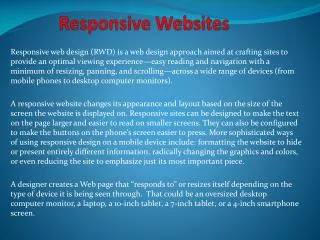
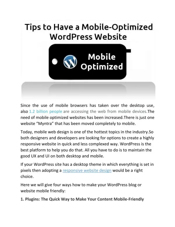
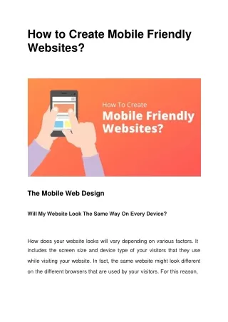
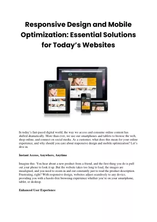
Responsive Design Techniques for Mobile-Friendly WordPress Websites In today's digital era, ensuring your website is mobile- friendly is not just a luxury but a necessity. With an increasing number of users accessing the internet via mobile devices, it’s essential to provide a seamless and engaging experience across all screen sizes. At Amral Infotech, we specialize in crafting responsive WordPress websites that deliver exceptional user experiences. If you are searching for the best web designer in Pune India location then you are at the right place. We have been doing web design work in Pune India since 2012., We have built this business with full sincerity. We fully support you till your business promotion by creating our website. We have served over 2000+ clients across Pune, Mumbai, Hyderabad, Bangalore, Delhi and other big cities of India. Amral Infotech https://www.amralinfotech.com/
Here are our key responsive design techniques to make your WordPress site mobile-friendly. 1.Use a Responsive WordPress Theme: Selection: Choose a theme designed with responsiveness in mind. Many modern WordPress themes are built to adapt seamlessly to different screen sizes. Testing: Before finalizing a theme, test its responsiveness on various devices and screen sizes to ensure it meets your requirements. 2.Adopting a Mobile-First Approach: Design Strategy: A mobile-first design strategy involves designing the website for mobile devices first and then scaling up for larger screens. This approach ensures that the most critical aspects of your website are prioritized for mobile users. Simplification: By simplifying the design and focusing on essential features, we create a streamlined user experience that works beautifully on smaller screens and expands gracefully to larger ones. Amral Infotech https://www.amralinfotech.com/
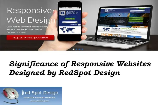
3. Flexible Images and Media: Responsive Images: Use CSS techniques like max-width: 100% to ensure images resize within their containers. This prevents images from breaking the layout on smaller screens. Adaptive Media: Implement HTML5's picture element or the srcset attribute to serve different image sizes based on the device’s screen size. 3.Prioritize Performance: Minimize HTTP Requests: Reduce the number of elements that require HTTP requests, such as images, scripts, and stylesheets. Lazy Loading: Implement lazy loading for images and videos to improve page load times on mobile devices. Caching: Use caching plugins to speed up your website by serving cached versions of your pages. 4.Typography and Readability: Legible Fonts: Choose fonts that are easy to read on small screens. Adjust font sizes and line heights using media queries. Text Scaling: Ensure text scales appropriately on different devices. Avoid fixed font sizes and use relative units like em or rem. Amral Infotech https://www.amralinfotech.com/
5.Test Across Devices and Browsers: Cross-Device Testing: Regularly test your website on various devices and screen sizes to ensure a consistent experience. Browser Compatibility: Check compatibility with different browsers, including mobile versions of Chrome, Safari, Firefox, and others. 6.Leverage WordPress Plugins: Responsive Plugins: Utilize plugins designed to enhance responsive design, such as WPtouch for creating mobile- friendly versions of your site. SEO Optimization: Use SEO plugins like Yoast SEO to ensure your mobile site is optimized for search engines. Amral Infotech https://www.amralinfotech.com/