Download
1 / 18
190 likes | 334 Views
Two Variable Statistics An Introduction. We have studied one variable statistics . We developed techniques to visualize one variable data (frequency diagrams, box and whiskers plots) and to summarize one variable data (measures of central tendency and measures of spread). .

E N D
Two Variable Statistics An Introduction
We have studied one variable statistics. We developed techniques to visualize one variable data (frequency diagrams, box and whiskers plots) and to summarize one variable data (measures of central tendency and measures of spread).
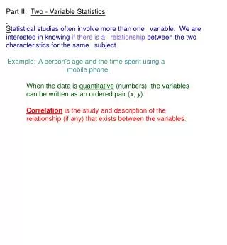
Sometimes we are interested in seeing if a relationship exists between two sets of data. We can create visual displays of these relationships (scatter plots) and summarize this relationship (correlation coefficients and mathematical models).
Scatterplots: • When creating scatter plots: • Make sure you can define the dependent and independent variable. • If doing it by hand, pick an appropriate scale.
Describing the Scatter Plot Once a scatter plot is created, we describe the relationship by how close it is to a linear relationship.
Positive Correlation: A positive linear correlation would see the dependent variable increasing as the independent variable increases.
Negative Correlation: A negative linear correlation would see the dependent variable decreasing as the independent variable increases.
Words we use to describe linear correlation: • Weak • Moderate • Strong • A line of best fit is a straight line drawn that passes as close as possible to all of the points on a scatter plot.
http://www.regentsprep.org/regents/math/algebra/AD4/PracPlot.htmhttp://www.regentsprep.org/regents/math/algebra/AD4/PracPlot.htm
Analyzing Two Variable Data The Correlation Coefficient
Which situation describes an example of negative correlation? • time worked and earnings • mark on a math test and student heights • Per capita income and crime rate • None of the above
What is the dependent variable in a study of the amount of math retained and amount of TV watched? • Type of TV watched • Amount of TV • Number of Facebook friends • Amount of math retained
A scatter plot provides a visual piece of evidence for correlation but sometimes when we classify the correlation (i.e. weak, moderate and strong) we are making a subjective decision. A correlation coefficient attempts to put a number on the strength of this correlation.
Formula for the correlation coefficient, r: where sx is the standard deviation of the variable X, sy is the standard deviation of the variable Y and sxy is the covariance of the variables X and Y. This formula is unwieldy for manual calculations.
Computation Formula for the Correlation Coefficient, r. Calculate the correlation coefficient for the cancer and smoking data.
Interpreting the Correlation Coefficient The value of r will range from -1 to 1. Classify the value of the correlation coefficient for the cancer and smoking data.
For each scatter plot, estimate the value of the correlation coefficient, r. Homework: p. 169 #5b-e,6bc