Download
1 / 8
80 likes | 263 Views
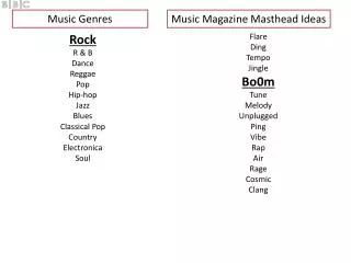
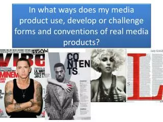
MASTHEAD IDEAS. Amy Salwey Music Magazine. RHYTHM Rhythm.

E N D
MASTHEAD IDEAS Amy Salwey Music Magazine
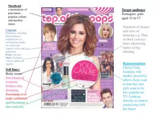
RHYTHMRhythm Although I haven’t yet decided weather I want the font to look like, I have trialled out both; having the masthead in all capitals and having only the R as a capital. From previous magazine research it is clear that most magazine brands use the capitals as their masthead, which proves it must be successful. I also think that masthead with all the letters as capitals is the most eye catching and attractive. This is what I want my magazine cover to visually look like.
The font that I have used here, is called “Craze One”.I think it fits in perfectly with the typically genre of music, however could potentially come across as slightly unreadable. I need my target audience to be able to read the masthead clearly, otherwise they might not know what the magazine is about. It appears to have a graffiti effect to it, which links back into some of the stereotypes with the Rap genre. Although, I don’t think this font would make a clear enough masthead, I do think that it would be a good font to use on the cover or part of the double page spread to make it appear more interesting and help the magazine relate back to the genre of typically Rap.
RHYTHM The font that I have used here, is called “VinetaBT”. I think this particular font is very clear and is presented well, making it readable for everyone who walks past. It does have a serif style to it, but not too much that its over the top. This would help draw attention from both males and females. I do really like this font, however, I think I need something a little bit bolder if I was to use it on the cover of my magazine, as people need to see the name of the magazine. I also don’t want it to be washed out by the photos or the coverlines etc… Although I don’t think I will be using this font as the masthead for my music magazine, I will definitely consider using the style font as coverlines, puffs etc… on the cover and also on the contents page and double page spread too.
RHYTHM The font that I have used here, is called “Impact”. It comes across very bold and would more than likely stand out on most backgrounds. The style of the font is serif, which does make it portray itself as being more of a masculine text, however if the cover model is going to be female then it could balance itself out and make a good composition for the cover. It would also be seen from a far distance as well, as the style is extremely bold. I would more than likely have the cover model stood in front of the text, which would block out the middle of the masthead and only leaving the two sides. If I was to do this I would have to ensure that the masthead font is still noticeable, which I think this one is best suited for so far.
RHYTHM The final font that I have trailed out is called “Mistral”. This font is slightly different to the other fonts that I have looked at. It has more of a toned down graffiti effect to it, which fits in with the target audience and is still readable at the same time. Although I do like this font, I don’t think that it would be effective enough to be used at the masthead on the cover of my music magazine. I will definitely consider using the font in other ways. I think it would work well as a coverline or puff on the front cover or even the contents or double page spread.
RHYTHM The font that I have used here, is called “Castellar”. The font is clear and straight, which allows all ages to be able to read it. The font does have a slight serif style to it, which is supposed to be more feminine, however, in this case I don’t think it is as noticeable. I think it could appeal to both males and females. My genre I have chosen for my music magazine is Rap and therefore I don’t think that this style of font is very relevant and would probably make a few of the stereotypical target audience turn away, which would reduce the amount of profit. Not only do I think it is unsuitable for the genre, but I also think that the font style would blend too much into the background and other texts on the on magazine cover. I don’t feel that it is strong enough and bold enough to be recognised from a distance, which might stop it from catching peoples eyes and drawing them into looking at the magazine. If the magazine did become successful, it would be hard for people to see where it is straight away if the masthead is not bold enough.
RHYTHM I have decided that “Impact” is the best font to use for the masthead it is the most clearest out of the ones tested and enables to target audience to read it well.