Download

1 / 25
310 likes | 489 Views
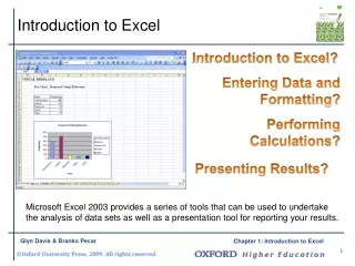
Introduction to Excel 2007. January 29, 2008. In Psych 209, we will use Excel to:. Store and organize data, Analyze data, and Represent data graphically (e.g., in bar graphs, histograms, and scatterplots). Excel Basics.

E N D
Introduction to Excel 2007 January 29, 2008
In Psych 209, we will use Excel to: Store and organize data, Analyze data, and Represent data graphically (e.g., in bar graphs, histograms, and scatterplots)
Excel Basics Excel spreadsheets organize information (text and numbers) by rows and columns: This is a row. Rows are represented by numbers along the side of the sheet. This is a column. Columns are represented by letters across the top of the sheet.
Excel Basics A cell is the intersection between a column and a row. Each cell is named for the column letter and row number that intersect to make it.
Data Entry 1. Type directly into the cell. Click on a cell, and type in the data (numbers or text) and press Enter. 2. Type into the formula bar. Click on a cell, and then click in the formula bar (the space next to the ). Now type the data into the bar and press Enter. There are two ways to enter information into a cell:
Practice Entering Data 1. Open Excel (Start All Programs MS Office Excel). 2. Enter the following information into your spreadsheet:
Formulas When you select a cell on a spreadsheet, you can enter data (e.g., text or numbers) into it, or you can enter a formula. Formulas are equations that perform calculations or values in your worksheet. Formulas always begin with an equal sign (=). When you enter an equal sign into a cell, you are basically telling Excel “calculate this.” Try entering ‘=5+2*3’ into an empty cell and press Enter to see what happens. To edit a formula, you can double-click the cell containing it.
Functions • Functions are Excel-defined formulas. They take data you select or enter, perform operations on them, and return a value or values. • The most common format for the functions we will use today is: • “=FunctionName(first cell label:last cell label)” • =SUM(B2:B9) • =SUM(B1,B2,B3,B4,B5,B6,B7,B8,B9) • **BOTH functions above will give you the same result, but notice the two different ways of telling Excel which cells should be added together.** • Today we will begin by calculating means, medians, modes, variances, and standard deviations.
Functions for Descriptive Statistics Below are several functions you will need to learn for this class. Try them out with the practice data set. =AVERAGE(first cell:last cell) calculates mean =MEDIAN(first cell:last cell) calculates median =MODE(first cell:last cell) calculates mode =VARP(first cell:last cell) calculates variance =STDEVP(first cell:last cell) calculates standard deviation You may directly write the functions for these statistics into cells or the formula bar, OR You may use the function wizard ( in the toolbar)
Notes about Functions Now, we will move on to correlations and scatterplots. • In this class, we will always use VARP (not VAR, VARA, or VARPA) and STDEVP to calculate variance and standard deviation, respectively. • If a data set has more than one mode, the =MODE() function will report only the lower modal value. • If you are asked to use Excel to calculate the mode in a data set that has more than one mode, you won’t be penalized for using Excel’s modal value. But be vigilant and correct the mode whenever possible.
Correlations A quick review: • Every correlation has a direction (positive or negative): • + correlation: high scores on one variable are associated with high scores on another variable. • - correlation: high scores on one variable are associated with low scores on the other variable. • Every correlation has magnitude or strength: • The closer the correlation coefficient is to +1.00 or -1.00, the stronger it is. • The closer the correlation coefficient is to 0.00, the weaker it is.
Correlation Practice • Put the following r values in order from weakest to strongest: -.96 +.05 +.68 -.14 +.70 -.33 What did you get? +.05 -.14 -.33 +.68 +.70 -.96 * Remember to use absolute values (ignore + or – signs) when comparing the strengths of one or more correlation coefficients. Negative correlation does not mean “less” than positive correlation.
Calculating Pearson’s r • Correlations are described using the Pearson Product-Moment correlation statistic, or r value. • In Excel, there are many functions that can calculate a correlation statistic, however, we will only use =PEARSON. Let’s return to our data set and calculate Pearson’s r for our two variables: StudyHrs (average number of hours spent studying for 209 each week) and GPA (grade-point average earned in 209 at the end of the quarter).
Step 1: Select the cell where you want your r value to appear. Step 2: Go to the function wizard . Step 3: Search for and select PEARSON.
Step 4: For Array1, select all the values under StudyHrs. For Array2, select all the values under GPA.
Step 5: That’s it! Once you have your r value, don’t forget to round to 2 decimal places.
Scatterplots • A scatterplot is an excellent way to visually display the relationship between two variables. • We will now create a scatterplot for StudyHrs and GPA.
Step 1: Select both columns of variables you wish to plot (StudyHrs and GPA). Step 2: Click on the tab labeled ‘Insert’, and then select ‘Scatter’ in the ‘Charts’ menu.
Step 4: Remove the legend by clicking on it and hitting Delete.
Step 5: Add axis titles by selecting the ‘Layout’ tab and clicking on ‘Axis Titles.’ For the horizontal title, you want it below the x-axis. For the vertical title, you want the ‘Rotated Title’ option. NOTE: Your chart must be highlighted for the ‘Layout’ tab to appear under ‘Chart Tools.’
A note about x- and y-axes: • For scatterplots, it does not matter which variable goes on each axis (this is NOT true for other types of charts). • However, you need to label your axes with the proper variable name. • In this example, GPA is on the y-axis and Study Hours is on the x-axis (we can tell this based on their different ranges of values). • As a helpful hint, Excel will automatically put the first variable (left-hand column) on the x-axis, and the second variable (right-hand column) on the y-axis.
Step 6: Change the chart title by selecting it, typing a new one, and pressing Enter. Chart and axis titles may be altered by right-clicking on them.
Your scatterplot is now finished! Next week, we will learn how to create bar graphs and histograms.