Download
1 / 7
80 likes | 682 Views
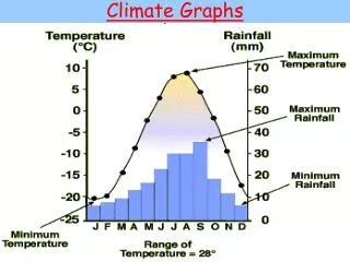
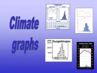
Climate Graphs. Climate Graphs. Each climate graph is made up of 2 major parts. A line graph for temperature. Always represented by a red line. A bar graph for precipitation. Always represented by blue bars. Climate Graphs. Climate Graphs. Line Graphs.

E N D
Climate Graphs • Each climate graph is made up of 2 major parts. • A line graph for temperature. • Always represented by a red line. • A bar graph for precipitation. • Always represented by blue bars
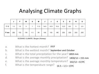
Climate Graphs • Line Graphs. • Temperature is easier seen with a line graph than by statistics. • The horizontal axis is used to show the time period (months), and the vertical axis is used to show the temperature (degrees Celsius). • The first step is finding the average temperature for each month and then plotting it on the graph. • Once you have done this you can connect the dots with a flowing line. • You should not see the dots when you are finished.
Climate Graphs • Bar Graphs. • They are similar to a line graph and easy to interpret. • The horizontal axis shows the time period (months), and the vertical axis shows the precipitation quantities (mm). • Bars are joined together to show a continuity from one month to the next. • You need to have the average precipitation for each month to construct the bar graph.
Climate Graphs • It is when the temperature line graph and precipitation bar graph are put together that you get a climate graph. • From a climate graph you can determine: • Temperature and temperature ranges for a particular place. • Rainfall and the seasonal distributions of rain. • Approximate latitude and elevation. • Northern or southern hemisphere. • You can identify climate types by carefully looking at the temperatures, the temperature range, the rainfall amount and the pattern of rainfall.
Climate Graphs • Climate Graphs • Interactive Climate Map