Download
1 / 19
2.6k likes | 5.35k Views
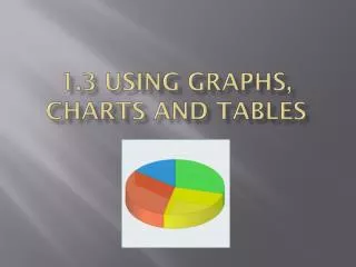
Describing Graphs, Tables and Charts. What is a chart?. A chart is a diagram that makes information easier to understand by showing how two or more sets of data are related. There are two common types of chart, a pie chart and a bar chart.

E N D
What is a chart? • A chart is a diagram that makes information easier to understand by showing how two or more sets of data are related. • There are two common types of chart, a pie chart and a bar chart.
A Pie chartis a circle divided into segments. It is usually used to show percentages.
ABar chartis a diagramthat makes information easier to understand by showing how two or more sets of data are related. A bar chart is divided into columns.
A Graph is a diagram, usually a line or curve, which shows how two or more sets of numbers or measurements are related.
What is a trend? • Trends are the changes or movements in facts and figures over a period of time. • We can use different verbs and nouns to describe trends
Verbs: Show Provide Deals with Indicate Demonstrate Display Offer Present
Downward movement(verbs) Decrease Drop fall Crash Go down
Upward movement(verbs) Climb Rise increase gain Grow Go up Improve jump
Rally (grouping) recover remain Stability(verbs) hold steadylevel offstabilise
For specifying the degree of change we can use different adverbs: • Dramatically • Sharply • Moderately • slightly • suddenly, • Rapidly (quickly) • Steadily • Gradually • slowly
For specifying the degree of change we can use different adjectives • Slow • Steady • Slight • Sharp • Gradual • Rapid • Heavy
Use adverbs with verbs and adjectives with nouns. 1- There was a sharp increase in the percentage of using facebook. 2- Sales went up suddenly in 2004. 3- There is a gradual grow in the number of bugs fixed by Microsoft at work. 4- The number of students in 2012 decreased rapidly.
How to describe a chart 1) Introduction: The pie chart is about the channels which are used to make Birthday wishes The chart is divided into 6 parts.
2) Message of the diagram The largest percentage is for facebook. It is the most used channel with more than 60 %. Skype and phone calls are almost used with the same amount.SMS go down comparing it with skype and phone calls. However, Twitter and E-mails are the least used channels. 3) Conclusion The most popular channel is the facebook for Birthday wishes. Other channels are used as well but with different percentage.
Birthday wishes by channels The pie chart is about the channels which were used to make Birthday wishes The chart is divided into 6 parts. The largest percentage is for facebook. It is the most used channel with more than 60 %. Skype and phone calls are almost used with the same amount. SMS go down comparing it with skype and phone calls. However, Twitter and E-mails are the least used channels. The most popular channel is the facebook for Birthday wishes. Other channels are used as well but with different percentage.
B) Population growth in Canada This graph shows the growth of the population in Canada from 1978 to 2009.There are three graphs in the chart. The green graph offers the total growth of the population, the black one deals with the migrated people in Canada and the blue graph displays the natural increase of the population. In 1988/89, there was an enormous growth. In the following years, the total growth went down to about 250,000 in 1998/99. From that time on, the Canadian population has been gradually growing again although the natural increase slows down. So we can say that the growth of the population in Canada is based on migration.