Download
1 / 21
210 likes | 227 Views
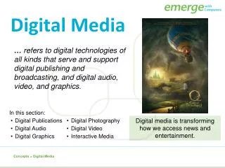
Learn about typefaces, alignment, contrasts, effects, and more for effective digital design and typography. Explore layout composition, orientation, and essential design elements.

E N D
Digital Media Notes Your Name
Typography • Typography is the selection and arrangement of typefaces (fonts), sizes, and spacing on a printed publication or web page. • Typography has a major impact on the overall look and image of your page and its overall quality. • Another name for a typeface is font.
Font • All letters, numerals, and any symbols that make up any typestyle in any one size is called a type font. • Fonts are divided into four categories: uppercase (ABC), lowercase (abc), numbers (123), and miscellaneous symbols (!@#).
Alignment • Alignment is the placement of elements on a page or in columns, especially text. Left alignment is also called flush-left, left-justified, or ragged right. Right alignment is also called flush-right, right-justified, or ragged left. In justified alignment the text goes from edge to edge. Justified text can also be referred to as full justification. Justified text is used most often in newspaper articles and magazine columns.
Centered Text • Lends a formal appearance to text. • Generally harder to read because the starting position of each line changes. • Works best with fairly short lines and extra space between text. • Often used for headlines, invitations, greeting cards, and certificates.
Contrast • Contrastis the difference between two or more elements in a composition. • The greater difference the greater the contrast. • Contrast adds interest to the page and provides a means of emphasizing what is important or directing the reader’s eye. • Contrast aids in readability by making headlines and subheadings stand out.
Line Spacing • Line Spacing shows how much space appears between lines of text or between paragraphs. • Single spaced lines and double spaced lines are examples of line spacing. • Another term for line spacing is leading.
Script Font • In typography, Script Fonts mimic handwriting styles that look as if written with writing instruments like calligraphy pens.
Serif vs. Sans Serif • A serif is a little extra stroke found at the end of some letterforms. • Times New Roman is an example of a serif font. • Fonts without serifs are called sans serif. (In French the word sans means without.) • Tahoma is an example of san serif font.
Font Effects & Styles Different font effects and styles can create a “font family” and interest in your typography designs. • Bold-Makes your text thicker. • Italic- Makes your text slanted. • Italic Bold- Makes your text slanted and thicker. • Underline- Puts a stroke under your text. • Shadow-Adds a shadow behind your text. • ALL CAPS BOLD-ALL TEXT IS IN CAPITAL LETTERS & BOLD • Small Caps Bold-All Text Is Capital But Use Lowercase Typesets and is Bold • Reverse – The color of the text is a positive against a negative background.
Character Spacing • Character Spacing is the amount of empty space between text characters. • Another term for Character Spacing is Kerning. • Condensed -The character spacing between text is tight & narrow. • Expanded-The character spacing between the text is lengthened.
Graphic Design • Graphic Design is the process of communicating visually using typography and images to present information. • It is also known as Commercial Art.
Design & Composition • Design is the plan, conception, or organization of a work of art; the arrangement of independent parts (the elements of art) to form a coordinated whole. • Composition is the organization of elements of art and principles of design in a work of art.
Page Layout & Orientation • Page layout is the part of graphic design that deals in the arrangement of visual elements on a page. • Page orientation is the way in which a rectangular page is oriented for normal viewing. • The two most common types of page orientation are portrait (vertical layout) and landscape (horizontal layout).
Portrait & Landscape Page Orientation • Portrait page orientation is when the height of the page is greater than the width. • Landscape page orientation is when the width of the page is greater than the height. Portrait Landscape
Keyboarding • Keyboarding is the activity of typing information into a computer or word processor. • The home row keys are the row of keys on the computer keyboard your fingers rest on when not typing. • The home row keys for your left-hand are A, S, D, and F and your right-hand are J, K, L, and ; (semicolon). For both hands, the thumbs rest on the spacebar. • GWAM stands for gross words a minute
GRADIENT • A Gradient in art is a visual technique of gradually transitioning from one color to another; or from one shade to another; or one texture to another.
Elements of Art • The basic components used by an artist when producing works of art. • The elements include line, shape, value, texture, and color.
Line • A line is a point moving in space. • Line quality can vary in lightness, darkness, width, length, curvature, color, or direction. • Line direction may be horizontal, vertical, or diagonal.
Shape • A shapeis a two dimensional area that is contained by a line. • When a line overlaps itself it creates a shape. • A shape may be geometric or organic. • A geometric shape has a precise formula and looks as if it was created by a drawing instrument. • An organic shape is acurvy and irregular free form shape that looks like it is derived from nature and drawn by hand.
Shape • Geometric Shapes • Organic Shapes