Download

1 / 27
270 likes | 308 Views
Bootstrap 3.3.x is a powerful front-end framework for building responsive websites. Download and integrate the CSS, fonts, and JS files to leverage its JavaScript functionalities like carousels, dropdown menus, and more. Utilize font icons for responsive and scalable designs while reducing bandwidth consumption. Learn about the Bootstrap grid system, grid classes, responsive utilities, and styling elements like tables and buttons to enhance your web development projects.

E N D
http://china2017.zift.ca/ Twitter Bootstrap Grid System Medhat Elmasry
Bootstrap 3.3.x • Mobile 1st framework for building responsive websites • Download from http://getbootstrap.com/ • Copy css, fonts, and js folders into your web directory • Bootstrap's JavaScript requires jQuery version 1.9.1 or higher.
css folder files • bootstrap.css • bootstrap.min.css • bootstrap-theme.css • bootstrap-theme.min.css
font folder files • use of font files instead of flat images to showcase various image icons. This has a couple of advantages: • Consumes less bandwidth, speeds up the website • The font icons are responsive and resizable • Font icons are called Glyphicons
js folder files • bootstrap.js • bootstrap.min.js • These files contains bootstrap’s main JavaScript libraries for things like: • carousels • drop down menus • search auto suggest • +…. many other powerful JavaScript functionalities
Bootstrap CDN • CDN == Content Delivery Network <!-- Latest compiled and minified CSS --> <link rel="stylesheet" href="https://maxcdn.bootstrapcdn.com/bootstrap/3.3.7/css/bootstrap.min.css"> <!-- Optional theme --> <link rel="stylesheet" href="https://maxcdn.bootstrapcdn.com/bootstrap/3.3.7/css/bootstrap-theme.min.css"> <!-- Latest compiled and minified JavaScript --> <script src="https://maxcdn.bootstrapcdn.com/bootstrap/3.3.7/js/bootstrap.min.js"></script> http://www.asp.net/ajax/cdn
Three equal columns • The following example shows how to get three equal-width columns starting at tablets <div class="row"> <div class="col-sm-4">.col-sm-4</div> <div class="col-sm-4">.col-sm-4</div> <div class="col-sm-4">.col-sm-4</div> </div>
Bootstrap Grid System • Bootstrap's grid system allows up to 12 columns across the page. • If you do not want to use all 12 column individually, you can group the columns together to create wider columns:
Start with this . . . . . . <!DOCTYPE html> <html lang="en"> <head> <meta charset="utf-8" /> <title>Bootstrap 3.0 Grid System</title> <meta name="viewport" content="width=device-width, initial-scale=1.0"> <link href="css/bootstrap.min.css" rel="stylesheet" media="screen"> <style> .col-xs-12 { height: 100px; background-color: blue; color: white; text-align: center; border: 2px solid black; } </style> </head> <body> <div class="container"> <div class="row"> </div> </div> </body> </html>
Grid classes • .container or container-fluid • wrapper for all your rows • Also centers row and prevents it from being full screen. • .row • contains all your column classes • .col-##-## • the sizes of the columns in your row (xs, sm, md, lg) See: 1 to 9 **** .html
Ordering classes • Only for md and lg screens • .col-##-push-## • Pushes your columns • .com-##-pull-## • Pulls your columns See: 10-push-pull.html
Offset classes • Only for md and lg screens • .col-##-offset-## • Moves your columns depending on what column is offset by See: 11-offset.html
Responsive utility classes • Hide and show content on your screen depending on which your device style is for. • .visible-## • Your contents will only be visible on that screen size • .hidden-## • Your contents will only be hidden on that screen size See: 12-visible.html & 13-hidden.html
Styling tables <table class="table table-condensed table-striped table-hover"> <caption>Months of the year</caption> <thead> <tr> <th>Month</th> <th>Days</th> </tr> </thead> <tbody> <tr class="danger"> <td>January</td> <td>31</td> </tr> <tr class="active"> <td>February</td> <td>28<span class="text-danger">*</span></td> </tr> <tr class="success"> <td>March</td> <td>31</td> </tr> See: 14-table.html
Buttons • To use a button, simply write class="btnbtn-default". • Can use <button> tag or <a> tag: <button type="button" class="btnbtn-default">Button Text</button> <a href="..." class="btnbtn-default">Button Text</a> • Other button classes are: .btn-primary, .btn-success, .btn-info, .btn-warning, .btn-danger, and .btn-link • Button sizes can be defined with the following classes: .btn-lg (large button), .btn-sm (small button), and .btn-xs (extra small button). 21-icon button.html
Styling buttons <div class="container"> <div class="row"> <div class="col-md-8 text-center"> <br /> <div class="btn-group"> <input class="btn" type="submit" value="Save" /> <button class="btnbtn-danger">Delete</button> <a href="#" class="btnbtn-primary">Update</a> </div> </div> <div class="col-md-4"> </div> </div> </div> See: 15-buttons.html
Modal Dialog See: 16-modal-dialog.html
Menu System See: 17-menu.html
Bootstrap Form Layouts • Bootstrap provides three types of form layouts: • Vertical form (this is default) • Horizontal form • Inline form • Standard rules for all the three types of form layout: • Add role="form" to the <form> element • Wrap labels and form controls in a <div> element with class="form-group" (needed for optimum spacing) • Add class="form-control" to all textual <input>, <textarea>, and <select> elements 19-FormLayouts.html
Jumbotron • A Jumbotron indicates a big box for calling extra attention to special content • A Jumbotron is displayed as a grey box with rounded corners and enlarged text inside it. 20-jumbotron.html <div class="container"> <div class="jumbotron"> <h1>My first Bootstrap website!</h1> <p>This page will grow as we add more and more stuff to it.</p> </div> </div>
<img> classes Example: <imgsrc="cinqueterre.jpg" class="img-responsive" alt="Cinque Terre">
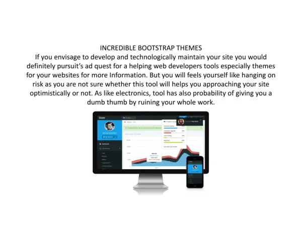
Bootstrap Themes http://bootswatch.com/