Download
1 / 19
190 likes | 507 Views
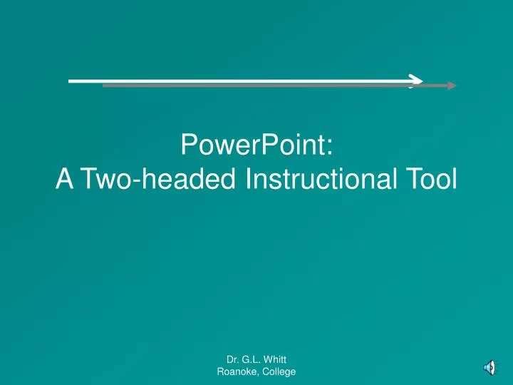
PowerPoint: A Two-headed Instructional Tool PowerPoint Common Abuses Best Practices You get to practice Common Abuses Funky graphic design Distracting noise Graphic density too high Dual processor fouls (read and listen) Graphic Design Watch for color bleed This is Hard to Read

E N D
PowerPoint: A Two-headed Instructional Tool Dr. G.L. Whitt Roanoke, College
PowerPoint • Common Abuses • Best Practices • You get to practice Dr. G.L. Whitt Roanoke, College
Common Abuses • Funky graphic design • Distracting noise • Graphic density too high • Dual processor fouls (read and listen) Dr. G.L. Whitt Roanoke, College
Graphic Design • Watch for color bleed Dr. G.L. Whitt Roanoke, College
This is Hard to Read Dr. G.L. Whitt Roanoke, College
Choose 1 Emphasis Method If you choosetoo manymethods of • emphasiszing • something, your students don’t know what is important! Dr. G.L. Whitt Roanoke, College
So is This Dr. G.L. Whitt Roanoke, College
Fonts Should Be Large Dr. G.L. Whitt Roanoke, College
Use Contrasting Color Schemes Dr. G.L. Whitt Roanoke, College
Fonts • This is a 32 point font • This is a 32 point font • Notice any difference?? • Serifs make it difficult to read text. • It’s pretty but it is less legible. Dr. G.L. Whitt Roanoke, College
Noise • Can be useful (rarely) • It is usually distracting and counter-productive Dr. G.L. Whitt Roanoke, College
Graphic Density This is just a fancy way to say that many people try to put too much stuff on a slide. PowerPoint isn’t meant to be used this way. You don’t ever want to put more than 25 words on a slide. This slide has 47. Dr. G.L. Whitt Roanoke, College
Dual Processing Never read to your students while expecting them to read. If you were going to read it to them, you shouldn’t have put it on a slide, unless, of course, you were going to give them time to read it as well. Dr. G.L. Whitt Roanoke, College
Best Practices Dr. G.L. Whitt Roanoke, College
Large Fonts This is a 60 point font This is a 40 point font This is a 20 point font and has become an eye test Dr. G.L. Whitt Roanoke, College
Some Colors Just Work Better Dr. G.L. Whitt Roanoke, College
Dark Font on Light Text It’s fairly dull but it is legible
Light Font on Dark Background is Also Fine Dr. G.L. Whitt Roanoke, College
Just Be Careful Out There and PowerPoint Responsibly Dr. G.L. Whitt Roanoke, College