Download
1 / 10
100 likes | 127 Views
This guide covers frequency graphs, scattergrams, tables with multiple variables, and data reduction techniques to organize and analyze data effectively. Learn to create visual representations and interpret numerical information using histograms, bar graphs, stem-and-leaf plots, and more. Understand the relationship between variables through scattergrams and tables depicting correlations. Ensure accurate data processing by transcribing data, creating data matrices, and conducting descriptive and inferential statistics for comprehensive analysis.

E N D
Data Description • Tables and Graphs • Data Reduction
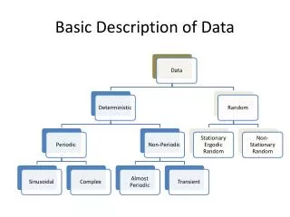
Tables and Graphs • Tables: Numerical data in a matrix format • Graphs: Visual representation of data • Types of Graphs/Tables: • Displaying information about a single variable • Frequency • Cumulative Frequency • Displaying information about the relationship among 2 or more variables • Scattergram • One or more IV and one or more DV • Time Series
Information about a single variable: Frequency graphs and tables • Frequency Table • Counts of responses • One row for each score or range of scores • Histogram • Bar graph • Stem and leaf plot • Frequency polygon • Cumulative frequency polygon
Relationships Between 2 Variables • In frequency plots, x axis is DV, but in most plots with 2 variables, DV is on y axis • Scattergrams • Tables with 1 IV and 1 DV (2 variables) • Tables with more than 1 IV (more than 2 variables) • Line and Bar Graphs • Time Series Graphs
Scattergrams • Used to show correlations • Any type of variable (IV or DV) can be on either axis, but often have DV on ordinate and IV on abscissa • Each plotted point represents the score of one individual on two separate variables
Tables with 2 or more Variables • In a table, the scores represent the DV • The columns represent the levels of the IV • With only 1 IV, there will be only 1 row • With 2 IVs, the rows will represent levels of the second IV • Additional IVs will be represented as groups of columns
Graphs with 2 or More Variables • DV is represented on the y axis • Levels of IV or IVs are represented on the x axis • With 2 or more IVs, levels of an IV may be represented by color, shape, or shading • Bar graphs are appropriate for categorical IVs • Line graphs are appropriate only for quantitative IVs on x axis
Time Series Graphs • X axis represents passage of time
Data Reduction • Prepare the data sheets for transferring data • Transcribe data onto a data summary sheet • Matrix containing all the data • One data point per row • Columns represent variables (DV in last column usually) • Create coding guide • Use coding guide to create computer data file • Check for missing data, invalid data, and outliers (descriptive statistics, or exploratory data analysis) • Proceed with analysis (descriptive and inferential statistics)