Download
1 / 4
40 likes | 139 Views
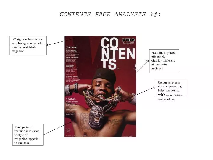
CONTENTS PAGE ANALYSIS 1#:. ‘V’ sign shadow blends with background – helps reinforce/establish magazine. Headline is placed effectively – clearly visible and attractive to audience. Colour scheme is not overpowering, helps harmonize with main picture and headline.

E N D
CONTENTS PAGE ANALYSIS 1#: ‘V’ sign shadow blends with background – helps reinforce/establish magazine Headline is placed effectively – clearly visible and attractive to audience Colour scheme is not overpowering, helps harmonize with main picture and headline Main picture featured is relevant to style of magazine, appeals to audience
CONTENTS PAGE ANALYSIS 2# Black background helps enhance headline font/colours Headline NME in striking red - makes a statement Headline in bold – font featured through the page - recognisable Clever layout – Contents is featured at side but does not overpower article Colour scheme Harmonize amongst eachother – Blend Effectively Variety of fonts add contrast to contents, keeps page varied Subscription feature in rich yellow – like NME, makes a statement
DOUBLE PAGE SPREAD ANALYSIS 1# Reference & Comparison to female celebrities adds both appeal and interest to article Graphology – Chosen font is simple and visible – does not overpower article due to size Pink background helps denote femininity - and appeal to female audience Main picture helps establish to audience the main ‘protagonist’ of article, helps create visual imagery for reader – a more enjoyable read Pink background remains consistent – as featured in the headline – helps maintain the feminine characteristic of the article
DOUBLE PAGE SPREAD ANALYSIS 2# Main headline harmonizes with article, stands out amongst dark background Black and white picture featured to help support main picture Slanted subheading is effective and dissimilar to other article layouts Quotation added from oasis singer – relevant and effective Main picture is featured on both pages – adds audience attention to picture Font of turquoise colour attracts reader – acts as starting point of story