Download
1 / 3
40 likes | 201 Views
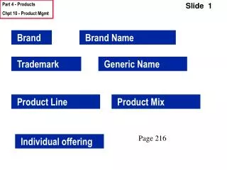
Brand Standards Guide. Logo usage. Two-Color Stacked Orientation: Our most commonly used GetThere logo treatment is the two-color stacked logo. The two-color stacked logo can appear in the two approved color versions on the right.

E N D
Logo usage • Two-Color Stacked Orientation: Our most commonly used GetThere logo treatment is the two-color stacked logo. The two-color stacked logo can appear in the two approved color versions on the right. • Two-Color Horizontal Orientation: To ensure the GetThere logo works in virtually every application, a horizontal orientation has been provided. The two-color horizontal logo can appear in the two approved color versions on the right. • One-Color Stacked Orientation: Designed for applications in which you are limited to one-color printing, the logo can appear all in black on a white background, or all in white on a black background. • One-Color Horizontal Orientation: Designed for applications in which you are limited to one-color printing, the logo can appear all in black on a white background, or all in white on a black background.
Logo usage – what not to do • The GetThere logo is our visual brand. Please don’t skew, stretch or change the proportion of the symbol in any way or place it on textured or patterned backgrounds. • Please don’t change the font on the logotype. Never alter or re-proportion the logotype in any way. Never use the GetThere “G” without the company name. • The GetThere logo should not be altered or re-proportioned in any way or printed in other colors than the official corporate red or acceptable black and white variations. • The GetThere logo is the crown jewel. Please don’t change the original artwork and do not add elements, such as a drop shadow. Logo mark must be either red, black or white • Do not crowd the logo. Always leave a border around the logo on all sides at least as large as the “T” in GetThere. • Multicolor logo and “A Sabre Company” signatures were phased out in 2000. Do not use.