Download

1 / 47
470 likes | 598 Views
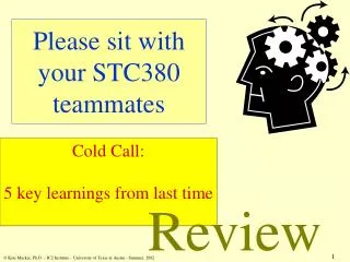
Review. We learned about 3 types of positioning. How would you offset the green box 10px from the top & right of the blue box?. position: relative. position: static. Review. We learned about 3 types of positioning.

E N D
Review • We learned about 3 types of positioning. • How would you offset the green box10px from the top & right of the blue box? position: relative position: static
Review • We learned about 3 types of positioning. • How would you offset the green box10px from the top & right of the blue box? position: relative position: absolute position: relative
Today’s Outline CSS Pseudo Classes HTML5 CSS3 Browser Compatibility CSS Specificity Extras
Goal Today: Learn the latest trends & wrap up HTML & CSS
CSS pseudo-classes • Adds effects to your selectors • Syntax: • .selector:pseudo-class { …css styles … } • Ex: a:visited { … }, #box1:hover { … } • Common pseudo-classes: • :visited = Links you’ve visited • :active = Links when you click on them (happens in milliseconds) • :hover = When mouse is over element • :focus = When typing in the current <input> tag (we go over <input> tags later on) • Remember :hover! Most likely you will use this the most ;)
CSS pseudo-classes :hover
CSS pseudo-classes :active (happens briefly) Click this Link Click this Link :visited Click this Link
CSS pseudo-classes :focus Name: Name: Age: Age: Year: Year: Major: Major:
HTML5 • Allows use of CSS3 • New semantic tags: <header>, <footer>, etc. • Multimedia tags: • <video> • <audio> • Can now draw graphics with: • <canvas> • Combined with JS, you can also do: • Drag and Drop • Geolocation
Semantic Tags • Semantic Tags • Just <div> tags, but with meaning • Easier to distinguish structure of a site
<video> • Great way to showcase videos you uploaded or video files on the web (non-Youtube videos) • Syntax: • <video width=“640” height=“480” controls> <source src=“clip.mp4” type=“video/mp4”> Browser does not support this</video> • 2 lines inside <video>: Source tag & text, in case browser does not support HTML5 <video> (Chrome, Firefox, Opera, Safari, and IE9+ supports)
<video> • Syntax: • <video width=“640” height=“480” controls> <source src=“clip.mp4” type=“video/mp4”> Browser does not support this</video> • You can add attributes to <video> tag • controls = Shows play, pause, etc. buttons • autoplay • loop • muted
HTML5 • Other HTML5 tags require Javascript • For now, know semantic tags + <video> • With Javascript: • Grab Geolocation • Draw Graphics on a Canvas • Do more with <video> and <audio>
CSS3 • Latest CSS version • Border-radius & shadows • Opacity • Animations & 2D/3D transformations • Gradients, text effects, etc.
border-radius • You can now round your 90 degree corners • Syntax: • border-radius: 10px; • You can also use percentages (up to 50%) • border-radius: 50%; • If your element is a square, this turns it into a circle. Why? 50%
box-shadow • Add shadow to your elements • Syntax (parentheses optional): • box-shadow: h v (blur) (spread) (color) (inset) • E.g.: 0 5px 5px #aaa; • Great for subtle effects and modals (e.g. Facebook Photo Viewer)
Opacity • Allows transparency of elements • Syntax (parentheses optional): • opacity: 0.5; • Values from 0 (invisible) to 1 (fully visible) • Important! • Not the same as display:none • display: none hides the element (takes no space on page) • opacity: 0simply makes the element invisible (but still takes up space on the page)
Transitions • Move, scale, and change the color of elements (and lots more!) • Essentially changing from state 1 to state 2 • Syntax: • transition: 0.2s; • Time is usually very short (<1s) #box { width: 100px; height: 100px; background-color: red; transition: 0.2s; } #box:hover{ width: 200px; height: 200px; background-color: blue; }
2D Transformations • Translate, scale, rotate, skew • Translate: • transform: translate(xvalue, yvalue); • E.g. transform: translate(10px, 80px); • Rotate: • transform: rotate(45deg); • Scale: • transform: scale(xtimes, ytimes); • E.g. transform: scale(2, 4); • Skew: • transform: skew(xdeg, ydeg); • E.g. transform: skew(10deg, 40deg);
3D Transformations • Translate, scale, rotate… but wicked! • Like 2D transforms… but with “3d” • Takes 3 args: • transform: translate3d(x,y,z); • transform: rotate3d(x,y,z, deg); • transform: scale3d(x,y,z); • Examples (3 args & 1 arg for specific): • transform: rotateY(45deg); • transform: scaleZ(2); • transform: scale3d(1,1,2); • transform: rotate3d(0, 1, 0, 60deg);
Browser Compatibility • CSS3 led to browsers rendering websites differently • Cross-Browser Compatibility – Web Developers’ worst nightmare • The Big 5 Browsers: • Google Chrome • Mozilla Firefox • Apple’s Safari • Opera • Internet Explorer
Browser Compatibility • Some browsers use their own CSS styles • Vendor Prefixes • Add them to the beginning of CSS3 styles (border-radius, transitions, transform, etc.) • Chrome, Safari, and Opera (recently converted from -o-) • -webkit- • Ex: -webkit-border-radius, -webkit-transition • Firefox • -moz- • Ex: -moz-box-shadow
Browser Compatibility • Usually when using CSS3 styles (except opacity), use a trio of three CSS3 styles • Ex: • -webkit-border-radius: 3px;-moz-border-radius: 3px;border-radius: 3px; • Now, what about Internet Explorer?
Browser Compatibility • Internet Explorer is dreadful • Each version is different from another • IE6 • No CSS3 Support • No top, left, right, bottom for position: absolute • IE8 • First use of display: inline-block • IE9 • First full support of CSS3 • Uses –ms- vendor prefix • IE10 (most stable current release) • For most part, no longer need –ms- prefix
Browser Compatibility • Support IE with separate styles • Syntax: • <!-- [if lt IE9]> <link rel=…. href=“iestyles.css”><![endif]> • Add after normal <link> tag • Extra • lt = less than • gt = greater than • lte = less than
CSS Specificity • Determines which CSS rule is applied (based on precedence) • If 2 selectors apply to the same element, 1 has higher precedence • IDs (#) more precedence over Classes (.) • <div id=“box1” class=“box”> • #box1 { … style is used over .box … } • Use spaces to signify parent-child relationship • <div class=“panel”> <div class=“title”> • .panel .title { … style is used over just .title … }
CSS Specificity Precedence: #panel1 > .panel <div id=“panel1” class=“panel”> <div class=“title”></div> <div class=“body”> <div class=“author”> </div> </div> </div> .panel .title > .title #panel .title > .panel .title #panel .body .author > .author div.panel > .panel
Extras • Shorthands • margin: 0 auto; • = margin: 0 auto 0 auto; • = margin-top: 0, margin-left: auto, … etc… • background-color: #ff8800; • = background-color: #f80; • Comments • CSS • /* Multi-line comment */ • // Single line comment • HTML • <!-- This is a multi-line comment in HTML -->
Extras • Combinations • #box1, #box2 { color: red; height: 80px; } • = #box1 { color: red; height: 80px; } #box2 { color: red; height: 80px; }
Summary • CSS pseudo-classes • HTML5 • Semantic Tags & Video • CSS3 • Border-radius & Box-shadow • Transitions &Transformations • Browser-Compatibility • Important for CSS3 • Always use 3 CSS3 prefixes: -webkit-, -moz-, (regular) • CSS Specificity All lecture material, handouts, and homework can be found at: http://www.thewebdesignworkshop.co
CSS Specificity • Surprisingly, you can think of CSS specificity as a calculator • This calculator weighs 4 categories with different point values: • Inline Styles – 1000 • E.g. <p style=“color: blue;”></p> • IDs – 100 • E.g. #box, #title • Classes, attributes, pseudo-classes – 10 • E.g. .panel, :hover, :focus • Elements & pseudo-elements – 1 • E.g. img, h1, :after, :before, :first-line
CSS Specificity • Examples: • body #container .panel .title:hover • 1 + 100 + 10 + 10 + 10 = 131 • p a.mysite • 1 + 1 + 10 = 12 • Also note, that you can also attach class selectors to generic elements • E.g. a.mysite • This means “select the <a> element with the class mysite”
CSS3 Gradients • Gradients are easy to do with CSS3 • Syntax: • background: linear-gradient(red, blue); • Simply add a color 1 and a color 2, and CSS will generate the transition from 1 to 2 • background: linear-gradient(left, red, blue); • Add an optional direction if you like as the first argument • Starts from left, and goes right • background: linear-gradient(top left, red, blue); • Combine two directions (starts at top left) • background: linear-gradient(#f00, #0f0, #00f); • Multiple color stops • Also can use HEX colors or RGB
HTML Structure • Now that we are wrapping up HTML, you can hone in on “good structure” of a web page • Consider looking into Bootstrap or Foundation just to see how they structure their elements, or the 960 Grid system
CSS Structure • Same for CSS, it’s time to hone in on your CSS structure! • For the body selector, always add margin: 0 and padding: 0 • This prevents the browser from using a default margin/padding for <body> • Allows your site to look the same across all browsers • Keep your CSS clean, avoid repetitive code chunks • E.g. h1, h2 { … same styles…} vs h1 {…} and h2 {…} • Test your CSS across browsers (eventually we will cover mobile) • Use @font-face to use custom fonts, but always have fall-backs • Keep @font-face, body, and important tags/dependencies at the top of your CSS file • Consider using LessCSS(lesscss.org) if you know coding • Allows use of variables (e.g. repetitive colors now 1 variable)