Download

1 / 10
100 likes | 265 Views
Pulley Lab. The Graph. Graph. Get a blank sheet of graph paper. Graph. Draw the Y axis Draw the X axis. Graph. Y axis X axis. Graph. On the X axis, Write the range for the dependent variable, MA. The range is 1 to 6. Graph.

E N D
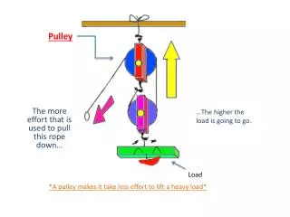
Pulley Lab The Graph
Graph • Get a blank sheet of graph paper
Graph • Draw the Y axis • Draw the X axis
Graph • Y axis • X axis
Graph • On the X axis, Write the range for the dependent variable, MA. • The range is 1 to 6
Graph • On the Y axis, write the range for the independent variable, EF in Newtons. • The range is from 1.0 N to 11.0 N
Do not write this data on your graph! This data will be found on the Data Table for each Pulley. 5 MAs and 5 EFs Graph • For Pulleys 1 through 5, Plot the data points as EF and MA
Graph • Plot a data point for each pulley • 5 pulleys, 5 data points!
Graph • In a nonlinear graph, lines are not drawn dot to dot through data points. • For our Line of Best Fit, the nonlinear graph is drawn to fit or include some but not all data points. • The Line of Best Fit should show the pattern described by the data
Graph • Line of Best Fit is a compromise. • To do it well you would have to understand what it is for. • Make the line VERY LIGHTLY and show it to Mr. Gussin if you are unsure. • Do not draw beyond the last data point.