Download
1 / 48
500 likes | 1.07k Views
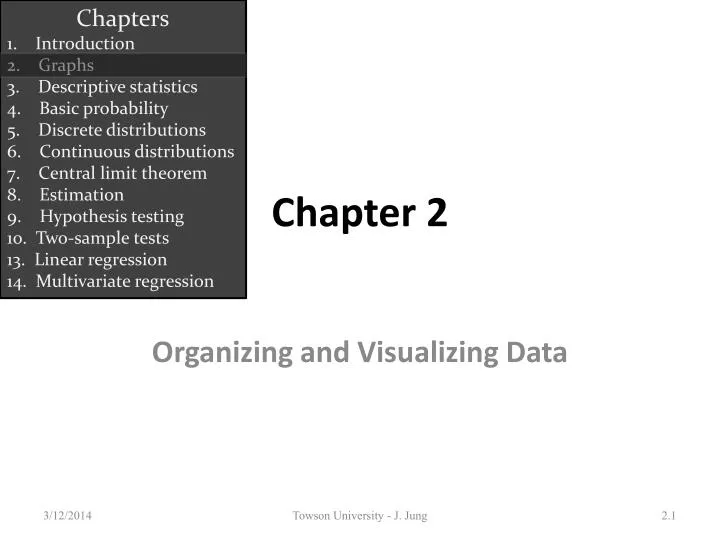
Chapters 1. Introduction 2. Graphs 3. Descriptive statistics 4. Basic probability 5. Discrete distributions 6. Continuous distributions 7. Central limit theorem 8. Estimation 9. Hypothesis testing 10. Two-sample tests 13. Linear regression

E N D
Chapters 1. Introduction 2. Graphs 3. Descriptive statistics 4. Basic probability 5. Discrete distributions 6. Continuous distributions 7. Central limit theorem 8. Estimation 9. Hypothesis testing 10. Two-sample tests 13. Linear regression 14. Multivariate regression Chapter 2 Organizing and Visualizing Data Towson University - J. Jung
Introduction & Re-cap… • Descriptive statistics involves arranging, summarizing, and presenting a set of data in such a way that useful information is produced. • Its methods make use of graphical techniques and numerical descriptive measures (such as averages) to summarize and present the data. Statistics Data Information Towson University - J. Jung
Populations & Samples Population Sample • The graphical & tabular methods presented here apply to both entire populations and samples drawn from populations. Subset Towson University - J. Jung
Definitions • A variable is some characteristic of a population or sample. Typically denoted with a capital letter: X, Y, Z… E.g. student grades: X={B, A-, C, A, B,…} • The valuesof the variable are the range of possible values for a variable. E.g. student marks (0..100) • Data are the observed values of a variable. E.g. student marks: {67, 74, 71, 83, 93, 55, 48} Towson University - J. Jung
Types of Data & Information • Data (at least for purposes of Statistics) fall into three main groups: • Quantitative or (1) Numerical (Interval) Data: Discrete Data, Continuous Data • Qualitative or Categorical Data: (2) Ordinal Data, (3) Nominal Data, Towson University - J. Jung
Example: Types of Data To count number of observations per category use Excel: = countif(cell,”sophomore”) Towson University - J. Jung
Types of Data Discrete Data Can you do math? 1 Numerical Data Yes Continuous No Ordered? 2 Ordinal Data Yes Categorical Data No 3 Nominal Data Towson University - J. Jung
1 Interval data • Real numbers, i.e. heights, weights, prices, etc. • Also referred to as quantitative or numerical. • Arithmetic operations can be performed on Interval Data, thus its meaningful to talk about 2*Height, or Price + $1, and so on. • Discrete Data: gaps exist between possible values • e.g. # of children in a family • Continuous Data: no gaps exist between possible values • e.g. annual income of a family Towson University - J. Jung
2 Ordinal Data… • OrdinalData appear to be categorical in nature, but their values have an order; a ranking to them: E.g. College course rating system: poor = 1, fair = 2, good = 3, very good = 4, excellent = 5 • While it’s still not meaningful to do arithmetic on this data (e.g. does 2*fair = very good?!), we can say things like: excellent > poor or fair < very good • That is, order is maintained no matter what numeric values are assigned to each category. Towson University - J. Jung
3 Nominal Data… • Thevalues of nominal data are categories. E.g. responses to questions about marital status, Single = 1, Married = 2, Divorced = 3, Widowed = 4 • Because the numbers are arbitrary, arithmetic operations don’t make any sense (e.g. does Widowed ÷ 2 = Married?!) • Only counts of the number of items in a category are allowed. • More examples: gender, religious preference, etc. Towson University - J. Jung
Hierarchy of Data… 1 Interval • Values are real numbers. • All calculations are valid. • Data may be treated as ordinal or nominal. 2 Ordinal • Values must represent the ranked order of the data. • Calculations based on an ordering process are valid. • Data may be treated as nominal but not as interval. 3 Nominal • Values are the arbitrary numbers that represent categories. • Only calculations based on the frequencies of occurrence are valid. • Data may not be treated as ordinal or interval. Towson University - J. Jung
Graphical & Tabular Techniques for Nominal Data… • The only allowable calculation on nominal data is to count the frequency of each value of the variable. • We can summarize the data in a table that presents the categories and their counts called a frequency distribution. • A relative frequency distribution lists the categories and the proportion with which each occurs. Towson University - J. Jung
Nominal Data (Tabular Summary) Towson University - J. Jung
Nominal Data (Frequency) Bar Charts are often used to display absolutefrequencies… Towson University - J. Jung
Nominal Data (Relative Frequency) Pie Charts show relative frequencies… Towson University - J. Jung
Nominal Data • It’s all the same information,(based on the same data). • Just different presentation. Towson University - J. Jung
Graphical Techniques for Interval Data • There are several graphical methods that are used when the data are interval (i.e. numeric, non-categorical). • The most important of these graphical methods is the histogram. • The histogram is not only a powerful graphical technique used to summarize interval data, but it is also used to help explain probabilities. Towson University - J. Jung
Building a Histogram… • Create a frequency distribution for the data… How? a) Determine the number of classes to use. b) Determine how large to make each class. c) Place the data into each class… • classes are mutually exclusive and collectively exhaustive; • each item can only belong to one class; • classes contain observations greater than or equal to their lower limits and less than their upper limits -> […) • class limits; class mark; class interval Towson University - J. Jung
Example: Histogram • As part of a larger study, a long-distance company wanted to acquire information about the monthly bills of new subscribers in the first month after signing with the company. • The company’s marketing manager conducted a survey of 200 new residential subscribers wherein the first month’s bills were recorded. • The general manager planned to present his findings to senior executives. • What information can be extracted from these data? Towson University - J. Jung
Building a Histogram • Collect the Data • Create a frequency distribution for the data… • How? • Determine the number of classes to use…How? Refer to table 2.6: With 200 observations, we should have between 7 & 10 classes… Alternative, we could use Sturges’ formula: Number of class intervals = 1 + 3.3 log (n) Towson University - J. Jung
Histogram • Collect the Data • Create a frequency distribution for the data… How? a) Determine the number of classes to use. [8] b) Determine how large to make each class… How? • Look at the range of the data, that is: Range = Largest Observation – Smallest Observation Range = $119.63 – $0 = $119.63 • Then each class width becomes: Range ÷ (# classes) = 119.63 ÷ 8 ≈ 15 Towson University - J. Jung
Example: Histogram • In the previous example we created a frequency distribution of the 5 categories. • In this example we also create a frequency distribution by counting the number of observations that fall into a series of intervals, called classes. • We have chosen eight classes defined in such a way that each observation falls into one and only one class. Towson University - J. Jung
Example: Histogram Classes • Amounts that are less than 15; [0, 15) • Amounts that are more than or equal 15 but less than 30; [15, 30) • Amounts that are more than or equal 30 but less than 45; [30, 45) • Amounts that are more than or equal 45 but less than 60; [45, 60) • Amounts that are more than or equal 60 but less than 75; [60, 75) • Amounts that are more than or equal 75 but less than90; [75, 90) • Amounts that are more than or equal 90 but less than 105 ; [90, 105) • Amounts that are more than or equal 105 but less than 120 ; [105, 120) Towson University - J. Jung
Example: Histogram Towson University - J. Jung
Interpretation (18+28+14=60)÷200 = 30% i.e. nearly a third of the phone bills are $90 or more. about half (71+37=108) of the bills are “small”, i.e. less than $30 There are only a few telephone bills in the middle range. Towson University - J. Jung
Shapes of Histograms… • Symmetry • A histogram is said to be symmetric if, when we draw a vertical line down the center of the histogram, the two sides are identical in shape and size: Frequency Frequency Frequency Variable Variable Variable Towson University - J. Jung
Shapes of Histograms… • Skewness • A skewed histogram is one with a long tail extending to either the right or the left: Frequency Frequency Variable Variable Positively Skewed (Right Skewed) Negatively Skewed (Left Skewed) Towson University - J. Jung
Shapes of Histograms… Modality A unimodalhistogram is one with a single peak, while a bimodal histogram is one with two peaks: Bimodal Unimodal Frequency Frequency Variable Variable A modal class is the class with the largest number of observations Towson University - J. Jung
Shapes of Histograms… Bell Shape • A special type of symmetricunimodal histogram is one that is bell shaped: • Many statistical techniques require that the population be bell shaped. • Drawing the histogram helps verify the shape of the population in question. Frequency Variable Bell Shaped Towson University - J. Jung
Histogram Comparison The two courses, Business Statistics and Mathematical Statistics have very different histograms… unimodal vs. bimodal spread of the marks (narrower | wider) Towson University - J. Jung
Frequency Polygon • It is a line version of the histogram. • It is plotted using class midpoints as X values and frequencies as Y values. • Refer to Lab Manual Chapter 2! Towson University - J. Jung
Ogive… • (pronounced “Oh-jive”) is a graph of a cumulativefrequency distribution. • We create an Ogivein three steps… 1) First, from the frequency distribution created earlier, calculate relative frequencies: Relative Frequency = # of observations in a class Total # of observations 2) Calculate cumulative relative frequencies by adding the current class’ relative frequency to the previous class’ cumulative relative frequency. (For the first class, its cumulative relative frequency is just its relative frequency) Towson University - J. Jung
Cumulative Relative Frequencies… first class… next class: .355+.185=.540 : : last class: .930+.070=1.00 Towson University - J. Jung
Ogive… • Is a graph of a cumulativefrequency distribution. 1) Calculate relative frequencies. 2) Calculate cumulative relative frequencies. 3) Graph the cumulative relative frequencies… Towson University - J. Jung
Ogive… The Ogivecan be used to answer questions like: What telephone bill value is at the 50th percentile? “around $35” (Refer also to Fig. 2.13 in your textbook) Towson University - J. Jung
One Nominal Variable • Bar or Column Chart: X axis: category labels Y axis: absolute frequencies • Pie Chart: relative frequency • Pareto Diagram: a special type of column chart categories are ordered from left to right, largest frequency to smallest Towson University - J. Jung
Graphing the Relationship Between Two IntervalVariables • How two interval variables are related? We employ a scatter plot, which plots two variables against one another. • Example 2.9 A real estate agent wanted to know to what extent the selling price of a home is related to its size… • Collect the data • Determine the independent variable (X – house size) and the dependent variable (Y – selling price) • Use Excel to create a “scatter plot”… Towson University - J. Jung
Patterns of Scatter Plots… • Linearity and Direction are two concepts we are interested in Positive Linear Relationship Negative Linear Relationship Weak or Non-Linear Relationship Towson University - J. Jung
Time Series Data… • Observations measured at the same point in time are called cross-sectional data. • Observations measured at successive points in time are called time-series data. • Time-series data graphed on a line chart, which plots the value of the variable on the vertical axis against the time periods on the horizontal axis. Towson University - J. Jung
Line Chart… • From ’87 to ’92, the tax was fairly flat. Starting ’93, there was a rapid increase taxes until 2001. Finally, there was a downturn in 2002. Towson University - J. Jung
Appendix Towson University - J. Jung
Summation Notation where a and b are integers satisfying a is the starting value for i, b is the ending value. The above notation is to sum up to .
That is, for variable X where X has values The sum of all the values of X can be written as If all the values for X’s are given, we can get the value for
Example: Suppose X1=2, X2=0, X3=2, X4=5, and X5=1
In general, • Example: , while
Summary II… Towson University - J. Jung
Review: Chapter 2 - Graphs • What is categorical data? • What is numeric/interval data? • What graphs can you make for ordinal data? • What graphs can you make for interval data? • What are the steps involved in making a bar chart in Excel? • How do you make a histogram in Excel? Towson University - J. Jung