Download
1 / 8
90 likes | 279 Views
ABB Basic Quality Tools Series. Bar Chart Evaluation Tool for comparing quantitative data. Bar Chart - Content. What is it for?. For general display and communication of numeric data. To illustrate much information concisely. For comparing similar sets of data, showing changes between sets.

E N D
ABB Basic Quality Tools Series Bar ChartEvaluation Tool for comparing quantitative data © ABB Group, 9AKK105151D0101 July 15, 2010 Slide 1
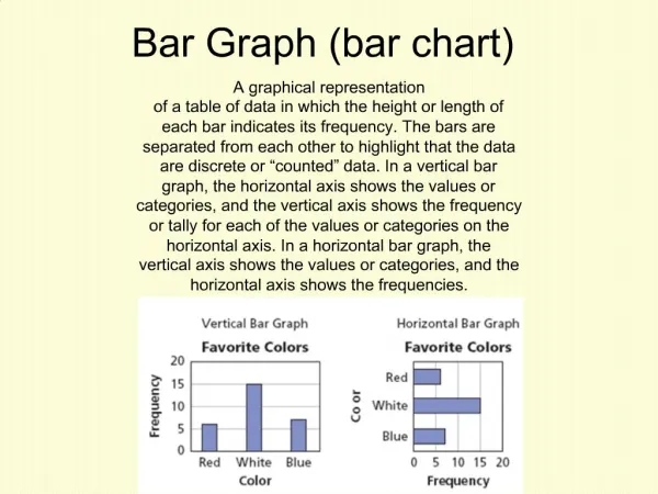
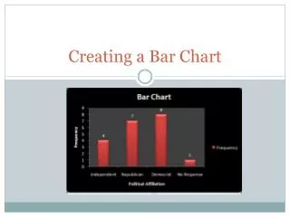
Bar Chart - Content What is it for? • For general display and communication of numeric data. • To illustrate much information concisely. • For comparing similar sets of data, showing changes between sets. Where could I use it? • To show the need for improvement. • To show how the project has improved target data. • When presenting results for effect. Understanding of service complaints How do I use it? • Define purpose of using chart. • Identify type of chart to use. • Collect data to display. • Plot the chart. • Interpret the chart. Risks and how to avoid them Example © ABB Group, 9AKK105151D0101 July 15, 2010 Slide 2
Bar Chart - What is it for? • Uses of this tool: • The Bar Chart is used to compare sets of similar data. • It can show changes of one set of data over time or can be used to compare separate data sets. • Its visual nature makes it useful for communications. • Pictorial graphs are a form of Bar Charts which have a more visual impact. • Radar charts provide visual clarity on trends on several criteria. • Pie charts present much information graphically to give a concise overview of a situation. • Expected Benefits: • The display of clear data allows decisions to be made quickly and easily. • Visual display helps with communication, agreement and gaining commitment to decisions. © ABB Group, 9AKK105151D0101 July 15, 2010 Slide 3
Bar Chart - Where could I use it? • Background: • Bar Charts are widely used and understood, making them an ideal tool for simple communications. • Pictorial graphs are a special form of Bar Chart that are less precise but more effective for presentation. • Radar charts give an overall view based on several crieria • Pie Charts provide a very compact form of illustration. • Uses: • Use it, rather than a line chart, to show discrete numerical quantities (rather than continuous change). • Use the Bar Chart to compare performance data and identify possible projects. • It can also be used during the analysis phase to identify specific problems to address. • It can be used to visualise improvement during a project lifecycle. • Powerful in presenting data in a simple way where the main areas of difference are clearly visible. Supporting tables of data are available for the details. © ABB Group, 9AKK105151D0101 July 15, 2010 Slide 4
Bar Chart - How do I use it? Procedure and Guidance Notes: • Clarify what you want to gain from using the chart. • For example, ‘Identification and agreement of improvement needs.’ Define purpose of using chart • The Bar Chart can be used in several ways, for example to compare several sets of data, showing each data set stacked in one bar or with side-by-side bars. • There are other forms of similar chart which may be used. • Pie Charts show proportion, but not absolute amounts • Pictorial graphs increase the visual impact • Radar charts show data in a round group. • Choose the type of chart that will best meet your purpose. For example using a stacked chart to show the contributions of different items. • Pictorial graphs and Radar charts have a high visual impact. • Pie charts show information very compactly. Identify type ofchart to use • Collect the data to show in the Chart. • Check Sheets can be used to collect manual data. Collect data to display • Plot the chart as planned. • Microsoft Excel/ Power Point have a number of different Bar Chart formats available and can produce charts easily and quickly. Plot the chart • The difference in heights of bars are usually significant. • Review the chart to meet your purpose and find meaning in what is displayed. Interpret the chart © ABB Group, 9AKK105151D0101 July 15, 2010 Slide 5
Bar Chart - Risks and how to avoid them • Risks : • If the wrong chart is selected, for example a Histogram instead of a Bar Chart or a Bar Chart instead of a Pareto Chart, then this can lead to incorrect decisions or confusing communications. • Invalid data or errors in copying data. • Steps to avoid them : • Be clear about what you want to achieve with the chart and verify, before using it, that it is the best tool for the job. • Where unexpected results occur, the first step should be to check that the data is valid. © ABB Group, 9AKK105151D0101 July 15, 2010 Slide 6
Bar Chart - Example 1. Define purpose of using chart Understanding of service complaints 2. Identify type of chart to use For exploration: stacked bar and side-by-side 3. Collect data to display 4. Plot the chart 5. Interpret the chart more Little variation in issues across regions North and West have more Marketing issues; East has R&D issues. © ABB Group, 9AKK105151D0101 July 15, 2010 Slide 7
R&D issues 25 20 15 North 10 Supplier issues Marketing issues 5 South 0 East West People issues Finance issues Pictorial Graph & Pie Chart - Example Pictorial Graph Number of aircraft bought by company Pie Chart % of investment in companies Radar Chart Regional issues © ABB Group, 9AKK105151D0101 July 15, 2010 slide 8