Download
1 / 36
360 likes | 774 Views
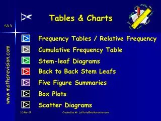
Effective Tables and Charts. Important Elements of Graphic Presentation of Data Rena Cheskis-Gold. Part I. Charting Data. Basic Table. Bar Charts. Quickly compare one category to another. Pie Charts. Less flexible than bar charts. Must include all categories and add to 100% .

E N D
Effective Tables and Charts Important Elements of Graphic Presentation of Data Rena Cheskis-Gold © 2004 Demographic Perspectives wwww.dem-perspectives.com
Part I. Charting Data © 2004 Demographic Perspectives wwww.dem-perspectives.com
Basic Table © 2004 Demographic Perspectives wwww.dem-perspectives.com
Bar Charts • Quickly compare one category to another. © 2004 Demographic Perspectives wwww.dem-perspectives.com
Pie Charts • Less flexible than bar charts. • Must include all categories and add to 100%. © 2004 Demographic Perspectives wwww.dem-perspectives.com
When there is a second layer of information, you must use a bar chart. © 2004 Demographic Perspectives wwww.dem-perspectives.com
Bar charts are useful for more complex comparisons. © 2004 Demographic Perspectives wwww.dem-perspectives.com
Comparing Distributions:Males to Females © 2004 Demographic Perspectives wwww.dem-perspectives.com
Comparing Divisions © 2004 Demographic Perspectives wwww.dem-perspectives.com
Time Plots © 2004 Demographic Perspectives wwww.dem-perspectives.com
Cumulative Time Plot © 2004 Demographic Perspectives wwww.dem-perspectives.com
Box Plots • To Summarize Large Amounts of Information © 2004 Demographic Perspectives wwww.dem-perspectives.com
Part II. Statistical Thinking © 2004 Demographic Perspectives wwww.dem-perspectives.com
When to chart or not? 1. Enough variation to chart? 2. Makes sense to chart? 3. Interesting enough to chart? 4. Precise enough to chart? 5. Enough information to draw a conclusion? 6. Is a chart the best way? © 2004 Demographic Perspectives wwww.dem-perspectives.com
Is there enough variation to warrant a chart? © 2004 Demographic Perspectives wwww.dem-perspectives.com
Will the comparison make sense if charted? © 2004 Demographic Perspectives wwww.dem-perspectives.com
Are the data interesting enough to chart? © 2004 Demographic Perspectives wwww.dem-perspectives.com
Are the data precise enough to chart? © 2004 Demographic Perspectives wwww.dem-perspectives.com
Is a chart the best way to display these data? © 2004 Demographic Perspectives wwww.dem-perspectives.com
Part III.Effective Presentation of Data © 2004 Demographic Perspectives wwww.dem-perspectives.com
Importance of an Effective Data Presentation • The desired effect is not ‘data,’ but ‘information.’ • A good appearance will not disguise bad data, but a bad appearance may minimize your good efforts. © 2004 Demographic Perspectives wwww.dem-perspectives.com
Why Do We Need to Understand Graphic Design? • To have the correct vocabulary to communicate with design professionals • To work efficiently and produce better quality documents • Good design is “intelligence made visible” © 2004 Demographic Perspectives wwww.dem-perspectives.com
Project Background Questions • What are the expectations of the audience? What is their level of sophistication? • How will the document be used? • What are the available resources and timetable? • How and where will the document be printed, and are there cost limitations? © 2004 Demographic Perspectives wwww.dem-perspectives.com
Basic Graphic Design Elements • Unity • Variety • Design a Page Grid • Group Related Items • Establish Clear Alignments • Repeat Visual Elements • Utilize Strong Contrasts • Choose Appropriate Fonts © 2004 Demographic Perspectives wwww.dem-perspectives.com
Size Reproduction Lines Level of Precision Over-label Choosing Your Style Abbreviations Style Considerations © 2004 Demographic Perspectives wwww.dem-perspectives.com
“Although we often hear that data speak for themselves, their voices can be soft and sly.” Mosteller, F. Beginning Statistics with Data Analysis. 1983. © 2004 Demographic Perspectives wwww.dem-perspectives.com
Conceptual Errors in Presenting DataAnna Waggener, U.S. Army War College • Using ‘chart junk’ • No relative basis in comparing data batches • Compressing the Vertical axis • No zero point on the vertical axis © 2004 Demographic Perspectives wwww.dem-perspectives.com
‘Chart Junk’ and Lie Factor Good Presentation Bad Presentation Minimum Wage Minimum Wage $ 1960: $1.00 4 1970: $1.60 2 1980: $3.10 0 1960 1970 1980 1990 1990: $3.80 © 2004 Demographic Perspectives wwww.dem-perspectives.com Source: Anna Waggener
No Relative Basis Bad Presentation Good Presentation A’s received by students. A’s received by students. Freq. % 30% 300 200 10% 0 FR SO JR SR FR SO JR SR Source: Anna Waggener © 2004 Demographic Perspectives wwww.dem-perspectives.com
No Zero Point on Vertical Axis Bad Presentation Good Presentation Monthly Expenses Monthly Expenses $ $ 45 60 42 40 39 20 36 0 J F M M J J F M A M J A Graphing the first six months of sales. © 2004 Demographic Perspectives wwww.dem-perspectives.com Source: Anna Waggener
More Errors in Presenting Data • Inappropriate use of depth • Poor labeling • Too small or too crowded • Bad translation from color to black and white • Not enough information © 2004 Demographic Perspectives wwww.dem-perspectives.com
Especially Annoying Errors in Presenting Data • Usage of abbreviations, especially computer variables • Superfluous ‘tick’ marks • Vibration • Unnecessary precision • Data hiding in text form © 2004 Demographic Perspectives wwww.dem-perspectives.com
Using Fonts in Presentations • Pick the right font for the message. • Serif fonts (Times New Roman) vs. Sans Serif fonts (Arial). • Use bold, italics, and color carefully. • Consistency is important. Source: Microsoft Powerpoint. © 2004 Demographic Perspectives wwww.dem-perspectives.com
Typical Powerpoint Default Chart © 2004 Demographic Perspectives wwww.dem-perspectives.com
For help or information, contact Rena Cheskis-Gold, (203) 397-1612 rena@dem-perspectives.com. © 2004 Demographic Perspectives wwww.dem-perspectives.com