Download
1 / 21
230 likes | 448 Views
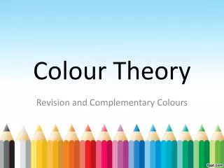
Explore the essentials of colour theory and its applications in graphic communication. Learn about the colour wheel, harmonising and contrasting colours, warm and cold colours, tone, tints, shades, and their impact on design.

E N D
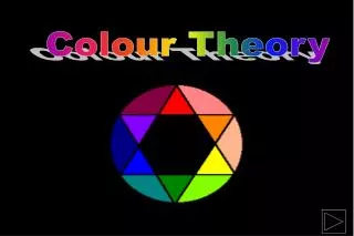
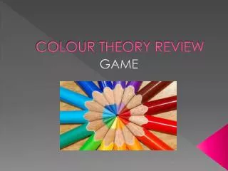
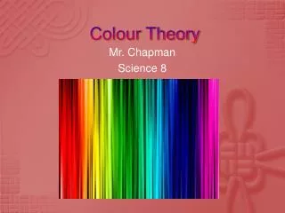
Colour Theory Graphic Communication CDT Department
Graphic Communication • Colour theory is needed for the Knowledge & Interpretation and the Presentation & Illustration Grades. • This consists of a range of different aspects.
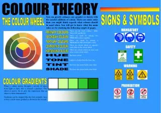
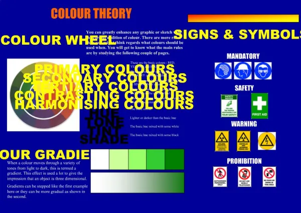
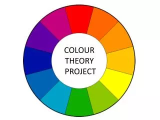
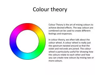
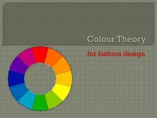
Graphic Communication • You will need to know about the colour wheel. • What colours are contrasting? • What colours are harmonious? • What colours are advancing? • What colours are receding? • What colours are warm or cold? • What is tone, tints and shades?
Harmonising Colours • Harmonising colours are beside each other on the colour wheel. • The following colours are harmonious: • Yellow & Orange • Red & Violet • Blue & Green
Contrasting Colours • Contrasting colours are on opposite sides of the colour wheel. • The following colours are contrasting: • Yellow & Violet • Red & Green • Blue & Orange
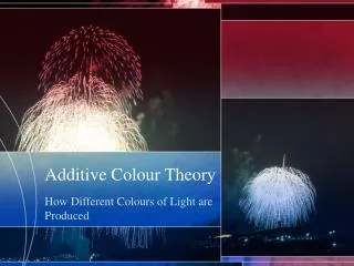
Advancing Colours • Advancing colours appear to come towards you when you look at them. • Advancing colours are warm colours: • red • orange • yellow
Receding Colours • Receding colours appear to move into the background when you look at them. • Receding colours are cold colours: • blue • green • violet
Warm Colours • These colours are used to give a feeling of warmth to a drawing. • They can also be used to show hot things as part of a symbol, like a red dot on a hot water tap. • red • yellow • orange
Cold Colours • These colours are used to give a feeling of coldness to a drawing. • They can also be used to show cold things as part of a symbol, like a blue dot on a cold water tap. • blue • green • violet
Tone • The tone of a colour is how strong or weak a colour is. • By applying more coats of a colour its tone can be made stronger. • This can be shown in the tonal bar.
Tint & Shade • Tints and shades are created by adding white or black to a colour. • White is added to a colour to give it a tint. Pale colours tend to be soft. • Black is added to a colour to give it a shade. Dark colours look as though they are heavy.
Red • Warm • Vibrant • Exciting • Active • Festive • Passion • Danger
Yellow • Warm • Sunny • Happy • Glowing • Easily seen
Blue • Cool • Elegant • Sophisticated • Formal • Classy
Green • Cool • restful • natural calm • soothing • fresh
Violet • Cool • Peaceful • Solitary
Orange • Warm • Happy • Cheerful • Energy • Refreshing
Greys Natural Restful Calm Browns Natural Earthly Safe Elegant Dignified Reliable Good Neutral Colours
Black & White • Dramatic • elegant • opposing • contrasting • sophisticated