Download
1 / 122
1.23k likes | 1.86k Views
Training Objectives Prepare you to plan for data collection and analysis by using the ASA Data Collection Plan Discuss various ways to display and analyze data Describe how to construct various graphs as they apply to the ASA Template Review the basics of creating charts using Excel

E N D
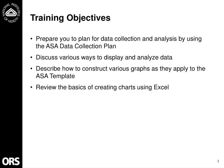
Training Objectives • Prepare you to plan for data collection and analysis by using the ASA Data Collection Plan • Discuss various ways to display and analyze data • Describe how to construct various graphs as they apply to the ASA Template • Review the basics of creating charts using Excel
PLAN before you act! • Data collection can be time consuming • Need to figure out the Who, What, Where, When, Why for each performance measure • Distribute the data collection responsibility among your ASA Team Members • Garbage in = Garbage out • Plan now to prevent crisis down the road
ASA Data Collection Plan • Takes ASA Template information and spells out the specifics of gathering data • Performance objective • Performance measure • Methodology • Point of Contact (POC) • Source of Data • Frequency • Target • Recommend EACH ASA Team complete ONE Data Collection Plan • Road map for the team’s data collection efforts • Distributes responsibilities among team members • Allows the team to communicate their methods to others • ASA Consultant, OQM, your Division/Office Director may request to review your Data Collection Plan
Completing the ASA Data Collection Plan • Step 1: Review Common Performance Objectives and Measures • Step 2: Add Unique Performance Objectives and Measures • Step 3: Review/Determine Methodology • Step 4: List Points of Contact (POC) • Step 5: List Source of Data • Step 6: List Data Collection Frequency • Step 7: List Target
Completing the ASA Data Collection Plan (cont.) • Common performance objectives and performance measures are already listed • Need to add Discrete Services as appropriate • Need to add unique performance objectives and measures as appropriate • Boxes with text can be edited if desired • Shaded areas typically do not need to be filled in
Step 1: Review Common Performance Objectives and Measures • Review common measures in each perspective • If measurement is occurring at the Discrete Service level • Enter your Discrete Services on the form • Plan provides for 3 Discrete Services for common measures • Add/delete rows for Discrete Services as necessary • If measurement will occur at the Service Group level • Change shaded boxes to white background on row that lists the common measure • Enter information in that row • Delete the rows for the Discrete Services
Step 1: Review Common Performance Objectives and Measures (cont.) Shaded areas usually require no entry Common performance measures from ASA Template are listed for each of the four perspectives.
Step 1: Review Common Performance Objectives and Measures (cont.) Type in Discrete Services for common measures as appropriate.
Step 1: Review Common Performance Objectives and Measures (cont.) • To add rows • Click left mouse button on DS3 • Choose “Insert”, “Row” • Select Columns A and B in new row • Choose “Format”, “Cells”, “Alignment”, “Merge Cells” • Click “OK” • Re-label and edit rows as appropriate
Step 1: Review Common Performance Objectives and Measures (cont.) • To delete rows • Click left mouse button on DS3 • Choose “Edit”, “Delete” • Click “Entire Row” • Click “OK”
Step 2: Add Unique Performance Objectives and Measures Type in Unique Performance Objectives and Measures on Template for each perspective. Add Discrete Services as needed.
Step 3: Review/Determine Methodology • Methodology is a summary of how you plan to gather and analyze the data • For common measures, review the suggested methodology and edit as appropriate • For unique measures, decide on appropriate methodology and type on template
Step 3: Review/Determine Methodology (cont.) Edit or develop methodology for data collection and analysis.
Step 3: Review/Determine Methodology (cont.) • Edit methodology as appropriate • To resize rows • Position mouse at bottom of row number at left of screen • A crosshair appears
Step 3: Review/Determine Methodology (cont.) Height: 236.25 • Click left mouse button to display row height • Move mouse up or down to increase or decrease row height
Step 3: Review/Determine Methodology (cont.) • To format cells for word-wrap • Select cell(s) with mouse • Choose “Format”, “Cells” , “Alignment” • Click “Wrap text”, “Merge cells” • Click “OK”
Step 4: List Points of Contact (POC) • Decide who will have primary responsibility for data collection and analysis for each performance measure • Serve as focal point regarding the data collection/analysis if several people are involved • Can provide Team Leader with updates on how data collection and analysis is proceeding • POC will ensure that data collection for that measure occurs in a timely fashion
Step 4: List Points of Contact (POC) (cont.) Type in Point of Contact for each measure as appropriate.
Step 5: List Source of Data • Identify where you will actually get the data for each measure • Possible sources of data include: • Ordering systems (ADB) • Budgeting systems (OROS) • Studies that have been conducted (Rate Studies) • Hard copy order forms • Tally of customer requests • Email messages • Phone calls • Observations
Step 5: List Source of Data (cont.) • If no known source exists • Need to develop methods to collect data • Check sheets useful for all kinds of data collection • Constructed to whatever size, shape, format appropriate for you • Easy to compile data in a way that can be readily graphed • Record data for later analysis using bar, pareto, and run charts • Provide historical record of the process over time • Can be used to introduce data collection to workers who may not be familiar with it • May want to use simple check sheet to summarize data already collected but not tallied
ExampleCheck Sheet Customer Contacts July Aug Sept Total Email Phone Visit Email Phone Visit Email Phone Visit Other ORS Div/Office 1111 1111 1111 12 NIH OD 11 11 1111 8 Clinical Center 111 111 111 111 111 111 18 NCI 1111 1111 1111 111 111 111 111 111 111 30 NHLBI 11 11 11 6 NIAID -- Other NIH Institute 1 1 1 1 4 HHS 11111111 11111111 11111 21 Outside Agency 11 11 11 11 11 11 12
Step 5: List Source of Data (cont.) • For more information on designing data collection forms: • Memory Jogger for an example of a Check Sheet (p.31) • Statistical Methods for Quality Improvement (pp. 7 - 16) • Guide to Quality Control (pp. 30-41) • Basic Tools for Process Improvement Module 7: Data Collection (pp. 12-23) • http://www.odam.osd.mil/qmo/pdf/datacoll.pdf • Process Improvement Notebook for Data Collection Sheet and Check Sheet (pp. 66, 68) • http://www.odam.osd.mil/qmo/pdf/pin.pdf
Step 5: List Source of Data (cont.) Type in Source of Data for each measure you have listed.
Step 6: List Data Collection Frequency • Identify the frequency of data collection for each measure • Examples include: • Ongoing (e.g., ordering systems) • Weekly (e.g., count of number of complaints) • Monthly (e.g., utilization statistics) • Quarterly (e.g., financial reports) • Once per fiscal year (e.g., customer survey) • Some Common Measures are filled in for you
Step 6: List Data Collection Frequency (cont.) Type in Frequency of Data Collection for each measure.
Step 7: List Target • Identify the target performance level for this FY if possible • Targets are usually identified after it is understood what the process is capable of doing • Consult Service Level Agreements (SLA) if they exist • Examples include: • Response time within 3 business days • 95% of reports error free • Actual asset utilization within 10% of plan • Reduce use of vendors by 5% • If performance measure is being defined for the first time this year • True process capability is being defined for first time • Type in “Baseline” under “Target” • Targets for some Common Measures are filled in for you
Step 7: List Target (cont.) Type in Target performance for each measure listed on your Plan.
There are Many Ways to Analyze Data • Two general types of data • Quantitative • Qualitative • Ways to analyze quantitative data • Through visual displays - graphs • Through process behavior charts • Through statistical analyses • Chi-square, t-tests, ANOVA, correlation, regression analyses, factor analysis • Through predictive modeling • LISREL
Common Graphs for Analysis • Pie charts • Bar charts • Pareto charts • Radar charts • Line graphs • Run charts • Process behavior charts • Scatter diagrams • Correlation • Gap analysis
Pie Charts • Often used to summarize categorical data • Show the proportional size of items that make up a whole • Convey the relative contribution of different categories to the total • Usually used with percentages • Good for simple descriptions, quick snapshots of some kinds of data
ORS ExamplePie Chart Conference Services Survey Respondents N=564
Bar Graphs • Useful for comparing different categories by contrasting heights of various bars • Helpful in making comparisons among items • Frequency, size, importance, satisfaction, dollars, etc. • Often used to show comparisons on more than one dimension • Categories of products ordered
ORS ExampleBar Graph Conference Services: Scheduling Actions that Occurred N=564
ORS ExampleBar Graph Categories of Photography Products Ordered by Year
Pareto Charts • Type of bar chart • Display bars in descending order • Help to focus efforts on areas that offer the greatest potential for improvement • Based on the Pareto principle • Most problems are due to a minority of categories of causes • For more information: • The Memory Jogger for more information (p. 95) • Building Continual Improvement (pp. 38-44) • Statistical Methods for Quality Improvement (pp. 17-24) • Basic Tools for Process Improvement Module 8 - Pareto Charts • http://www.odam.osd.mil/qmo/pdf/pareto.pdf • The Process Improvement Notebook for Pareto Chart of Causes of Quality form (pp. 70-73) • http://www.odam.osd.mil/qmo/pdf/pin.pdf
ExamplePareto Chart Improvement Ideas Supported by Customers N=250
Radar Charts • Used to compare actual values on a series of categories to ideal values • Allows comparison among data points • Encourages identifying strengths and weaknesses • See The Memory Jogger for more information (p. 137-140)
ExampleRadar Chart Ideal Value Actual Value
Line Graphs • Used to study data for patterns • Helpful in making comparisons over time • Show changes in numerical amounts • Identify sequences/changes in data • Demonstrate performance before and after an intervention • Can be used to predict future performance • Run charts and process behavior charts are types of line graphs • For more information: • The Memory Jogger (pp. 141-144) • Building Continual Improvement • The Process Improvement Notebook for Run Chart and Control Chart forms (pp. 82-98) • http://www.odam.osd.mil/qmo/pdf/pin.pdf
ExampleLine Graph Ratings of Responsiveness to Customer Complaints by Year N=125
ORS ExampleLine Graph NIH ID Cards Issued by Year
Scatter Diagrams • Demonstrate the relationship between two variables • Values on two variables are plotted on a graph to visually show the relationship • For more information: • The Memory Jogger (pp. 145-149) • Statistical Methods for Quality Improvement (pp. 67-89) • The Process Improvement Notebook for Scatter Diagram Worksheet (pp. 78-81) • http://www.odam.osd.mil/qmo/pdf/pin.pdf
ExampleScatter Diagram Gap Analysis of Customer Ratings of Satisfaction and Importance Each symbol indicates both the importance and satisfaction rating for a variable, such as timeliness.
Analyzing Data With Graphs Customer segmentation charts are good examples of these.
Analyzing Data With Graphs (cont.) Customer satisfaction results will be provided to Service Groups using radar charts.
Analyzing Data With Graphs (cont.) Internal Business Process measures often require run charts or control charts. Control charts are a special type of run chart. Training on process behavior charts will be available (http://www.nih.gov/od/ors/od/oqm/asa/asa_training.htm)
Analyzing Data With Graphs (cont.) Scatter charts depict the correlation between 2 variables and can be used to investigate hunches you may have about relationships.