Download
1 / 31
310 likes | 424 Views
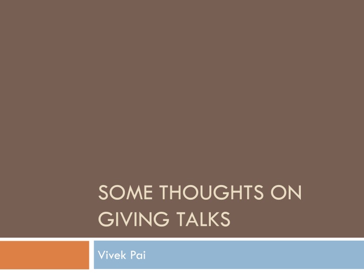
Some thoughts on giving talks. Vivek Pai. Was The Opening Slide a Good Idea?. Wasted top 2/3 of screen Top is the valuable real estate Bottom may be obscured based on room. Was The Opening Slide a Good Idea?. What about the color scheme? White on light blue is asking for trouble

E N D
Some thoughts on giving talks VivekPai
Was The Opening Slide a Good Idea? • Wasted top 2/3 of screen • Top is the valuable real estate • Bottom may be obscured based on room
Was The Opening Slide a Good Idea? • What about the color scheme? • White on light blue is asking for trouble • Some projectors may make that light blue look like white • Light colors are fine for accents, but bad for critical areas
Was The Opening Slide a Good Idea? • How about branding? • What should people remember? What do you tell them? • Title is important, and so is name. What about affiliation? • Better yet, make title larger
What About the Body Slides? • Title size, location looks decent • Slide format is uncluttered – that’s a plus • Font is ok – it’s not Comic Sans, for example • People hate Comic Sans • Avoid it if only for that reason
Do The Body Slides Use Real Estate Wisely? • Size of title block ok • Body text block uses most of available area • What about the very bottom? • What should go there?
What To Put At The Bottom • Your name – use this opportunity to remind people who you are • Talk title – again, drive it home • Page number – if someone wants to ask a question, they can do so by page number Your Name Talk Title Page Number
What About More Complicated Designs? • This is a horrible choice • There’s too much contrast • Too many high frequencies
When Should You Use Images • All the time • As appropriate • Images convey information • Not distraction • Not jokes, humor • Use them instead of describing
But My Computer Is So Powerful! • It can do transitions! • It can make this magically appear • It can make things bounce! It can draw all sorts of cool letters
But What Is Your Goal? • Presentation, not distraction • Do not overshadow your message
Simple Slides Are Important • Pick a good design • Simple background • Good color choices • Do not crowd yourself • 7 x 7 rule • 7 lines of text • 7 words per line • Use as much of screen as realistic
General CS Slide Rules • Make text readable • Minimize eyestrain • Avoid complete sentences
Other Slide Types - Consulting • Justify extremely high rates • Obviate need to read actual report • Meant to be read printed • Lots of lines of text • Lots of complete sentences • Small fonts
Other Slide Types - Military • Lots of acronyms • Very dense – like consulting • Avoid complete sentences
Font Choices • Simple fonts • Stick to main font families • Not something weird, like Lucida Blackletter • Serif vs San Serif • Serifs maybe minimize eyestrain • San Serif may pack tighter • Avoid parallelism problems of Arial Narrow
Color Choices • Primary colors: red, green, blue • Easy to project • Easy to specify • Bad for color-blind users • Red-green color-blindness is common • More prevalent in males • About 7-10% of population • Orange-blue safer than red-green
Graphing Choices • Paper is about accuracy • Presentation is about understanding • It’s ok to decrease precision to improve understanding
Other Talk Guidelines • Don’t fidget • Don’t stand in the way • Turn off automatic notifications • Speak into microphone • Have fun
Summary • Make slides readable • Use space wisely • Make graphs non-default • Goal: make people want to follow your talk