Download
1 / 12
120 likes | 234 Views
What Should I Include in My M edia?. Designing for Students with Visual I mpairments. Sizing. Use a larger size font, 14 or 16 point Adjust paper size so that word groupings look practical Which sentence is easier to read? Which sentence is easier to read ?

E N D
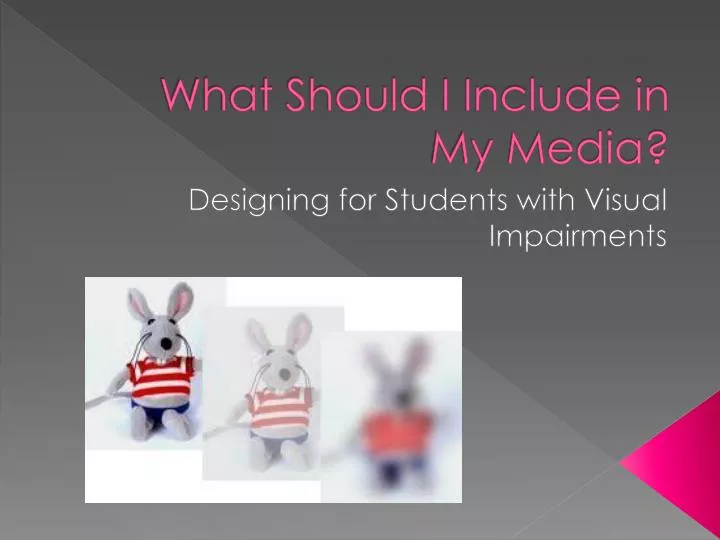
What Should I Include in My Media? Designing for Students with Visual Impairments
Sizing • Use a larger size font, 14 or 16 point • Adjust paper size so that word groupings look practical Which sentence is easier to read? Which sentence is easier to read? Which sentence is easier to read?
Typefaces • Avoid odd or indistinct typefaces • Courier is better than Times New Roman • Print all numbers clearly (a 3 can easily be mistaken for a 5) Don’t Use: Hello Hello Hello Hello
Contrast • Use a color combination that is easy to read Good Contrast Bad Contrast
Weight • Use a medium or bold type weight, avoid light weights Good Choices: Hello Hello Hello Hello Not so Good Choices: Hello Hello Hello Hello
Capital Letters • Avoid using long strings of capital letters EX. LONG STRINGS OF CAPITAL LETTERS ARE HARDER TO READ! SO THEREFORE, WE SHOULD AVOID USING THEM WHEN CREATING OUR MEDIA FOR THOSE WITH VISUAL IMPAIRMENTS.
Line Length • Keep lines to 50-65 characters or less • Avoid using hyphens at the end of lines EX. For example, when we use long senten- ces that seem to go on and on forever an-d have hyphens at the end of lines, it be-comes increasingly difficult to comprehend the text.
Spacing • Use regular spacing between words • Use line spaces between paragraphs and unrelated sections in a text • Avoid justifying text • Avoid rotating text or wrapping around an illustration • When creating forms, use larger spaces for handwriting This makes it harder to read This is hard to read as well
Paper • Avoid using glossy or thin paper When writing on glossy surfaces, text can be harder to focus on. When writing on thin paper, text can show through both sides.
Visuals • When adding visuals to media, consider adding audio as well. • Make sure visuals are larger and clear.
Other Features to Consider • In addition to those mentioned in this presentation, one should always keep in mind the usual media design aspects • Titles/headings • Summaries • Outlines • Italics
References • Chapter 17 in Anglin’s BOOK 2nd EDITION: Message Design-Issues & Trends by Grabowski • Chapter 32 in Resier & Dempsey’s BOOK: Using Rich Media Wisely by Clark & Mayer. • Hartley, J. (2004). Designing instructional and informational text. In D. H. Jonassen (Ed.) Handbook of Research in Educational Communications and Technology (2nd edition). Mahwah, N.J: Erlbaum. ISBN 0 8058 4145 8. Retrieved August, 28, from http://www.aect.org/edtech/34.pdf • http://www.google.com/imgres?q=media+for+the+visually+impaired