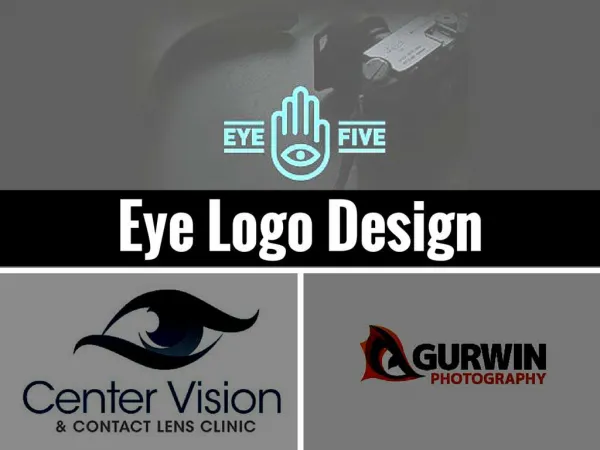
Elevate your brand with our expert logo design and development services. Our team offers innovative ideas tailored to your business needs, guiding you through the logo creation process from start to finish.
An Image/Link below is provided (as is) to download presentationDownload Policy: Content on the Website is provided to you AS IS for your information and personal use and may not be sold / licensed / shared on other websites without getting consent from its author.Content is provided to you AS IS for your information and personal use only. Download presentation by click this link.While downloading, if for some reason you are not able to download a presentation, the publisher may have deleted the file from their server.During download, if you can't get a presentation, the file might be deleted by the publisher.
E N D
Presentation Transcript
Logo Ideas & Development
Logo Development On this page, I will be displaying the stages that I have worked through to achieve the final logo for my company – Zen Promotional & Merchandise Products Company – this finalised logo will be the ambassador and the core representative for the company , the logo will give the clients or any potential clients first impressions of the company, whether the company is experienced or professional enough to earn the clients’ trust and investment in the company. Therefore, the logo will be the important forefront of the company. Stage 1 Stage 2 Stage 3 Main Tools Used: Line Tool Grid Lock: On Main Tools Used: Delete Line Segment Tool (Delete Part Tool) Grid Lock: On Main Tools Used: Rotational Tool Grid Lock: Off To create the outline of my logo in the TechSoft 2D Design CAD software, I first used a Line Tool to draw out the basic outline of my logo vertically. To ensure that the lines are perfectly aligned and straight, I have turned on the Grid Lock to ensure point to point fully horizontal accuracy. I also encountered some difficulty when forming the checkmate pattern at the top of my logo, later, once I have asked my teacher for assistance, he advised me that I should form a grid pattern with the Line Tool, and later, remove any unwanted lines to form the checkmate pattern. During this stage, after I have created the initial outline and the grid form pattern in Stage 1, I used the Delete Line Segment Tool, where it only deletes lines with ends or where it has been crossed by another line at a junction. This way, I could then continue with creating the checkmate pattern, which I had difficulty in doing so before. To form the vertical/diagonal logo layout that I have designed, I selected the horizontal shape from the previous stage and left-clicked on my mouse on the yellow Circle Handle to rotate the horizontal shape around 50-60 degrees counter-clockwise until the ‘Blade-like Edge” is horizontal. Stage 6 Stage 5 Stage 4 Main Tools Used: Text Tool Fill Tool Grid Lock: Off Main Tools Used: Line Tool Text Tool Grid Lock: On Main Tools Used: Text Tool Grid Lock: Off In this stage, I have decided to extend the body of the logo once again, but I will only be extending the checkmate pattern by adding an extra set of 3 squares at the end to make the checkmate or fading design much more obvious as I wanted this shape intended to look like a modern version of a brushstroke, a typical Asian theme, with fading ends, as a brushstroke would do, as the brush dries up with no ink left. However, in the end, I have settled with the original length, as a longer would prove to be too large to fit on company items, such as Business Cards, and finished products. In this stage also the final stage, I have change and decided that the final font should be Clarity Gothic SF, which will be standard as the corporate font. I have also added color with the Fill Tool, I have chose the color red, and with the font, these will form the corporate branding and livery for Zen Promotional & Merchandise Products Company. During this stage, I have also created a black (monochrome) version of my logo, which the logo should be visible in a white background. After forming the correct position of my logo, I then began to add the company’s simplified acknowledged name (Zen) by using the Text Tool. Initially, the first shapes that I have created horizontally wasn’t long enough to accommodate the large bold uppercase texts, therefore, I did have to extend the body of the shape of the logo until it is long enough to accommodate the text, as well as long enough to be aesthetically pleasing to the eye. At this stage I have temporarily chose the Arial Black font with fine black outline, this way, the logo would be visible in a black background monochrome.
Designing My Character On this page I will be recreating the character in my book in 2D Design V2 and explaining in a steps of how I have created him. I will be designing him in Vector format because it makes it easier to work with, more flexible and if I ever feel I need to tweak or modify anything, I can do it with ease. For my fourth step, I removed the excess lines and began adding some detail into my character. I created the structure of the face with basic shapes as well as creating the tail and hands of my character. First I did the very basic shapes of my character using basic geometry shapes in 2D Design V2. I did this to form a foundation of my design and a basic guideline of my character. For my fifth step, I started finalizing my design and started to add some detail, such as the detail on the suit, and the face of the tiger. I did this using a range of tools, such as the Path and Arcs tool. For my second step, I removed some of the excess lines to create a more simpler, less complicated guideline and foundation for my design. I also added the tail to my design using the Path tool. For my third step, I started designing the head of my character as well as starting to work from the foundation that I created for my design. The lines in red are the modifications/tweaks that I will not be deleting in my next step. For my final step, I finished by adding the rest of the design and did a few tweaks/modifications. To finish this, I used a range of tools, such as the Path Tool and Arcs Tool. Conclusion In conclusion, taking into my experience and the amount of time I spent on creating this, I say that my final outcome turned out pretty well. However, if I had more experience and more time I could have easily made some great improvements and tweaked it a little. For example, making the bottom half of the tiger’s face white instead of orange, or perhaps tweak the lines of my final outcome so that they do not overlap each other, but with my level of experience and the time I had, I say the final outcome went pretty well.
LOGO DESIGN IDEAS 2. 1. LOGO NAMES LOGO NAMES LOGO NAMES LOGO NAMES Logo 2 is made up of the company name with a branch/leaf design. The logo is very elegant and aesthetically pleasing. The logo is also very eye-catchy as it has a very rare and original design. The leaf-like design represents harmony and equality. The logo consists of only one colour (Black) this makes it easy and cheap to mass produce and manufacture. It also makes it easy to print onto many different coloured backgrounds. Logo 1 is made up of the company name (GO) and it also contains leaf design which flows around the company name. The leaf design represents harmony between cultures and countries. The logo is very proportionate and the bold design is eye catchy which makes it very easy to remember and it also makes it aesthetically pleasing. Not too many colours are used which will make it easy and cheap to manufacture. Sporty Seller GO Football Merchant Sport Geeks 5. 3. 4. S Logo 3 has a very nice design. The logo discretely makes up the company name (GO) and it is very proportionate. The logo is in black and whitewhich makes it easy to print onto a lot of different coloured backgrounds. The logo has a very modern look to it which will represent the current generation. The logo is very original and eye-catchy. Logo 4 has a very simple design. It only contains the company name (GO) and it is made up of only 2 colours (yellow and black). The logo is simple but effective. This makes it very attractive and elegant to the eye. The logo is not complicated and it is fit for its purpose. The logo would be easily and cheaply produced because of it simplicity. Logo 5 displays my company name (GO) with a bold outline. This makes it eye catchy and very original. The logo is black and white which will be easy to produce and manufacture. I think that the logo has a very nice and simple design to it which will suit my target audience. It also looks modern and very eye-catchy. Junéid Mohammed – Design & Technology: Graphic Products
LOGO DEVELOPMENT: I have selected my best logo design so I must now create it using computer aided design (CAD). The best format for a logo is VECTOR format because a VECTOR image is easily resizable so if I need my to resize my logo to a bigger or smaller size it will not look deformed or distorted in any way. A bitmap on the other hand will look pixelated if I have to resize the image. I will be using Photoshop to make a rough design of my logo. I will then use illustrator to make my final vector logo. T “Hit The Road” PEN TOOL PEN TOOL TYPE TOOL PEN TOOL Firstly, I inserted my company name “GO”. I used the font; “Hit The Road” because it was simple, bold and it was also similar to the font used in my sketches. This creates a foundation to the rest of the upcoming designs. Secondly, I drew the bottom-half section of the leaf design from my sketches. I did that by using the pen tool in Adobe Illustrator. I only drew half of the design so that I can duplicate it to receive a better finish. Then, I duplicated the bottom-half leaf design which I then mirrored to fit the other side of the design. I used the duplicate method so that the design is more accurate and so that it doesn’t look out of proportion. I then went on to complete the rest of the leaf design by drawing the top section of the leaf design using the pen tool. I made sure that the leaf was good in proportion and size. The logo is now complete. The logo has a lot of advantages as it is very diverse in manipulating and commercial advertisement. I made sure that I only used one colour for my logo so that it will be possible to be displayed and used on different coloured backgrounds without any trouble as the logo can be changed to any colour. This is also good because the logo creates a silhouette-like design which makes it appealing to the eye. O PEN TOOL Finally, I completed the logo design by duplicating the final element to the design. I made sure that the duplication was mirrored correctly so that the proportion is right. Junéid Mohammed 9881 – Design & Technology: Graphic Products