Download
1 / 17
170 likes | 187 Views
Learn to interpret scatter plots, identify correlations, & make predictions using linear models. Study examples & assess the line of best fit with practice quizzes.

E N D
Warm Up Problem of the Day Lesson Presentation Lesson Quizzes
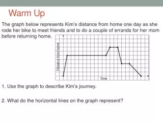
Warm Up Describe a scatter plot representing data with the given characteristics. 1. A strong positive correlation or association between the two variables. 2. A strong negative correlation or association between the two variables. Linear pattern of dots going upward from left to right. Linear pattern of dots going downward from left to right.
Problem of the Day The temperature at the base of a Hawaiian mountain is 75o F. For every 1000-ft increase in elevation, the temperature drops by 10o F. Describe the association or correlation between these two variables: temperature and elevation. negative
Learn to identify patterns in scatter plots, and informally fit and use a linear model to solve problems and make predictions as appropriate.
Vocabulary clustering
When data points in a scatter plot are grouped more in one part of the graph than another, it is called clustering. Clustering helps identify possible relationships between data.
Helpful Hint Be sure to consider outliers when making predictions or drawing conclusions from data. One outlier can greatly change some statistical measures.
Additional Example 1: Observe the Pattern A study is conducted to measure the effect of fatigue on texting speed. A. Describethepattern. B. Identify any clustering. C. Identify any possible outliers. The scatter plot appears to have a linear pattern. There appears to be clustering of the data points at x = 10. There appears to be an outlier data point at x = 35.
Check It Out: Example 1 The sales of fruit bars are shown in the scatter plot. A. Describethepattern. B. Identify any clustering. C. Identify any possible outliers. The scatter plot appears to have a linear pattern. There appears to be an outlier data point at x = 1. There appears to be clustering of the data points at x = 0.25.
Additional Example 2: Assessing the Line of Best Fit Compare the given scatter plots of data and their lines of best fit. Tell which model better fits the data. Explain your answer. Both scatter plots show data sets that have a positive correlation. The points in Graph A are closer to the line of best fit than in Graph B. The points are closer and more evenly divided both above and below the line of best fit.
Check It Out: Example 2 Compare the given scatter plots of data and their lines of best fit. Tell which model better fits the data. Explain your answer. Graph A has a negative correlation and Graph B has a positive correlation. The points in Graph A are closer to the line of best fit than in Graph B.
Additional Example 3: Economics Application Estimate an equation for the line of best fit, and tell what the slope and y-intercept represent in terms of the data it models. y = 20x + 130 Players gain about 20 lb/yr and begin at about 130 lb.
Check It Out: Example 3 Estimate an equation for the line of best fit, and tell what the slope and y-intercept represent in terms of the data it models. y =5x + 70 For every hour a student study, their grade increase about 5%. Without studying, most students would earn a 70%.
Lesson Quizzes Standard Lesson Quiz Lesson Quiz for Student Response Systems
Lesson Quiz Use the scatter plot for Items 1–4. 1. Does the pattern of association between the two variables appear to be linear or nonlinear? 2. Identify any clustering. 3. Identify any possible outliers. linear none x = 3
Lesson Quiz Use the scatter plot for Items 1–4. 4. Find an equation for the line of best fit, and tell what the slope and intercept represent. y = -3x + 55. For each month on the diet, the dogs lost an average of 3 lb. On average, the dogs began at a weight of 55 lb.
Lesson Quiz for Student Response Systems 1. Does the pattern of association between the two variables appear to be linear or nonlinear?. A. Linear B. Nonlinear 2. Identify any possible outliers. A. x = 0.25 B. x = 0.75 C. x = 1 D. x = 100