Download
1 / 41
410 likes | 535 Views
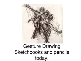
Sketchbooks. A little Respect, Please. Picasso always kept a sketchbook. Turner’s Sketchbook. Your Sketchbook is Important!.

E N D
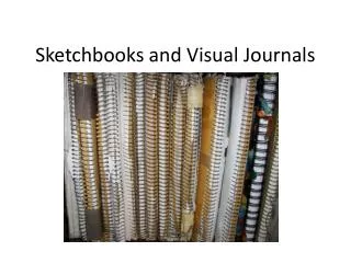
Sketchbooks A little Respect, Please
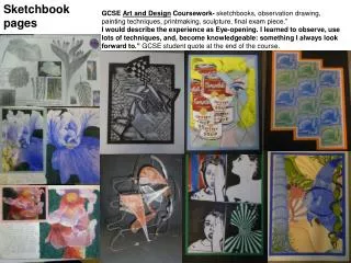
Your Sketchbook is Important! • A sketchbook is a creative document that contains both written and visual material. It is a place for researching, exploring, planning and developing ideas – for testing, practicing, evaluating and discussing your project. It is the place where you learn from other artists and express and brainstorm ideas.
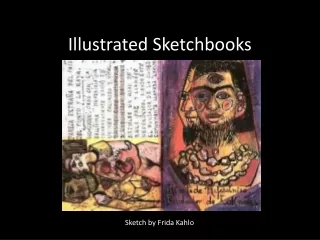
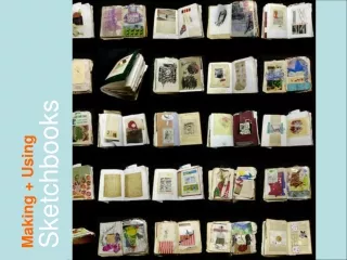
What is in Your Sketchbook? • The sketchbook is an important part of your Coursework project. It shows the journey (or development) towardsyour final piece and contains critiques/self evaluation, homework and planning that reflects: • Drawings, diagrams, thumbnails, composition plans, paintings and/or designs (particularly those that are incomplete or experimental) • Practice and trials of different techniques and processes • A range of mixed mediums and materials • Evidence of first-hand responses to subject matter and artworks, demonstrated through observational drawings, photographs and annotated pamphlets and sketches from exhibitions or gallery visits. • Digital printouts of relevant artist work • Your Critiques must also be in your sketchbook, no exceptions!
Create a dense and layered creativity page. Avoid the Cheese!
Now, A word about art projects Common Mistakes made by art students
AVOID Producing weak or uninspiring compositions Compositional errors can be broken into the following four categories: • Cheesy: Surprisingly, there are still students who attempt to create artworks containing hearts; glitter; prancing horses; leaping dolphins or bunches of roses. Overly ‘pretty’, cliché and/or unimaginative subjects are rarely successful. • Boring: Those who select appropriate but common subject-matter (i.e. portraits) but make no effort to compose these in an innovative way, do themselves no favors. Even highly able students sometimes submit projects that make an teacher want to yawn. (A less able student, on the other hand, with exciting ideas and clever compositions, can make an teacher sit up and take notice). • Simple: Another common compositional error – usually evident in weaker students – is to avoid complex / challenging arrangements and/or choose a scene that is completely ‘flat’ or formless (i.e. an enlarged detail of a brick wall or a cloudy sky). This is unlikely to give you sufficient opportunity to render complex three-dimensional form and runs the risk of limiting or stifling your project. • Unbalanced: Every image, page and preparatory component of your high school Art project should be arranged in a well-balanced, aesthetically pleasing way.
AVOID Taking Too Long To Begin • Some students are struck with a fear that they don’t have an original starting point or that they haven't interpreted their topic in quite the right way. They spend weeks fretting over their topic selection and worrying whether it is good enough. • Here’s the truth: it’s not the idea that matters – it’s what you do with it. Even the lamest beginnings can become draw-droppingly amazing if they are developed in the right way, with reference to the right artist models • Delaying your project in the hope of stumbling upon a ‘perfect’ topic rarely works: instead it results in panicked, last-minute submissions that are a pale shadow of what they could have been, had the full allotment of time been used. Great high school (in almost all cases) needs time. • Do yourself a favor and begin.
AVOID Drawing From Second Hand Sources Drawing or painting from images taken by others is one of the most risky strategies a high school Art student can use. It sets off alarm bells for the teacher, as it can indicate a lack of personal connection to a topic, a lack of originality, plagiarism issues and result in superficial / surface-deep work. Using images sourced from magazines, books and the internet screams of one thing: a student who cannot get off their backside long enough to find something of their own to draw.
Tips for GoodComposition: Remember the “Rule of Thirds” • Align any horizontals and verticals to the thirds of the picture • Keep focal point in one of the intersections. AVOID centralized composition, keep focal points away from touching the sides and away from the center. • Avoid big empty spaces in the center • Do not place identical shapes, etc. in each of the four corners. Have a balanced and equal amount of positive and negative space with interesting shapes Vary scale and size, do not have all your shapes floating in the same plane; overlap and group