Download
1 / 33
330 likes | 465 Views
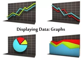
1.1 Displaying Data Visually. Learning goal: Classify data by type Create appropriate graphs MSIP / Home Learning: p . 11 #2, 3ab, 4, 7, 8. Why do we collect data?. We learn by observing Collecting data is a systematic method of making observations

E N D
1.1 Displaying Data Visually Learning goal: Classify data by type Create appropriate graphs MSIP / Home Learning: p. 11 #2, 3ab, 4, 7, 8
Why do we collect data? • We learn by observing • Collecting data is a systematic method of making observations • Allows others to repeat our observations • Good definitions for this chapter at: • http://www.stats.gla.ac.uk/steps/glossary/alphabet.html
Types of Data • 1) Quantitative – can be represented by a number • Discrete Data • Data where a fraction/decimal is not possible • e.g., age, number of siblings • Continuous Data • Data where fractions/decimals are possible • E.g., height, weight, academic average • 2) Qualitative – cannot be measured numerically • e.g., eye colour, surname, favourite band
Who do we collect data from? • Population - the entire group from which we can collect data / draw conclusions • Data does NOT have to be collected from every member • Census – data collected from every member of the pop’n • Data is representative of the population • Can be time-consuming and/or expensive • Sample - data collected from a subset of the pop’n • A well-chosen sample will be representative of the pop’n • Sampling methods in Ch 2
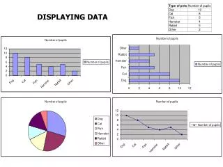
Organizing Data • A frequency table is often used to display data, listing the variable and the frequency. • What type of data does this table contain? • Intervals can’t overlap • Use from 3-12 intervals / categories
Organizing Data (cont’d) • Another useful organizer is a stem and leaf plot. • This table represents the following data: 101 103 107 112 114 115 115 121 123 125 127 127 133 134 134 136 137 138 141 144 146 146 146 152 152 154 159 165 167 168
Organizing Data (cont’d) • What type of data is this? • The class interval is the size of the grouping • 100-109, 110-119, 120-129, etc. • No decimals req’d for discrete data • Stem can have as many numbers as needed • A leaf must be recorded each time the number occurs
Displaying Data – Bar Graphs • Typically used for qualitative/discrete data • Shows how certain categories compare • Why are the bars separated? • Would it be incorrect if you didn’t separate them? Number of police officers in Crimeville, 1993 to 2001
Bar graphs (cont’d) • Stacked bar graph • Compares 2 variables • Can be scaled to 100% • Double bar graph • Compares 2 sets of data Internet use at Redwood Secondary School, by sex, 1995 to 2002
Displaying Data - Histograms • Typically used for Continuous data • The bars are attached because the x-axis represents intervals • Choice of class interval size (bin width) is important. Why? • Want 5-6 intervals
Displaying Data –Pie / Circle Graphs • A circle divided up to represent the data • Shows each category as a % of the whole • See p. 8 of the text for an example of creating these by hand
Scatter Plot • Shows the relationship (correlation) between two numeric variables • May show a positive, negative or no correlation • Can be modeled by a line or curve of best fit (regression)
Line Graph • Shows long-term trends over time • e.g. stock price, price of goods, currency
Box and Whisker Plot • Shows the spread of data • Divides the data into 4 quartiles • Each shows 25% of the data • Do not have to be the same size • Based on medians • See p. 9 for instructions • We will revisit in 3.3
Pictograph • Use images (size or quantity) to represent frequency
Timeline • Shows a series of events over time
Heat Map • Use colours to represent different data ranges • Does not have to be a geographical map • e.g., Gas Price Temperature
MSIP / Home Learning • p. 11 #2, 3ab, 4, 7, 8
Mystery Data • Gas prices in the GTA
An example… • these are prices for Internet service packages • find the mean, median and mode • State the type of data • create a suitable frequency table, stem and leaf plot and graph 13.60 15.60 17.20 16.00 17.50 18.60 18.70 12.20 18.60 15.70 15.30 13.00 16.40 14.30 18.10 18.60 17.60 18.40 19.30 15.60 17.10 18.30 15.20 15.70 17.20 18.10 18.40 12.00 16.40 15.60
Answers… • Mean = 494.30/30 = 16.48 • Median = average of 15th and 16th numbers • Median = (16.40 + 17.10)/2 = 16.75 • Mode = 15.60 and 18.60 • Decimals so quantitative and continuous. • Given this, a histogram is appropriate
“Having the data is not enough. [You] have to show it in ways people both enjoy and understand.” - Hans Rosling http://www.youtube.com/watch?v=jbkSRLYSojo 1.2 Conclusions and Issues in Two Variable Data Learning goal: Draw conclusions from two-variable graphs Due now: p. 11 #2, 3ab, 4, 7, 8 Infographic due tomorrow MSIP / Home Learning: Read pp. 16–19 Complete p. 20–24 #1, 4, 9, 11, 14
What conclusions are possible? • To draw a conclusion… • Data must address the question • Data must represent the population • Census, or representative sample (10%)
Types of statistical relationships • Correlation • When two variables appear to be related • i.e., a change in one variable is associated with a change in the other • e.g., salary increases as age increases • Causation • a change in one variable is PROVEN to cause a change in the other • requires an in-depth study • e.g., incidence of cancer among smokers • WE WILL NOT DO THIS IN THIS COURSE!!! • Don’t use the p-word!
Case Study – Opinions of school • 1 046 students were surveyed • The variables were: • Gender • Attitude towards school • Performance at school
Example 1 – cont’d • The majority of females responded that they like school “quite a bit” or “very much” • Around half the males responded that they like school “a bit” or less • Around 3 times more males than females responded that they hate school • Since they responded more favorably, the females in this study like school more than males do
Example 2a – Is there a correlation between attitude and performance? • Larger version on next slide…
Example 2a – cont’d • Most students answered “Very well” when asked how well they were doing in school. • There is only one student who selected “Poorly” when asked how well she was doing in school. • Of the four students who answered “I hate school,” one claimed he was doing well. • It appears that performance correlates with attitude • Is 27 out of 1 046 students enough to make a valid inference? • It depends on how they were chosen!
Example 2b - cont’d • From the data, the following conclusions can be made: • All students who responded “Very poorly” also responded “I hate school” or “I don’t like school very much.” • A larger proportion of students who responded “Poorly” also responded “I hate school” or “I don’t like school very much. • It appears that there is a relationship between attitude and performance. • It CANNOT be said that attitude CAUSES performance, or performance CAUSES attitude without an in-depth study.
Drawing Conclusions • Do females seem more likely to be interested in student government? • Does gender appear to have an effect on interest in student government? • Is this a correlation? • Is it likely that being female causes interest?