Download
1 / 41
420 likes | 1.41k Views
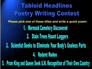
writing GREAT headlines. Beginning Journalism. Headlines are important…. They tell the reader what the story is about . A good headline lures the reader into the story and serves as a graphic element . A bad headline can ruin a good story if it fails to attract the reader.

E N D
writing GREAT headlines Beginning Journalism
Headlines are important… • They tell the reader what the story is about. • A good headline lures the reader into the story and serves as a graphic element. • A bad headline can ruin a good story if it fails to attract the reader.
What’s in a standard headline? • A headline usually consists of two parts…a primary headline and a secondary headline (or subhead). • primary headline grabs the reader’s attention with carefully selected words that summarize the story. It is usually large and is the most prominent text on the page. • secondary headline:adds information related to the story, leaves the reader wanting to know more. It is usually half the size of the primary headline.
follow the rules • Headlines must attract the reader honestly. You can’t promise something that isn’t in the story. • Headlines should cram as much information as possible into a small space, since readers tend to scan for interest.
…and these rules too • All extra words should be trimmed..leave out articles “a, an and the” • Headlines are written in present tense to give the reader a sense of immediacy • Avoid exclamation points and question marks: colons, semicolons, single quotes, commas are OK • Avoid “to be” verbs (is, are, was, were)
…and these rules too • Use a down style…all but proper nouns and the first letter of the first word are lowercase • Do not use the name of the school and the mascot • Avoid label headlines (“band” for the band story) or stating the obvious (“soccer team to play a game”)
more rules • Use names in headlines only if they are major newsmakers or very famous (OK: Britney Spears, Miley, Tiger, Bush, Obama, Clinton, etc.) • Cultivate a sense of humor…play on words and puns if they match the tone of the story
more rules • Avoid all caps…it is difficult to read (the Star does it, though, so it must be OK?) • Avoid splitting words or infinitives (to run) in headlines: no hyphens • Fill each line within two units of the letter “x” in lower case.
example of the “x” rule • This headline is too short for the spacexxx • Headline is just right to fill this here spacex • Yes, you may have to re-write more than once to get this headline thing correctxxxx
Clever examples • My word! Local teen allowed to compete in national spelling bee after all • No kidding, goat meat in short supply • Sentence not a cakewalk for diva of the catwalk • Landscape budget gets trimmed • Halloween scares up snow across Kansas • Pianist keeps city’s singers in good tune
Bad examples • Miners Refuse to Work after Death • 'Something Went Wrong in Jet Crash', Expert Says • Red Tape Holds Up New Bridges • Local High School Dropouts Cut in Half • Hospitals are Sued by 7 Foot Doctors • New Study of Obesity Looks for Larger Test Group
Bad examples • Include Your Children When Baking Cookies • Drunk Gets Nine Months in Violin Case • Iraqi Head Seeks Arms • Killer Sentenced To Die For Second Time in Ten Years • Arson Suspect Is Held In Fire • Juvenile Court To Try Shooting Victim
Typography • The personality for your publication
Types of Type Serif - with extensions (feet) usually what text is set in
Types of Type Sans serif - no extensions cleaner, more European look
Types of Type Cursive- looks like handwritten script
Types of Type Novelty - adds personality works well in small doses
This is set flush left. The left margin is even and the right one is ragged. It’s also called ragged right. The Heritage uses this for body copy. Alignment Flush Left – left margin is even
This is set flush right. The right margin is even and the left one is ragged. It’s also called ragged left. Alignment Flush Right – right margin is even
This is set justified. The left margin is even and the right one is even. The Patriot uses this for body copy. Alignment Justified – both margins are even
Selecting Fonts Body copy and cutlines are one font. Headlines are generally a different font. .
Selecting Fonts Use the KISS principal. Keep it Simple Stupid. Don’t mix a bunch of fonts. .
Font Size Standard body copy is nine or 10 points. Nine points 10 points Captions are usually one point smaller. Captioncaption Headlines can be lots of different sizes. More important stories use a bigger font. 72-18 pts.
Cool Uses of Type Logos
Cool Uses of Type Pulled Quote
Cool Uses of Type Reverse- white type on black or colored background
Cool Uses of Type Sidebars Additional content that complements Main story – Usually in graphic format