Download
1 / 11
120 likes | 748 Views
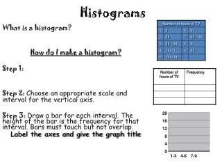
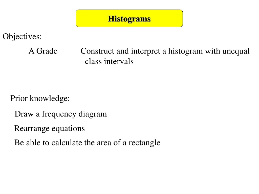
Histograms. Objectives:. A Grade Construct and interpret a histogram with unequal class intervals. Prior knowledge:. Draw a frequency diagram. Rearrange equations. Be able to calculate the area of a rectangle. Histograms. Summary of column graphs so far.

E N D
Histograms Objectives: A Grade Construct and interpret a histogram with unequal class intervals Prior knowledge: Draw a frequency diagram Rearrange equations Be able to calculate the area of a rectangle
Histograms Summary of column graphs so far A Bar Chart Sales of Paddling Pools per quarter A Frequency Diagram Time taken to complete a Table Test • Spot the differences from a bar chart to a frequency diagram: • There are no gaps between the bars • The horizontal axis has a continuous scale as it represents • continuous data • The width of the bars is the full width of the class interval • The class intervals (the width of the bars) is the same for all bars 6 5 4 Frequency 3 2 1 0 2 4 6 8 10 Time in Minutes
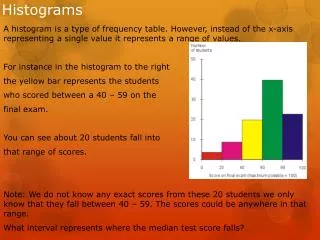
Histograms A histogram is a frequency diagram with unequal class intervals. The area of the bar represents the frequency Why have different class intervals? Sometimes data will be collected where there may be very little data in a class interval, and yet in another class interval of the same width. e.g. a survey was conducted to find the ages of surfers
Histograms e.g. a survey was conducted to find the ages of 60 surfers, the results are in the table below: Notice how the class intervals are different If you kept the class interval of 5 (as for ages 15 to 30) you may find several empty class intervals between 40 and 70 because the class width is different if we used frequency for the y-axis the sizes of the bars would represent the frequencies disproportionately.
Histograms We use frequency density to show the height. The frequency is the area of the bar The width of the bar is the class width Area of a rectangle = length × width frequency = frequency density × class width Frequency = AREA Frequency density rearranging this equation frequency density = frequency class width Class width
Histograms Draw a histogram to represent this data 1 3 15 5 3 2 5 5 1.6 1.2 10 1 3 30 3 2 1 Frequency density 0 10 20 30 40 50 60 70 Age (years)
Histograms From this histogram you could be asked further questions: Estimate how many people between the ages of 35 and 55 surf. Identify the area of the bars to which this applies. Remember: frequency is the area 3 2 1 1.2 Frequency density 1 3 55 35 5 Find the area separately of each bar 15 Estimate of the frequency = 6 + 5 = 11 5 × 1.2 = 6 15 × 1 = = 5 3 0 10 20 30 40 50 60 70 Age (years)
10 8 6 4 2 0 50 40 30 20 10 0 Frequency Density Frequency Density 10 11 12 13 14 15 16 17 18 19 20 151 152 153 154 155 156 157 158 159 160 Temperature oC Height (cm) Histograms Draw Histograms for these tables:
25 20 15 10 5 0 25 20 15 10 5 0 Frequency Density Frequency Density 0 2 4 6 8 10 12 14 16 18 20 11 12 13 14 15 16 17 18 19 20 Time (mins) Age (years) Histograms Draw Histograms for these tables:
Histograms Draw Histograms for these tables:
Histograms Draw Histograms for these tables: