Download
1 / 12
120 likes | 398 Views
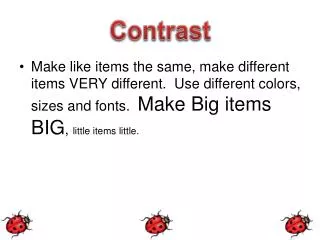
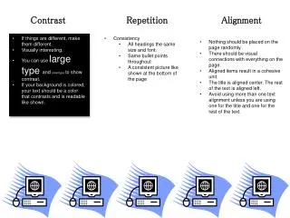
Contrast. Draw attention to your page. Contrast works with emphasis. No contrast is boring, and looks unorganized. The second example below emphasizes a focal point using contrast, though still is not aligned. Contrast: type. Large and small, formal and informal, condensed and expanded.

E N D
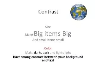
Contrast Draw attention to your page.
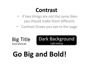
Contrast works with emphasis • No contrast is boring, and looks unorganized. The second example below emphasizes a focal point using contrast, though still is not aligned.
Contrast: type • Large and small, formal and informal, condensed and expanded.
Contrast: add interest • This flyer uses some contrast, a photo and contrasting sizes of type. But it’s still fairly staid and blah.
Contrast: make it bold! • Try to add interest by making contrast more dramatic.
Contrast: tips • Use bullets.
Contrast: tips • Boxes and rules offer a nice touch, although they are common tools.
Contrast: photography • Viewers may find photos with contrast intriguing.
Contrast in advertising • Some of history’s most successful advertising has used contrast to attract attention.
Contrast: an exercise • This flyer offers some contrast in illustration and larger headline, but it’s still pretty blah. How would you reinforce the theme while adding pizzazz?