Download
1 / 14
140 likes | 316 Views
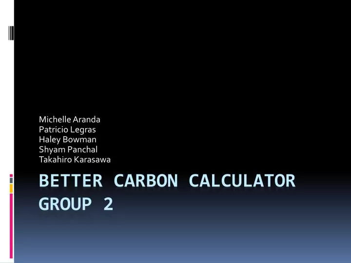
Michelle Aranda Patricio Legras Haley Bowman Shyam Panchal Takahiro Karasawa. Better Carbon Calculator Group 2. Better Carbon Calculator. Our group is focusing on: The visual aspect of the website What the number means on the result. Environmental Issue and Distribution.

E N D
Michelle Aranda Patricio Legras Haley Bowman ShyamPanchal Takahiro Karasawa Better Carbon Calculator Group 2
Better Carbon Calculator • Our group is focusing on: • The visual aspect of the website • What the number means on the result
Environmental Issue and Distribution • Environmental Issue • The reduction of the green house gasses emitted by a single person • IT intervention and Distribution • Modifying the layout and the visual aspect of the Better Carbon Calculator website • Show the user a graphical representation of the number of tons that they emit each year
Resources • Visual Aspects • Learn what the other carbon calculators have • Use of MTurk to gather information of what is needed on the current website • Graphical Representation • Research online how much a ton of Carbon Dioxide can be represented as
Roles • Visual Aspects • Michelle • Haley • Shyam • Programming • Patricio • Takahiro
The visual display here is in constant motion. The pictures are manipulated to appear like videos and are changing every five seconds or so to another ecological environment. This is an effective way to catch the users attention. Tabs that give the user more Information about the website and advise them on how to reduce their f ootprint or what to do next
Larger and more colorful graphics and buttons help direct users on what they should do first and create a more pleasing display. http://www.3degreesinc.com/carbon_calculator/
Using “green” pictures of the environment create a nicer display and contribute to the meaning of the website. After all, what we are trying to do is send the message that we need to stop polluting the environment to protect its beauty and efficiency. Buttons with graphics on them make the website easier to use because they add a visual aspect. We plan to place buttons like these next to the modules to better convey their purpose. http://www.begreennow.com/reduce-offset/carbon-calculator/
The graphics of this webpage capture the “greenness” that we mentioned before. The site includes aspects of the environment and uses recyclable-looking materials to create its images. These methods effectively communicate the website’s eco-friendly goals. http://www.b-e-f.org/
Tabs, like those used here, would be very helpful in communicating the background information, purpose, and goals of the Better Carbon Calculator website. The tabs make the aims of the website clearer and make the carbon calculator easier to use. Here is another example of effective buttons/graphics. http://www.carbonfund.org/Calculators/
Examples of Pictures That Would Be Used To Help The Aesthetics of the Better Carbon Calculator Website http://www.livescience.com/environment/060324_ glacier_melt.html http://www4.swansea.gov.uk/media/images/p/i/Reduce__ reuse_recycle_200px.jpg http://www.bio.warwick.ac.uk/res/resimg/csheppard1.jpg