Download
1 / 15
150 likes | 284 Views
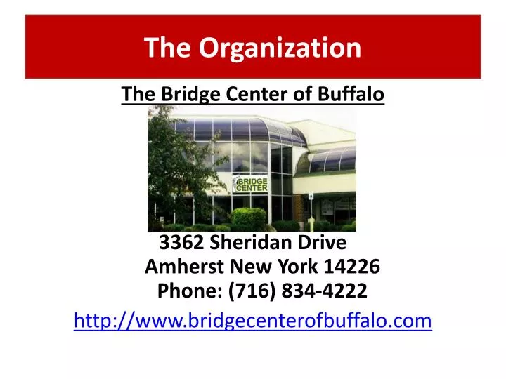
The Organization. The Bridge Center of Buffalo 3362 Sheridan Drive Amherst New York 14226 Phone: (716) 834-4222 http://www.bridgecenterofbuffalo.com. What is Bridge?. a partnership card game using a standard deck of 52 cards, dealt equally among four players

E N D
The Organization The Bridge Center of Buffalo 3362 Sheridan DriveAmherst New York 14226Phone: (716) 834-4222 http://www.bridgecenterofbuffalo.com
What is Bridge? • a partnership card game using a standard deck of 52 cards, dealt equally among four players • players bid in a coded language to describe their hands to their partners and then play to make their contract of tricks A card holder A “bidding box,” used by players to make called a “board.” bids at the table. • Generally, one suit is determined as “trump,” which led to the expression, “Play your trump card.” • Duplicate Contract Bridge, in which each competitor or team plays identical hands under similar conditions, is the main form of competitive bridge. A “traveler,” used for scoring
The Bridge Center of Buffalo, Inc. • Purpose/Mission: • To conduct duplicate contract bridge games sanctioned by the American Contract Bridge League (ACBL). http://www.acbl.org • To promote and stimulate interest in the game of bridge mainly by conducting educational programs. • To encourage the highest standards of conduct and ethics by its members, and to enforce such standards.
How We Became Involved • Board of Directors inquired about updating website through a member email survey • Solicited feedback from bridge players who access website • Bridge Center has very limited resources, so Eug. proposed LIS student help • B.o.D. and students prioritized areas of need and recommended: • Larger text size for menu (navigation bar), especially to meet the needs of elderly users • Required to keep yellow & blue font color (“vivid”) and white background • Add a more personable, inviting feel to webpages, such as by adding pictures • Create and post biographies for Mentors and Teachers • Create a Bridge Class Registration page & form so bridge students can sign-up directly on the site
Final Project Group • John Meczynski, Jr. • The “techie” of the group • Created homepage template & page styles, class regis. form • The “glue”: merged all pages to temporary host site • http://www.acsu.buffalo.edu/~jem44/LIS506/finalproject/ • Blodine Francois • The “task organizer/time manager” of the group • Created Mentors biographies/pages • Photos, tables, links • Initiated and Outlined Usability Test Scenarios & Questions • Eugene Harvey • “liason” btw. group and Board of Directors • Digitized & resized photos of teachers & mentors • Created teachers biographies/pages • Photos, tables, links • Implemented Usability Test • All of us • Brainstormed & outlined final project work goals • Identified & corrected minor errors on all pages (Proof reading) • Usability scenarios & statistical results • Power Point Presentation
Revision of Site Features • Font Size & Color • Size enlarged; color bolded • Ems vs. pts. • Pts.: “used for designing type for print, but are often unpredictable for displaying text on a computer screen.” • Ems: “measurement based on the height of the capital letter ‘M’…and the default font size.” • Benefits of Using Ems: • Respects users’ font size choices • E.g., if a user has “set the browser font size to a higher setting…then your font measurements will be reflective of those choices.” This is especially useful if you are designing a site for users who are more likely to have vision problems.
Revisions (cont’d) • Page margins • Table size based on pixels, not percentage • Limits width of table • Links • Larger font size relative to default font size • Rollover changed • Made more clear that user is rolling over a link • Mentor/Teacher Main Pages • Thumbnails (links to indiv. pages)
Revisions (cont’d) • Class Registration Form • Available for users who want to sign up for lessons • Validation • Certain fields must be filled out to send form – error given if the form is improperly filled out • Certain fields have format restrictions – e.g., email • User sent to “success page” upon successful submission • Removed unnecessary Javascript
Biography Pages • Inform • Contact Information • Expertise of Teachers & Mentors • Days and Times of Sessions • Recommended resources and links • Organization of Information • Tables • Divide information into headings and subheadings • Create clear format/layout
Biography Pages (cont’d) • Create Community • Pictures of people • Learn about Teachers and Mentors • Share Bridge experiences
Usability Testing • Developed 9 Multi-part questions & scenarios in 3 areas: • Identification and Comparison of Site Features • To gauge familiarity with current site, especially the homepage • To gather feedback about new homepage • Compare and contrast the two pages • Clarity & efficiency of site navigation • User Expectation of New Sections • Navigation buttons are self-evident/self-explanatory • Content of new webpages is self-evident/self-explanatory • Compare and contrast expectations with “reality” (the actual webpages) • Information Retrieval Tasks • Clarity of page design • Efficiency of information layout/format • Clarity and ease of navigation within site • Clarity and ease of navigation to/from external sites via internal links
Positive Findings • Site Features • Overwhelmingly preferred new homepage • Larger font size, more centered, less empty/“stark” • Major site features unchanged (photo, border, contact info.) • User expectations • Biography sections exceeded their expectations • Loved photos, personal backgrounds, interviews • “There is a sense of connection…” “…softens the website, makes it feel more personal.” “…makes the page feel warmer.” “good pictures too” • Major work goal: to make site “feel” more personal • Information Retrieval Tasks • Very little difficulty with most tasks (with one exception) • Liked the easy-to-scan table format and the delineation of sections (subheadings, tables, border) • Impressed with the easy-to-click links for resources • “That’s a nice feature…” “That’s cool…it takes me right there to see it.”
Problems • Minor Misspellings/“Typos” • Resources not clear on Teachers pages • Most users were slowed due to lack of clarity of resources - not sure of type of resource (i.e. a book, a website, etc.) • “Is that a book? (pause) Yep, I guess that’s a book.” “I wasn’t sure. I’m a very linear thinker.” • named a book, but then said, “…but I don’t know if it’s a book.” “I’m not sure if resources means books or not…” • “I’m not sure if these are books or not. I think they are…” “Yep, they are…” • Class Registration form • Canadian users not able to enter alphanumeric zip code due to validation rule • Difficulty entering phone number due to limited text field
Finally… HAVE FUN AND PLAY SOME CARDS! Thank you…and have a nice break!