Download
1 / 11
120 likes | 348 Views
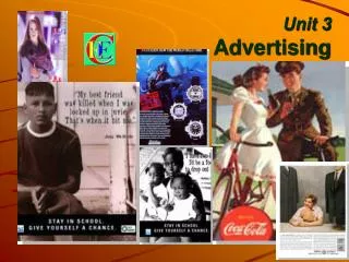
Advertising Unit. Tips for Creating Great Advertisements!. Five Step Formula. What do readers see first? Visual Caption Headline Copy Signature (Advertisers name, contact information) . Basic Ogilvy Ad Layout.

E N D
Advertising Unit Tips for Creating Great Advertisements!
Five Step Formula • What do readers see first? • Visual • Caption • Headline • Copy • Signature (Advertisers name, contact information)
Basic Ogilvy Ad Layout 1. Visual at the top of the page. If you are using a photo, bleed it to the edge of the page or ad space for maximum impact. 2. For photos, place a descriptive caption below. 3. Put your headline next. 4. Follow with your main ad copy. Consider a drop cap as a lead-in to help draw the reader into the copy. 5. Place your contact information (signature) in the lower right corner. That's generally the last place a reader's eye gravitates to when reading an ad.
Headline Right Variation • Visual first, to the left. If the visual lends itself to a more vertical arrangement or if you want to equalize the importance of the visual and headline, try this. • Headline next, to the right of visual. When you break your headline up into several lines like this, you'll probably want to avoid headlines that are too long. • Caption below photo. • Place main ad copy in two columns. You might want to use a drop cap as a lead-in. • Place your contact information (signature) at the bottom of the second column in the lower right corner.
Headline First Variation • Headline first. When your headline packs a bigger punch or is more important than the photo, put it up top to grab the reader first. • Visual next. • Caption below photo. • Place main ad copy in two columns. • Place your contact information (signature) at the bottom of the second column in the lower right corner.
Frames • Use frames with purpose and in moderation • Too many distract • Use frames to • Group • Set apart • emphasize
Rules for Using Frames • Convey an idea, add interest • Go beyond lines and pictures • The whole picture
Elements of Ad Design • Artwork • Titles • Body • Signature (Contact) • Extras
Small ad layout • Look at the bottom ad • Is it exciting? • Does it draw your eye?
Ad Makeover • Look at the top ad • What makes it better? • Does it draw your eye?
Stand-out Elements • Tilted graphics • Shaded boxes • Size and placement of text and images • Varied font and boldness