Download
1 / 17
170 likes | 204 Views
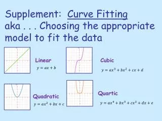
Learn how to select the correct graph type for different data display needs, including pictographs, bar graphs, line graphs, histograms, box plots, circle graphs, stem-and-leaf plots, and more. Understand when to use each type based on the information provided.

E N D
Essential Question • Can you pick the correct graph to use when given certain information?
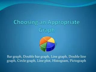
Choosing Appropriate Graphs • Pictograph – Visual display of data ***Key Features: Must use a symbol to represent data items “Eye Catching”
A Legend tells you what each bar represent. Choosing Appropriate Graphs… • Bar Graph - categorical data “categories” and comparing
Choosing Appropriate Graphs… • Line Graph – change over a period of time
Choosing Appropriate Graphs… • Histogram – a special type of bar graph that displays intervals or ranges Key Features: Ranges and Bars connect
Choosing Appropriate Graphs… Box plot – shows measures of variation of data and quartiles. The box tells you that about half of the people own 2 to 4 pairs of sunglasses
Choosing Appropriate Graphs… Circle Graph – displays percents or fractional parts
Choosing Appropriate Graphs… • Stem-and-leaf Plot – lists numerical data in order from least to greatest ex) Ordered Plot • Line Plot – shows data above number line displayed with “X’s” (outliers and mode easily identified)
What type of graph? • A car dealership sells seven makes of cars. Which data display(s) could be used to compare sales for each make of car last year? 2. 3.The ages of 16 school teachers are: 48, 52, 46, 58, 25, 48, 55, 51, 58, 49, 60, 53, 30, 27, 42, 49 4.
6. Select an appropriate display to compare the percent of ethanol production by state. Justify your reasoning. • Would you use a bar graph or a stem-and-leaf plot to display the ages of 30 people buying a movie ticket? Explain. • Recreation football sign-ups are complete. The following number of boys registered in each age group are listed below: • 7 to 8 year olds - 48 boys • 9 to 10 year olds – 73 boys • 11 to 12 year olds – 68 boys • What type of graph would you use to display this information?
EXAMPLE 1 Choosing an Effective Display Stamps Which graph is more effective in comparing the percent of people who prefer sports stamps to the total number of people?
1 4 5 8 7 9 3 6 6 6 4 3 2 5 3 7 5 0 3 5 EXAMPLE 3 Choosing an Appropriate Display Weather Weather The data displays organize the daily high temperatures during a recent month in Boston, Massachusetts. Which display can you use to find the median high temperature? 6 3 0 9 9 4 3 8 8 5 0 6 2 7 8 4 º 36 F Key:3 6 =
for Examples 1, 2, and 3 GUIDED PRACTICE 1. Suppose you want to compare people preferring art stamps to people preferring animal stamps. Which graph is more effective? Explain. What If?
Appropriate Data Displays Which graph would be most appropriate to show the method of travel used by most people? Which graph compares the number of people who ride the bus to the entire population? BrainPop: Graphs
Appropriate Data Displays Which graph would be best to show the change in average temperatures?