Download
1 / 27
270 likes | 386 Views
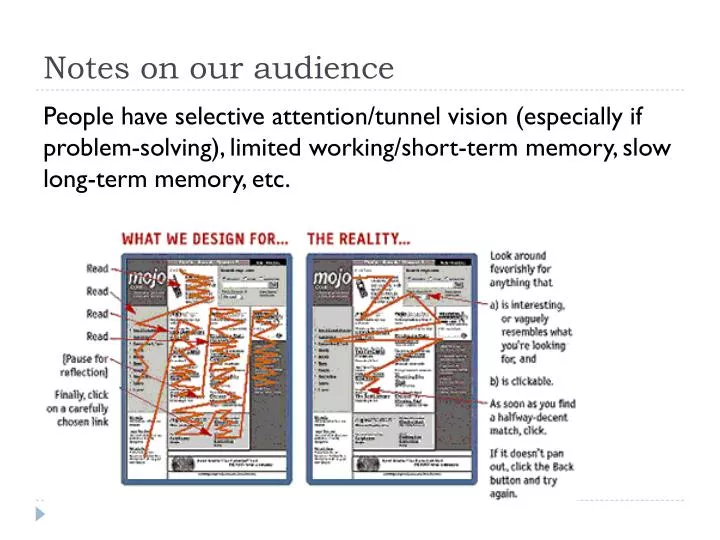
Notes on our audience. People have selective attention/tunnel vision (especially if problem-solving), limited working/short-term memory, slow long-term memory, etc. Same song, second verse. Same song, second verse. I’m microtasking. I’m bored. I’m local. Graphical User Interface =.

E N D
Notes on our audience People have selective attention/tunnel vision (especially if problem-solving), limited working/short-term memory, slow long-term memory, etc.
Same song, second verse I’m microtasking I’m bored I’m local
Graphical User Interface = Graphical display (1+ pixel) for people to see + Controls for people to use + Computation function(s) on object(s)
Controls of… • A typical ATM? • Touch-screen kiosk? • Car stereo? • An Illustrator vector shape? • Sony Walkman?
When interaction is a Good Thing • “For manipulation software, interaction is perfectly suitable: the user views a visual representation of the model, considers what to manipulate next, and performs a manipulation. • The software, in turn, inputs the user’s manipulation request, updates the model, and displays the updated representation.” • The ACTION is for doing the actual work with some Thing (like painting in PS).
When interaction is NOT a Good Thing • “For information software, all interaction is essentially navigation to adjust the user’s view into the data space. The only reason for the user to ACT is to explicitly provide some context that the software can’t otherwise infer - to indicate a relevant subset of information. • Navigation is usually pure excise (cognitive or physical penalty for using a tool) AND • The user has to already know what she wants in order to ask for it. • The user has to know how to ask. • Spaces that can be navigated are spaces in which the user can get lost.
Commuting in GUIs • How much real estate is content vs. navigation?
Commuting in GUIs • How much real estate is content vs. navigation?
Commuting in GUIs From the user’s POV, is the activity/space as complicated as the (misguided) GUI is making it?
Commuting in GUIs From the user’s POV, is the activity/space as complicated as the (misguided) GUI is making it?
Commuting in GUIs When the activity/space is complicated, how to bring clarity? • Visual hierarchy
Commuting in GUIs When the activity/space is complicated, how to bring clarity? • Visual hierarchy • Environmental clues or familiar cultural/platform norms
Commuting in GUIs When the activity/space is complicated, how to bring clarity? • Visual hierarchy • Environmental clues or familiar cultural/platform norms
Commuting in GUIs When the activity/space is complicated, how to bring clarity? • Visual hierarchy • Environmental clues or familiar cultural/platform norms • "You are here" signage
Commuting in GUIs When the activity/space is complicated, how to bring clarity? • Visual hierarchy • Environmental clues or familiar cultural/platform norms • "You are here" signage
Commuting in GUIs When the activity/space is complicated, how to bring clarity? • Visual hierarchy • Environmental clues or familiar cultural/platform norms • "You are here" signage • Maps
Commuting in GUIs How much real estate is content vs. navigation? When the activity/space is complicated, how to bring clarity? • Visual hierarchy • Environmental clues or familiar cultural/platform norms • "You are here" signage • Maps • Clearly visible change/movement/transitions (aka feedback)
Commuting in GUIs How much real estate is content vs. navigation? When the activity/space is complicated, how to bring clarity? • Visual hierarchy • Environmental clues or familiar cultural/platform norms • "You are here" signage • Maps • Clearly visible change/movement/transitions (aka feedback) • Reduce distances …
Commuting in GUIs (reducing distances)Anti-pattern: meandering away • Normal flow through the screen takes the user on a (needlessly) meandering journey
Commuting in GUIs (reducing distances)Anti-pattern: Pogo stick navigation (common malady of UIs for comparison decision making tasks) Example: List of products doesn’t provide appropriate level of info for a choice, so you • navigate down into one to get info, • navigate back to the list, • navigate down into another to get info • navigate back to the list …
Commuting in GUIs (reducing distances)Anti-pattern: Pogo stick navigation (common malady of UIs for comparison decision making tasks) Example: List of products doesn’t provide appropriate level of info for a choice, so you • navigate down into one to get info, • navigate back to the list, • navigate down into another to get info • navigate back to the list …
Commuting in GUIs (reducing distances) Advice from Josh Clark: Don’t organize your app like a web. People should be able to flip through its screens: • in a straight line (flat pages), • a simple set of categories (tab bar), • or a neatly categorized collection (tree structure). Paths through your app should be predictable and, ideally, unique: Aim to build your app according to a “one room, one door” principle so that every screen has just one approach. P. 120 of Tapworthy
Commuting in GUIs How much real estate is content vs. navigation? When the activity/space is complicated, how to bring clarity? • Visual hierarchy • Environmental clues or familiar cultural/platform norms • "You are here" signage • Maps • Clearly visible change/movement/transitions (aka feedback) • Reduce distances … by optimizing screen/flow for the primary task.
Buttons Menu bars Pop-up menus Drop-down menus Toolbars Links Action Panels Carousels Sliders … Double click Swipe Rollover Keyboard actions/commands Drag-and-drop … GUI nouns & verbs • Perceived affordances? • Natural mapping relationships? • Consistent with/builds on conventions? • Feedback? • Transitions?
Must work both GUI aspects: Visual organization Personality (look & feel) • “Visual contrast and visual hierarchy to create layouts that guide users through content (i.e. work the Gestalt principles and CRAP) • “Selecting the right fonts, colors, shapes, textures, and images to communicate an appropriate message to your target audience