Download
1 / 16
180 likes | 505 Views
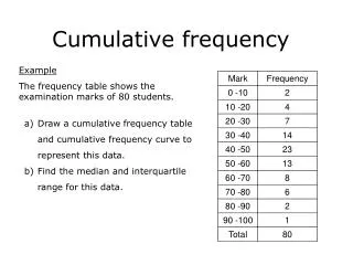
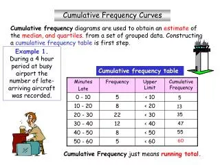
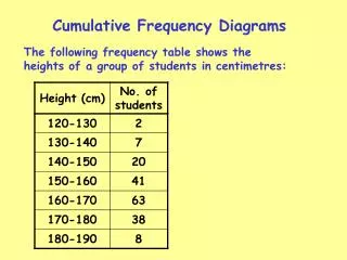
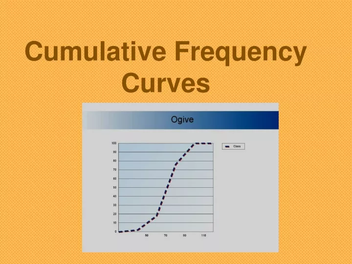
Cumulative Frequency Curves. Example 1. The heights of some plants grown in a laboratory were recorded as follows: Construct a cumulative frequency graph and then answer the questions that follow. Solution. Step 1 : Find the class boundaries and the cumulative frequencies for each class.

E N D
Example 1 The heights of some plants grown in a laboratory were recorded as follows: Construct a cumulative frequency graph and then answer the questions that follow.
Solution Step 1: Find the class boundaries and the cumulative frequencies for each class. 10.5 – 15. 5 15.5 – 20.5 20.5 – 25.5 25.5 – 30.5 30.5 – 35.5 35.5 – 40.5 3 10 29 49 60 62
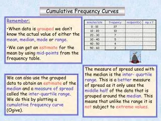
Step 2: Scale off your x and y axes….x-axis with class boundaries….y-axis with appropriate scaling to accommodate the cumulative frequencies .5 .5 .5 .5 .5 .5 .5
Step 3: Plot the cumulative frequency of each class at the UPPER CLASS BOUNDARY .5 .5 .5 .5 .5 .5 .5
Step 4: Starting at the lowest class boundary (frequency = 0) connect all of your points to create your graph. .5 .5 .5 .5 .5 .5 .5
1) Approximately how many plants had a height less than 25 cm? 2) 55 plants had a height less than ____ cm?
Measures of Position -Percentile Graphs • Definition: indicate the position of a value in a data set in hundredths. • Used frequently in education and health related fields. • Essential Question: Why do we study percentile graphs? • Growth charts
Example 2 The following data represent vehicle speeds on a highway: Construct a percentile graph (or a relative cumulative frequency graph) and then answer the questions that follow.
Solution Step 1: Find the class bound, c. f. and r. c. f. for each class. 45.5 – 48.5 48.5 – 51.5 51.5 – 54.5 54.5 – 57.5 57.5 – 60.5 60.5 – 63.5 1 4 10 25 47 50 2 8 20 50 94 100
Step 2: Scale off your x and y axes….x-axis with class boundaries….y-axis by percents. .5 .5 .5 .5 .5 .5
Step 3: Plot the relative cumulative frequency of each class at the UPPER CLASS BOUNDARY .5 .5 .5 .5 .5 .5
Step 4: Starting at the lowest class boundary (frequency = 0) connect all of your points to create your graph.
What percentage of drivers were traveling at a speed greater than 55 mph? • 2) 70% of drivers were traveling under what speed?
Lesson Summary • Ticket out the door: Describe the process for constructing a proper percentile graph to your partner. Make sure you include the type of data set and all criteria necessary for construction of the graph.