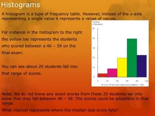
Download
1 / 25
250 likes | 427 Views
Histograms. Lecture 18 Sec. 4.4.4 Tue, Feb 17, 2004. Histograms. Histogram – A display of continuous quantitative data in which the data are divided into classes and rectangles represent the frequencies of the classes. Drawing Histograms. Use Data Set 1 on p. 184.

E N D
Histograms Lecture 18 Sec. 4.4.4 Tue, Feb 17, 2004
Histograms • Histogram – A display of continuous quantitative data in which the data are divided into classes and rectangles represent the frequencies of the classes.
Drawing Histograms • Use Data Set 1 on p. 184. • Find the maximum value, the minimum value, and the range. • Maximum = 51 • Minimum = 32 • Range = Max – Min = 51 – 32 = 19.
Drawing Histograms • Divide the data into classes of equal width. • The classes must not overlap. • Choose a convenient starting point. • Choose a convenient class width. • Write the endpoints of each class.
Drawing Histograms • Starting point = 30. • Class width = 5. • Classes: • 30 up to 35 (but not including 35). • 35 up to 40. • 40 up to 45. • 45 up to 50. • 50 up to 55.
Drawing Histograms • We may denote the classes in either of two ways. • Interval notation: [low, high) • [30, 35), • [35, 40), • [40, 45), etc. • [ and ] mean “include endpoints.” • ( and ) mean “exclude endpoints.”
Drawing Histograms • Range notation: low – high • 30 – 34, • 35 – 39, • 40 – 44, etc. • This notation does not indicate whether the endpoints are included. • Therefore, be sure the endpoints do not overlap.
Drawing Histograms • Count the number of observations in each class. This is the frequency of the class.
Drawing Histograms • Draw horizontal and vertical axes. • On the horizontal axis, show the class boundaries. • On the vertical axis, show uniform reference points representing frequencies apropos to the data. • For example, 0, 2, 4, …
Frequency 8 6 4 2 Age 0 30 35 40 45 50 55 Drawing Histograms
Drawing Histograms • Over each class, draw a rectangle whose height is the frequency of that class.
Frequency 8 6 4 2 Age 0 30 35 40 45 50 55 Drawing Histograms
Frequency 8 6 4 2 Age 0 30 35 40 45 50 55 Drawing Histograms
Frequency 8 6 4 2 Age 0 30 35 40 45 50 55 Drawing Histograms
Frequency 8 6 4 2 Age 0 30 35 40 45 50 55 Drawing Histograms
Frequency 8 6 4 2 Age 0 30 35 40 45 50 55 Drawing Histograms
Frequency 8 6 4 2 Age 0 30 35 40 45 50 55 Drawing Histograms
Frequency 8 6 4 2 Age 0 30 35 40 45 50 55 Drawing Histograms
Guidelines • Never use too few or too many classes. • Usually 5 to 12 classes is about right. • Use simple round numbers for the class boundaries. • Mark off the vertical axis uniformly, showing regular reference points, not the actual frequencies. • Frequencies must start at 0.
Let’s Do It! • Let’s do it! 4.14, p. 224 – Histogram of Household Income. • Let’s do it! 4.16, p. 226 – Matching Shapes to Characteristics.
Example • See Example 4.10, p. 227 – Histogram versus Bar Graph.
Histograms on the TI-83 • See page 263 for more detailed instructions. • Enter the data into list L1. • {45, 41, 51, …, 37} L1 • Press STAT PLOT • Turn Plot1 On. • Select Histogram Type. • Specify List L1.
Histograms on the TI-83 • Press WINDOW • Set Xmin to the starting point. • Set Xmax to the last endpoint. • Set Xscl to the class width. • Set Ymin to 0. • Set Ymax to the maximum frequency. • Press GRAPH • The histogram appears.
Frequency Distributions on the TI-83 • After getting the histogram, press TRACE. • The display shows the first class and its frequency. • Use the left arrow to see the other class frequencies.
Assignment • Page 227: Exercises 30 – 38. • Page 249: Exercises 68, 69.