Download
1 / 2
20 likes | 130 Views
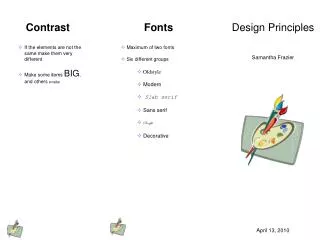
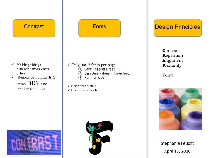
Contrast. Fonts. Design Principles. C ontrast R epetition A lignment P roximity Fonts. Making things different from each other Remember, make BIG items BIG , and smaller ones small. Only use 2 fonts per page Serif - has little feet San Serif - doesn’t have feet. Fun - unique

E N D
Contrast Fonts Design Principles Contrast Repetition Alignment Proximity Fonts • Making things different from each other • Remember, make BIG items BIG, and smaller ones small. • Only use 2 fonts per page • Serif - has little feet • San Serif - doesn’t have feet. • Fun - unique • 1 becomes title • 1 becomes body Stephanie Feucht April 13, 2010
Proximity Repetition Alignment • Keep something similar throughout. • Creates unity in the piece. • Keeps things organized. • Use strong lines when they are present. • Keep similar ideas close together. • Keep different items apart. • Use same spacing for similar circumstances. Bears: Polar Black Grizzly Birds: Robin Blue Jay