Download
1 / 5
50 likes | 127 Views
Learn how to master the art of graphic design with principles such as contrast, proximity, alignment, and repetition. Understand the dos and don'ts of each concept to create visually appealing and structured designs. Improve your skills and create captivating visual content.

E N D
Design Principles By: Jonathan Gross
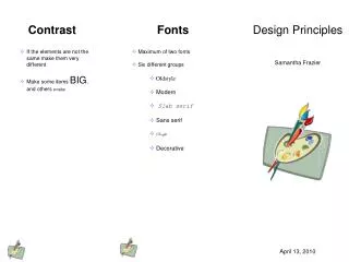
Contrast • It’s what makes a reader look at the page in the first place because it gets the readers attention. • When you look at a paper, why did you look at it in the first place? Because you thought it look interesting, because of the contrast. • Good use of contrast would be: • Bad use of contrast would be:
Proximity • Items relating to each other should be grouped close together. • It helps organize information, reduces clutter, and gives the reader a clear structure. • Good use of proximity would be: • Bad use of proximity would be:
Alignment • Nothing should be placed on the page arbitrarily. Every elements should have some visual connection with another element on the page. • This crates a clean, sophisticated, fresh look. • Good use of alignment would be: • Bad use of alignment would be:
Repetition • You can repeat colors, shapes, textures, spatial relationships, line thicknesses, fonts, sizes, graphic concepts, etc. • This develops the organization and strengthens the unity. • Good use of repetition would be: • Bad use of repetition would be: